Hey @mansyaprime ,
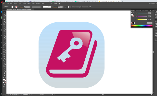
Thank you for the contribution. There is a problem on your editable source files. Shadow on logo design looks pix-elated.

- You used 2 pale color and it makes your logo design unpretentious. You could choose colors with better contrast.
- For mock-up design, it would be better if you show logo design on android menu screen. It does not mean anything for now.
Your contribution has been evaluated according to Utopian policies and guidelines, as well as a predefined set of questions pertaining to the category.
To view those questions and the relevant answers related to your post, click here.
Need help? Write a ticket on https://support.utopian.io/.
Chat with us on Discord.
[utopian-moderator]
Thank you for your review, @baranpirincal!
So far this week you've reviewed 2 contributions. Keep up the good work!