RE: New Logo for Kotlin NotePad Android
Hey @mansyaprime ,
Thank you for the contribution.
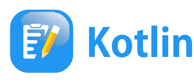
I realize that you made same shadow on your previous contribution. I suggest that you must work special for each project. Of course you can reflect your style but it is little more than that :)
There is a problem again on your editable files as I mentioned earlier. It need to be fixed

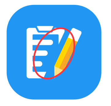
Also, in my opinion, these empty spaces seems undefined. Some corners of elements are flat some of them round. I am not sure but it could be better if they are all in same style.

Your contribution has been evaluated according to Utopian policies and guidelines, as well as a predefined set of questions pertaining to the category.
To view those questions and the relevant answers related to your post, click here.
Need help? Write a ticket on https://support.utopian.io/.
Chat with us on Discord.
[utopian-moderator]
Thank you for your review, @baranpirincal! Keep up the good work!