You are viewing a single comment's thread from:
RE: Introducing the steeminvite project to utopian
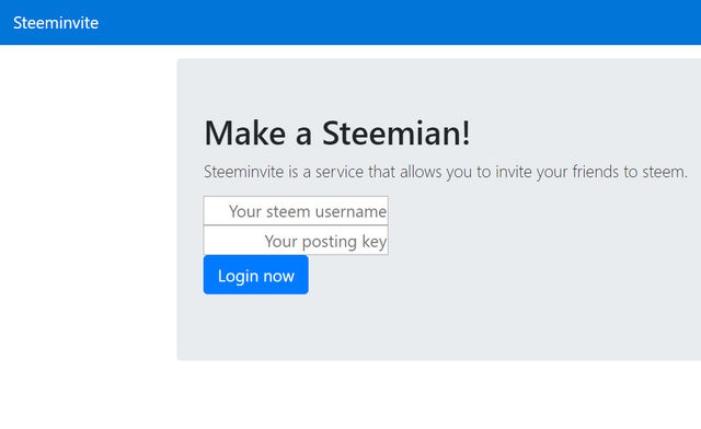
Excellent work @pharesim. Just wondering if I'm the one having problems with bootstrap?

If it was designed like that, a little spacing between the fields would make it look great.
Thanks, I forgot to style that form at all.