I like the clarity of your design, but I'm wondering whether you are disturbing the flow of the page by cutting the content into those strong boxes? The best motif for a 'river' of content is to surely:
a) Keep the flow, so your eye moves naturally down the page from post to post
b) To avoid anything which causes a 'full stop' in reading.
In your case, I would suggest that the shadowed boxes deliver a kind of interrupt in reading. Is there some way you could retain the clarity of information in the UI, while softening the divide from story to story somehow?
Actually looking at it again, I think a fair amount of it could also be due to a lack of emphasis. You have all the elements in the card at an almost equal weight, so for example the text is all the same, with only the title as bold. If you look at the original, you'll see that the ancilliary info is greyed out quite a lot, so your eye immediately focuses on the important stuff, the image and title.
Yeah, you're right. There's still much work to do on the hierarchy. It could resolve this problems you mentioned.
I just need to play around with the structure a little bit more. The main point is to make the content clear. Lets see what I can get with next iteration.
My pleasure. It's really refreshing to see how much passion this baby platform is getting even at this early stage. I think people are sensing some sort of revolution may be in action. :)
I really like the new design of how the single post looks, it's simple and elegant. Not so much a fan of the multiple rows to look at, don't know why just don't find it appealing. But I really like the change to the actual post putting emphasis on the more important buttons/info. Also it's really just nice to look at, has a more comfortable app feel to it over a colder more basic website look.
I wholeheartedly agree with this critique. However it could also be an option to view multiple rows, as it should not be too to difficult to allow users to view one row or two with a simple button push for those who want to see it that way. People like customization as long as it isn't confusing.
I love the multiple columns made possible by the postcard format. What I've been really wanting to see, though, are bigger images. Bigger preview content, generally, would benefit quality content. But I'm so pleased you proposed this style. I think it gives the eye a more dynamic experience. Less like I'm being a human scanner and more like I have many options to be delighted.
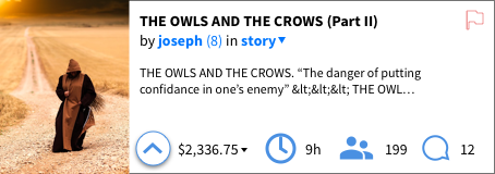
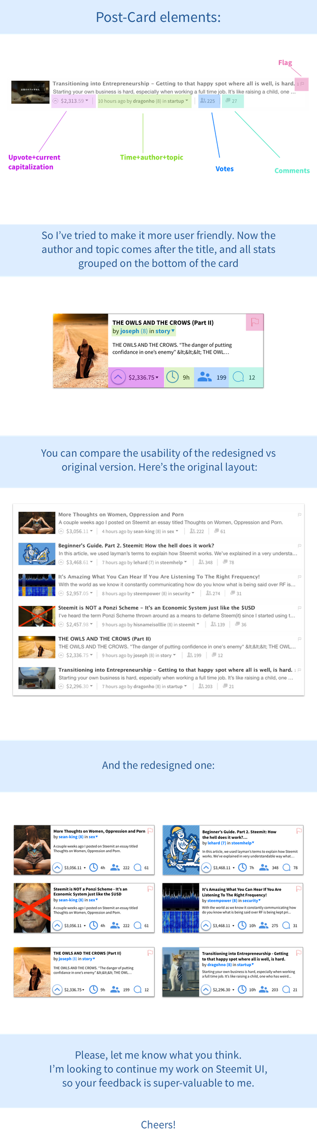
I like that the author is next to the title. It is also convenient that all statistics aligned.
Thank you! Glad you liked it!
There are some good ideas here for sure even if I find some of the icons too big.
Yeah, I see what you are talking about. I will continue my work
I like the clarity of your design, but I'm wondering whether you are disturbing the flow of the page by cutting the content into those strong boxes? The best motif for a 'river' of content is to surely:
a) Keep the flow, so your eye moves naturally down the page from post to post
b) To avoid anything which causes a 'full stop' in reading.
In your case, I would suggest that the shadowed boxes deliver a kind of interrupt in reading. Is there some way you could retain the clarity of information in the UI, while softening the divide from story to story somehow?
Actually looking at it again, I think a fair amount of it could also be due to a lack of emphasis. You have all the elements in the card at an almost equal weight, so for example the text is all the same, with only the title as bold. If you look at the original, you'll see that the ancilliary info is greyed out quite a lot, so your eye immediately focuses on the important stuff, the image and title.
Thoughts?
Yeah, you're right. There's still much work to do on the hierarchy. It could resolve this problems you mentioned.
I just need to play around with the structure a little bit more. The main point is to make the content clear. Lets see what I can get with next iteration.
Your comment is the best! Thank you so much!
My pleasure. It's really refreshing to see how much passion this baby platform is getting even at this early stage. I think people are sensing some sort of revolution may be in action. :)
Nice @savandra
Shot you an Upvote :)
I really like the new design of how the single post looks, it's simple and elegant. Not so much a fan of the multiple rows to look at, don't know why just don't find it appealing. But I really like the change to the actual post putting emphasis on the more important buttons/info. Also it's really just nice to look at, has a more comfortable app feel to it over a colder more basic website look.
I wholeheartedly agree with this critique. However it could also be an option to view multiple rows, as it should not be too to difficult to allow users to view one row or two with a simple button push for those who want to see it that way. People like customization as long as it isn't confusing.
Maybe multiple rows a bit harder to watch through
I love the multiple columns made possible by the postcard format. What I've been really wanting to see, though, are bigger images. Bigger preview content, generally, would benefit quality content. But I'm so pleased you proposed this style. I think it gives the eye a more dynamic experience. Less like I'm being a human scanner and more like I have many options to be delighted.
I show you my project:

https://steemit.com/steemit/@projekt/hello-everyone-i-created-a-new-website-design-for-steemit
It's kinda good looking but I suppose it's just to little content per page
Upvoted
Thank you so much sir!
Any suggestions to make it better?
Upvoted