05.01 - Choosing the Right Typeface - The Foundations of Typography

Chapter 05 - Utilization
Lesson 01 - Choosing the Right Typeface
"How do you choose the right typeface(s)?"
As a designer, I think this is the most common question I receive from non-designers. Today, there are so many typefaces available, so it can be quite intimidating and difficult to find “just the right one”. These tips should help refine your process and make it easier for you to find the perfect typefaces for your work.
Appropriateness
The designer's one essential task is to interpret and communicate the content. There are two main things to consider when trying to understand the content.
Tone
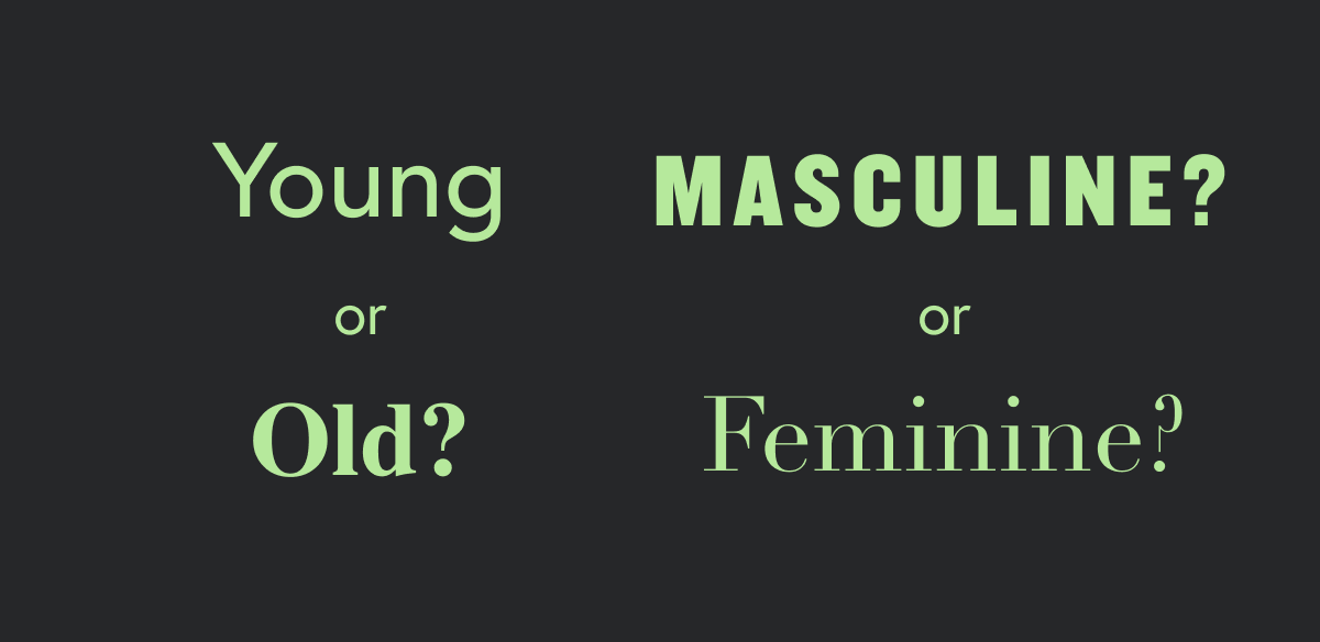
Consider the tone of your type. Is it casual or formal? Humorous or serious? You want something that not only fits the tone and the feel of your message, but actually amplifies it.

Audience
You need to consider the audience you're speaking to. What is the age, culture, gender of your audience?

Some typefaces are just plain awful. Don't just choose a typeface that you think is cool, invest the time to get to know the typefaces and choose one that really suits your content well.
Contrast
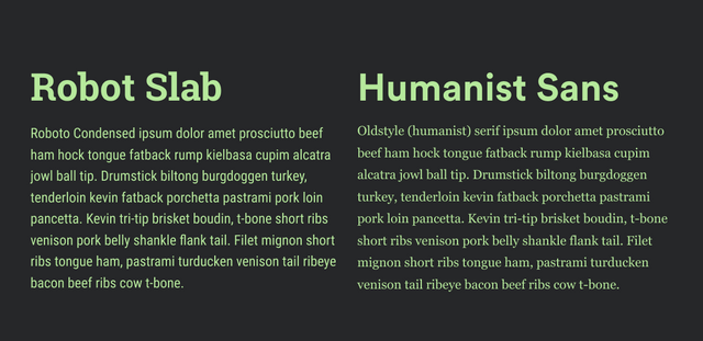
Contrast and differentiation are key. Even though you want your typefaces to share a similar tone and feel, having two typefaces that share similar qualities can be confusing and affect the unity of your message. So when choosing a typefaces, avoid small differences, bump up the contrast. Your headlines should contrast your body copy to allow for a clear hierarchy.

A quick way to ensure a balance of tone similarity and contrast is to choose different types of the same superfamily (ex: Roboto Slab and Roboto Sans Condensed). If you have a little more knowledge of the typefaces you're choosing, you can select a serif and sans serif of the same category (ex: a humanist sans serif such as Europa and an Oldstyle (humanist) serif typeface such as Georgia)
Legibility
Consider the medium(s) of your project. Does it need to be seen from 40ft away or is someone holding it inches away from their face when they are reading it? For example, a serif typeface is typically more legible when used in large quantities in print. But from there, it would be good to play around with a few different serif typefaces to see which ones read the best.
There aren’t any unwavering rules when it comes to choosing type for your project, only conventions. You’ll find beautifully designed posters with nothing but hard-to-read display fonts, and you’ll find beautiful menu’s with only one simple typeface. It’s worth experimenting and playing just to see what happens. The key is to make these decisions consciously.

good post. follow me @goga