04.01 - The Grid - The Foundations of Typography

Chapter 04 - Layout & Composition
Lesson 01 - The Grid
When laying out type, creating a system of structure is extremely important. A grid creates a skeleton structure for your type which you can use or break out of. Breaking your text into regular units by using a grid will save you time, unify your project as a cohesive whole, and enable you to be much more flexible and creative with your arrangement.
Single-Column Grid
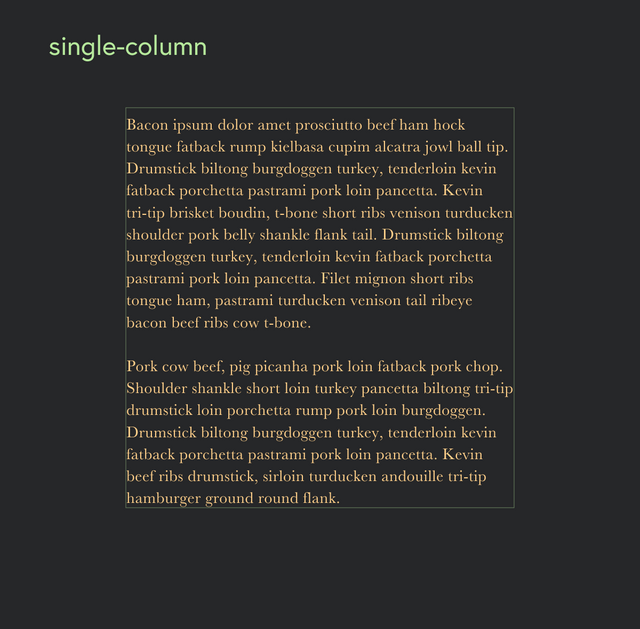
The single-column grid is simplest grid, using a fixed width and fixed margins. Novels and scholarly journals typically use this this style of grid.

Multi-Column Grid
A multi-column grid may vary in number of columns and how the columns are combined. The most commonly used multi-column grid is the 12 column grid, as it's extremely flexible due to it's high number of divisible sections. Since you don't need to fit a column of text in each column on the grid, the more columns you have, the more flexible you can be.

Modular Grid
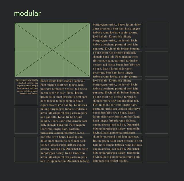
A modular grid incorporates horizontal divisions along with vertical divisions. The modular grid helps placement and cropping for images and graphics and maintaining a balance in your work. A modular grid allows for even more flexibility, as you can orient certain type vertically for more emphasis and vitality.

The grids can be created in Adobe InDesign by accessing Margins and Columns in the Layout menu. Select the number of columns you’d like, and the size of the gutter (or the space between columns). To create a modular grid, you can do this manually by first selecting number of columns in the Margins and Columns preference window and then adding horizontal grid lines in your workspace by clicking and dragging from the ruler.
Baseline Grid
Baseline grids ensure your page's elements align to a common rhythm. Create a baseline grid by choosing the typesize and leading of your text first, then use this line space increment to set the baseline grid in Preferences > Grids and Guides (in Adobe). You can align your type to the baseline in your Paragraph panel.
To style headlines, captions, and other elements, choose line spacing that makes sense with your baseline grid. The more time you spend upfront planning these kinds of things, the more time you will save in the end. Don't worry about aligning every single element to the baseline, but use it as a reference, and if something is not working, feel free to turn it off.
