03.02 - Alignment - The Foundations of Typography
Chapter 03 - Arrangement
Lesson 02 - Alignment
There are 5 types of alignment, left, right, centered, justified, and random/asymmetrical.
Left
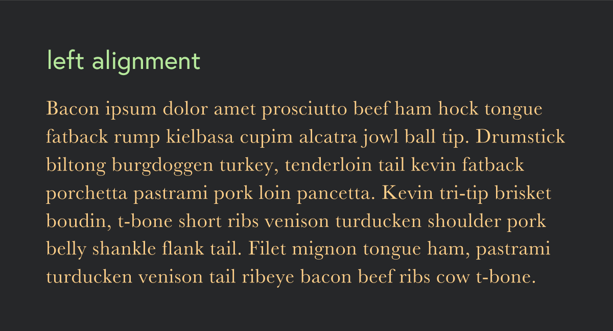
Left alignment is the most common type of alignment, and is a flush left (ragged or uneven on right) alignment. It is the easiest for legibility for any material that is more than a few lines because the starting point of the next line is easy to find.
Right
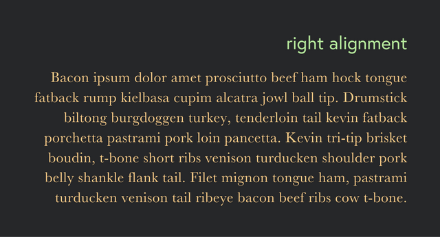
Flush right alignment, or right alignment is not good for lengthy reading as the eye has a hard time finding beginning of line while reading. A typical use case for this type of alignment is side captions The right alignment indicates that the content to the right is connected to the text.
Centered
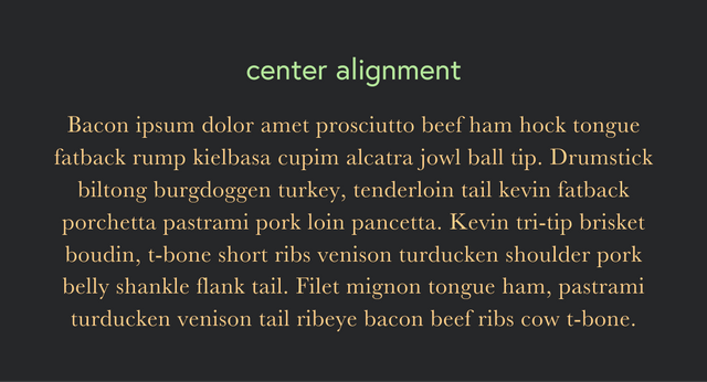
Center alignment is typically found in poems or invitations and not used for lengthy reading for same reason as flush right. Unless you are writing a poem, it's not recommended to use center alignment for more than 5-10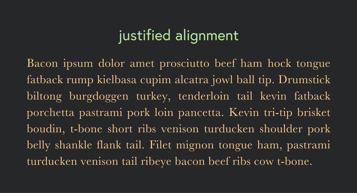 lines of text.
Justified
Justified alignment is flush on both right and left sides, and uses varying word space for each line to accommodate the space discrepancies. It's typically used in magazines or newspapers to emphasize the grid.

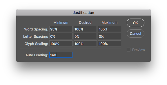
Since the varied word space exists in justified text, you'll have to keep a close eye on it to ensure your word spaces don't get too stretched. You can also control this with the Justification tool in the Adobe Creative Suite by clicking on the submenu in the top right of the Paragraph panel and selecting Justification. I recommend staying somewhere in between 95-110% for word spacing.
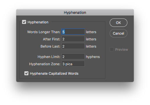
When using justified alignment, hyphens are usually needed to avoid awkward word spacing. In Adobe Creative Suite, you can actually control the number of hyphens you want to include in any given paragraph by clicking the submenu in the top right of the Paragraph panel and selecting Hyphenation.
Just like spacing, you can only do so much with the alignment tools before you need to edit your copy. Alignment is important and shouldn't be taken for granted.
Random/asymmetrical
Random and asymmetrical alignment is typically used for dramatic effect and once again, not good for lengthy reading. This type of alignment is fairly open and could take shape in many forms.
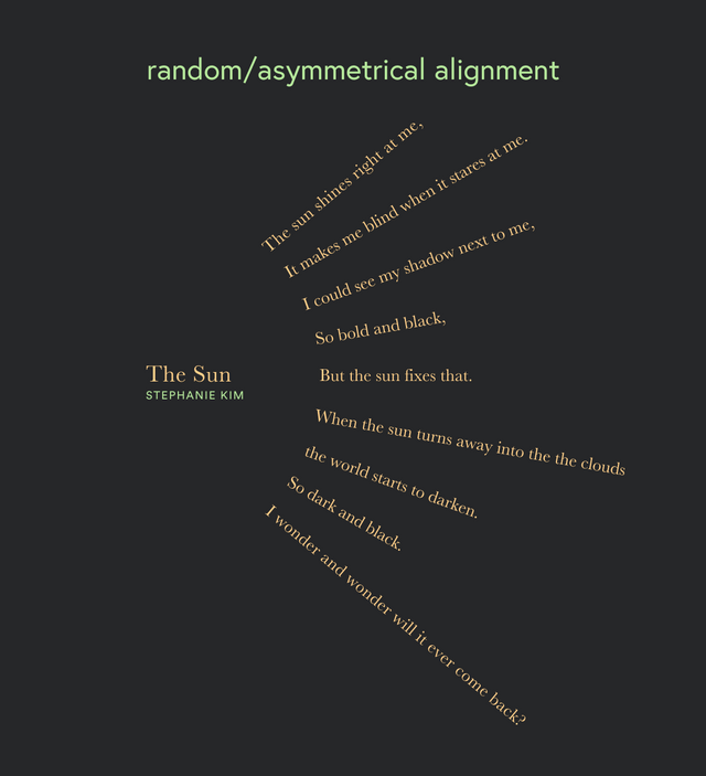
Vertical alignment/text on a path is probably the most common example. This should be used only once you have become very comfortable with type. The curves create variations of space and can be difficult to kern properly. It takes a lot of work and experience to ensure the spacing and rhythm works correctly along a custom path.
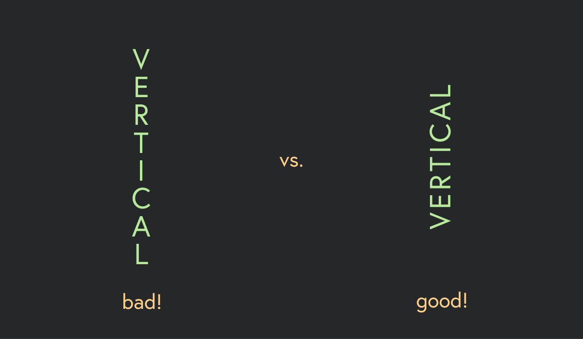
Never stacking type vertically. Vertical type should always read along the vertical alignment, especially if it’s lowercase.
I’m sure after this post, you will notice tons of good examples of alignment, and plenty of bad examples. The key is to keep thinking about the type around you, and over time you will gain a better understanding of what alignment feels right. I encourage you to share your examples of alignment you catch around your city, good and bad!
