SNAP Market Watch 9/27/18
SNAP stock is catching my attention at the moment.
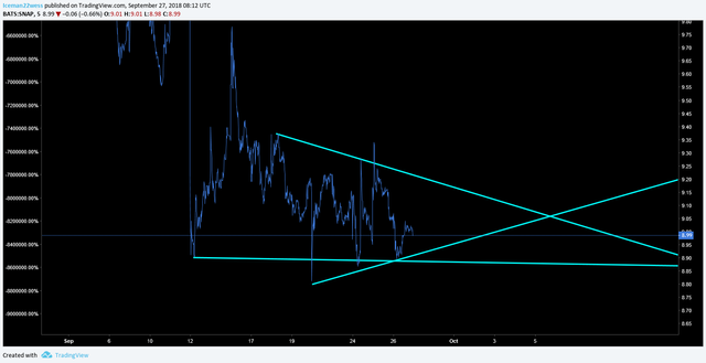
To set the stage, the stock is slightly oversold in my opinion and I am going to do some analysis on if this is a possible bullish trade chance.
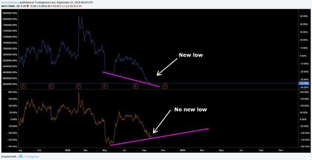
Here, the blue lines are showing the wedges we are currently reaching maturity in.
What I find really interesting here is the OBV though. We are making higher lows in the OBV and holding very well, and the price has not reflected this volume change yet.
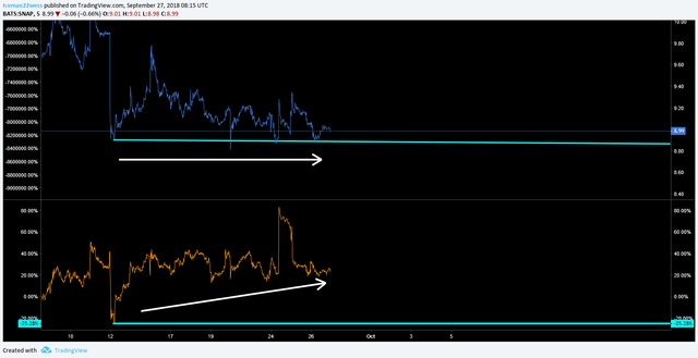
Even the giant spike in the OBV towards the end didn't do much to the price yet. This is a ticking time bomb waiting to pop up. I think we are simply waiting for the wedge to finish maturing before the price can be released out of the descending wedge pattern.
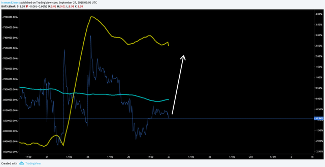
If I look into MA predictions bearish and bullish I get this...
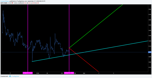
one of these lines always captures the general move of the price very well as it is a representation of the price correcting to the volume, or the volume correcting to the price. When I take into account the nature of the OBV making higher lows, it is highly likely that the price will correct to the volume, thus we should see the green line act as either support or resistance. Since this stock isn't hyped or anything right now, I suspect it will be more likely a resistance line. If I put all of this together that gives me a picture something like this.
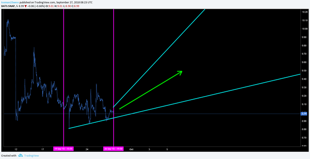
This doesn't mean the stock is mooning or anything, but this is one of the strongest charts I have seen for a bullish move this week.
Looking at the daily chart, it makes perfect sense as well. The stock has been slaughtered since February with the last bounce in May. 3 months before a bounce.... June, July and August continue down...It's about that time for a bounce.
Not only that but the OBV on the daily chart suggests the stock is oversold as well.
A clear divergence that could be traded in day trades and swing trades.
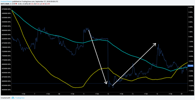
The final thing I would like to point out is an in general rule about the way I use my chart. These two lines represent a 200 MA and a 200 OBV MA. When they are scaled properly, they show snaps (no pun intended) in which direction the price will move. When the price gets on one side of both the lines, you can expect a reversal in price. That looks like this....
To put it in context, look how that same thing looks in a random place of the chart.
In my opinion, this stock has sold off far too much as is primed for an up move.
Thanks for reading,
-Icee-
Please leave me an upvote and remember this is not trading advice.
PS: This stock is a shitty long term investment.