Cryptotrading 101 : Types Of Chart & How To Read Them
Depending on the type of information that the traders are looking for and their trading objectives, there are three kinds of chart that are typically used in the cryptocurrency market, namely
- The line chart
- The bar chart
- The candlestick charts
The Line Chart
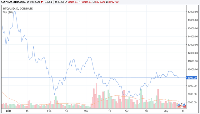
This is a chart that uses lines to demarcate one closing or opening price to another closing/opening price. When these lines are strung together, they show the movement of the price of the currency in the market over a period of time.
The Bar Chart
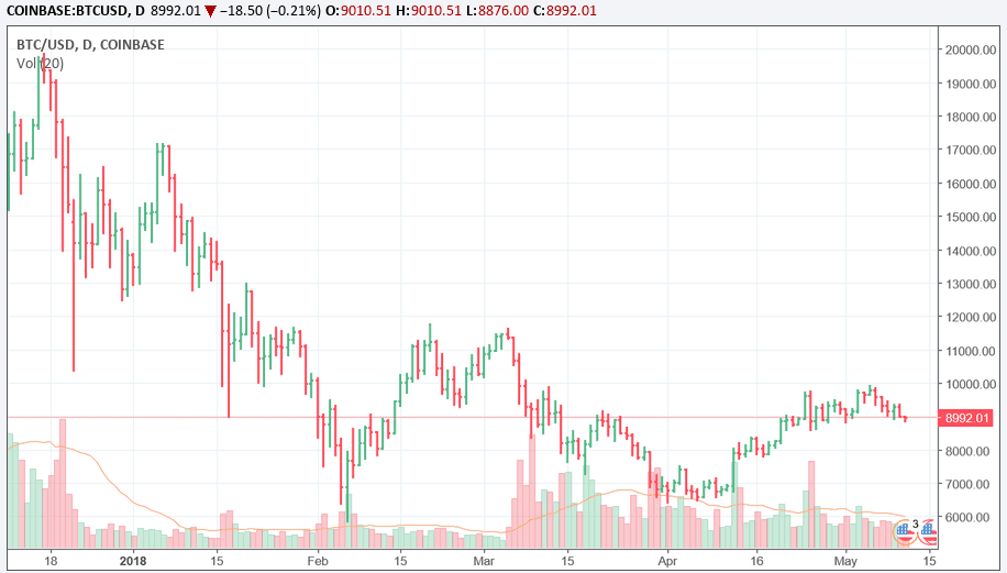
Well, the chart may not look like a bar chart but it is a complex chart showing the opening and closing price of the currency being traded as well as the highs and lows of the currency. The vertical lines at the bottom of the bar indicate the lowest traded price for a stipulated period while the top bar indicates the highest price for the currency being traded. The vertical bar shows the currency pairs, the horizontal hash by the left is the opening price and the closing price is at the right side
A simple bar chart show one segment of time, either the day, week or time, pay attention to what time frame it is referencing; bar charts can be called OHLC charts, this means they state the open, the high, the low, and the close for that currency being traded.
Here’s an example of a price bar.
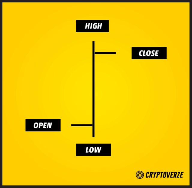
Open: the opening price is the horizontal line on the left
High: the time period is the vertical line at the top
Low: the low price within a time period is represented by the vertical line at the bottom
Candlestick charts
This is how a typical candlestick chart looks like showing a detail of the various highs and lows with the price on the vertical right-hand side.
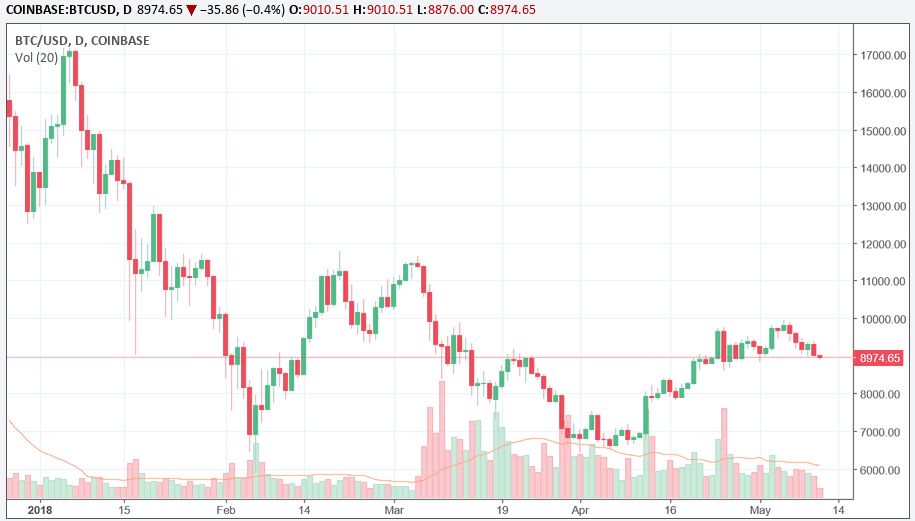
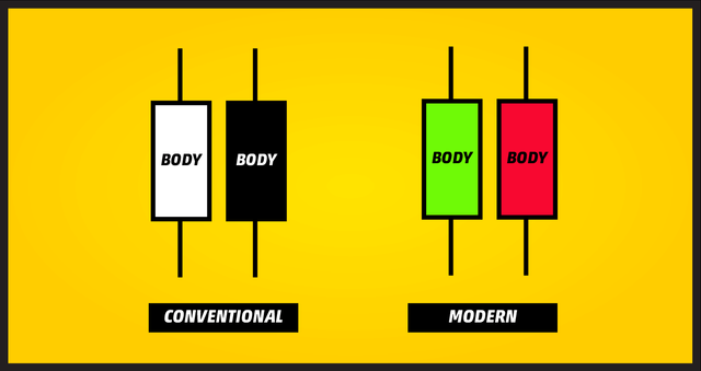
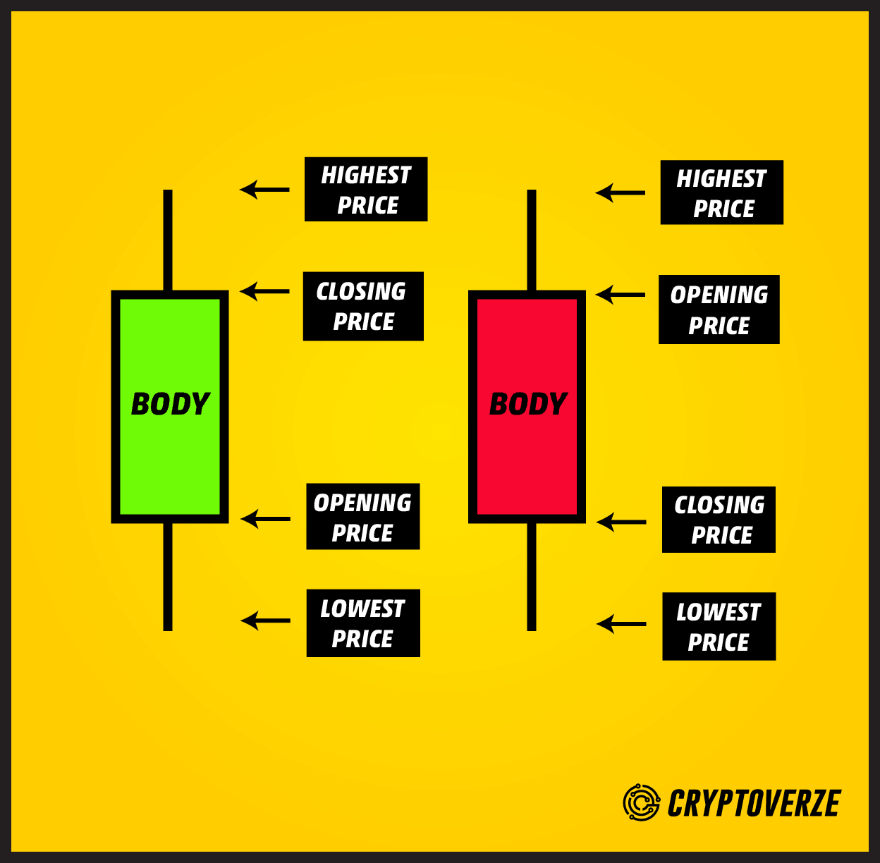
Candlestick charts are charts that show the same price information as a bar chart but in a more detailed and finer format. A candlestick bar is a vertical line that represents the high-to-low range of the price of a currency and the larger block in the middle of a candlestick chart represents the range between the opening and closing. On a conventional candlestick, the middle is filled or colored in, if the opening price of the currency pair higher than its closing price, the block will be filled with black color. The top signifies the opening price, and the bottom is the closing price. When the closing prices are higher than the opening price, the middle block will be colored white or left empty.
That was the conventional way that candlesticks were represented, colored in black and white but these days they are filled with colors, to make them easier to understand such as these below.
The advantages of the candlestick charts are:
- Candlestick charts are easier to understand and display the action in the market in much greater details than its counterparts.
- Candlestick charts provide a way to gauge the market sentiment via the price movement which is essentially suggestive of the interactions between the buyers and sellers
- Candlestick charts are a very good way to notice a change in the market. The change can be a reversal from an uptrend or to a downtrend or vice versa. You will understand better with constant practice and use of these charts.
- Candlesticks provide traders with a set of identifiable visual pattern that can facilitate the market trend prediction. Using the candlesticks pattern along with other technical analysis techniques, trader will be able to maximise their odds in correctly deduce the impending trend of the market.
Source: Cryptotrading 101 : Types Of Chart & How To Read Them