Unusual Way of Using Usual Indicators

Comparison of Japanese candlesticks with Renko chart
This post starts the experiment of application common technical analysis tools to non-standard charts
The experiment description. Definition of main rules and settings. Comparative analysis.
Dear friends,
Today, in my training article, I’d like to share the idea of my experiment that I’m going to start with this post. I’ll explain in short its gist.
Technical analysis applies numerous indicators; but their use is mostly limited by usual price charts that change along the time axis. The most common example is Japanese candlestick chart.

(candlestick chart)
As you see from the chart above, irrespective of whether there are any changes on the price axis, the chart will still paint the next bar and move one step forward, according to the set timeframe.
However, there are many other ways of indicating how the price changes, which do not so much depend on the time axis.
One of the examples is a Renko chart.

Renko looks like a series of little boxes. Each next box appears only if the price changes by a certain value. Therefore, if the price doesn’t change for a long time, Renko chart doesn’t move as well, and so, its dynamics doesn’t depend on the time movement, like in the candlestick chart.
To my surprise, many traders unjustly ignore Renko chart and seldom use it in technical analysis.
Moreover, I hardly ever see its application together with any other indicators.
Yes, I admit that indicators, analyzing trading volume, don’t suit Renko chart.
But there many other indicators, based on common and exponential moving averages, which analyze only simple average of the price that can be calculated by any type of chart.
In addition to Renko chart, other charts, that don’t depend on the time axis, include Linear Break Chart, Kagi, Tic Tac Toe Chart, Range.
The examples of these chart-types are below:

(Linear Break chart)
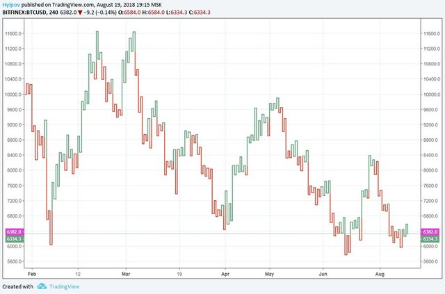
(Kagi)
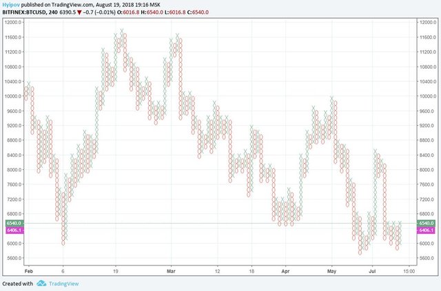
(Tic Tac Toe Chart)
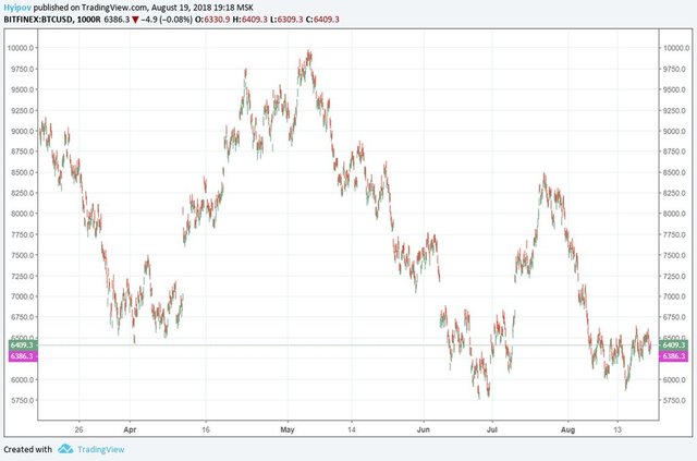
(Range)
Few traders know about these charts, and even fewer apply them in technical analysis, and, perhaps, hardly anybody has tried to apply common indicators to them.
That is what my experiment is. I’m going to apply common moving averages and standard MACD oscillator to each type of charts and test the signals, compared with the same set of tools in the usual candlestick chart.
I’ll sum up the results for each chart and the total outcomes in the end. I think I may develop a new, cool strategy, nobody has used before.
As I've already started describing Renko, I suggest we the experiment start with it.
As I've already said, the chart looks like a series of bricks or boxes, each of which is placed diagonal right to the previous one, at a certain distance. Each box represents a price movement by the value, you choose.
In classical Renko, it is a permanent parameter and you set the most convenient for you value on your own.

But mostly, by default, the box size is determined, based on a built-in indicator, ATR (Average True Range) with the period of 14 bars.
In the chart above, you see such an example, where in the red box at the top, there is displayed ATR with the period of 14 and the range that was identified, based on it. In the given example it is 125.1 USD.
According to these parameters, the chart will be like this:
In the chart above, the top box price is 6505.2 USD, so, the bottom box limit will be 6505.2 – 125.1 = 6380.1 USD.
On the price axis, you see a pink label with the current price at 6387.2 USD.
To build a new brick, it is necessary that in the set timeframe (in the given case, it is 4 hours) the price moves up by 125.1 USD higher than the top limit at 6505.2 USD (if so, there will be a green box) or down by 125.1 USD lower than the bottom limit at 6380.1 USD, then a red box will emerge.
As you understand, if the price doesn’t move in either direction by a certain value, the chart won’t move along the time axis, and so, one brick may include multiple periods of certain timeframes.
To see it clearer, look at the chart below.
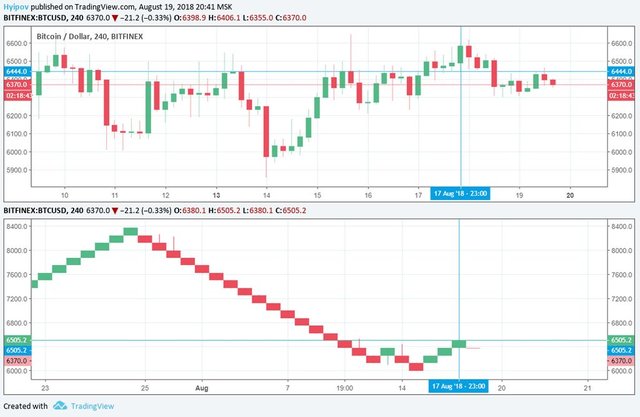
You see, the last box in Renko chart was built at 23.00 on August 17. The chart was being built at 20.44 on August 19, and so, the candlestick chart would have been far ahead by that time.
As it is clear, the main Renko chart advantage is filtering out minor price sideways movements. The chart, built of red and green bricks, makes it much easier to spot big trends and strong price moves.
For a fair experiment, I’ll record the box size at the calculated value of 125.1 USD, so that the chart won’t repaint itself due to the price volatility.
For the experiment, I’ll use a simple trading system, including two exponential moving averages with the periods of 9 and 26, and MACD indicator with usual settings (12, 26, 9).
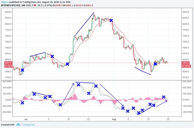
Finally, after analyzing the common candlestick chart, I have the following:
I marked the meeting of moving averages by blue crosses. As known, each such meeting is a signal to buy or sell, according to the direction, in which the short moving average breaks out the long one.
It is clear that MACD moving averages send many false signals, but the signals of divergence and convergence (blue lines) quite accurately predict the trend movements.
You see, moving averages in the candlestick chart send far less false signals; therefore, this instrument can be used to filter MACD signals.
However, it should be remembered that the signals of moving averages meeting, both in the indicator window and in MACD chart, are late. Therefore, we need a tool that can remove false signals and send enter/exit signals in advance.
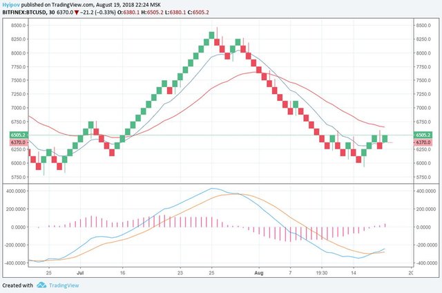
As it is clear from Renko chart, MACD and moving averages are coming even later than in the common price chart.
It is obvious that the box size is too big, and so, we see all the signals, sent by indicators, too late.
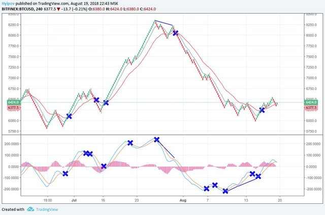
Having experimented with the box size a little, I got Renko layout to be more similar to the candlestick chart.
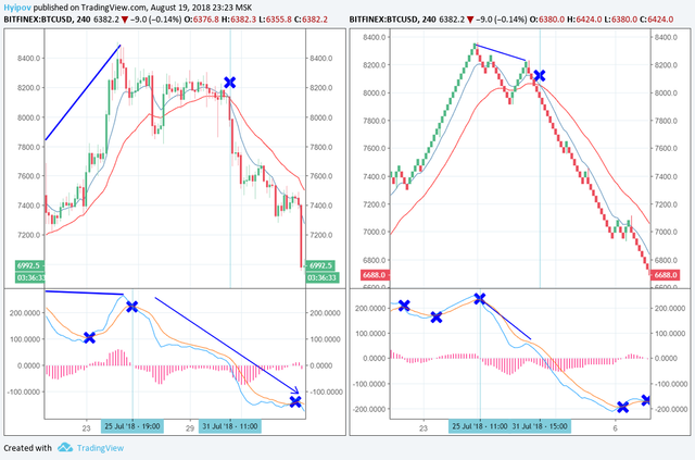
As an example, let’s take the signals that were sent at the high of 8200. As it is clear, the place and the time of the signal by MACD indicator proved to be accurate and came true at 19.00 on July 25. The signal by moving averages was 4 hours earlier in the candlestick chart than in Renko chart.

As you see in the chart above, if the Renko chart brick is smaller (in our case, it is 24 USD), the MACD signal is seen in the common chart 8 hours later. On the other hand, three false signals are seen in Renko chart, which are not in the candlestick chart (marked with green crosses).
Summary:
I cannot interpret the results of comparing the common candlestick chart with Renko chart in a definite way. It is clear that moving averages and MACD can be applied to Renko. But the number and the quality of signals mostly depend on how appropriate the box size is.
One of the main Renko benefits is that it filters out minor price sideways movements that are often dangerous for traders, especially for those, who trade in the trend. But when the little block size is used, this advantage almost disappears.

Besides, I should note that Renko chart itself is enough. You see that the green box in the right chart dated July 16 proves the signal in the candlestick chart, suggesting an upward reversal; and red box on July 26 proves the trend downward reversal, and the corresponding signal in the candlestick chart on July 25.
Therefore, Renko chart is quite convenient and simple to confirm reversal signals. However, the use of indicators in Renko chart hasn’t yet been decided and needs further studying.
I’m going to finish my comparative experimental analysis of Japanese candlestick chart and Renko chart on BTCUSD example. In my next educational article, I’ll break down Linear Break chart and compare it to the same Japanese candlestick chart, to find out its advantages and disadvantages.
I wish you good luck and good profits!
I wish you good luck and good profits!
Regards,
Mikhail @Hyipov by liteforex.com
