Apple changed the design of the Web version of App Store
Apple introduced a new design of the web version of the App Store. Now it looks like the App Store interface in iOS, which was completely changed last year. Thus, now the picture in the browser and on the iPhone screen is the same.

What changed
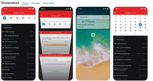
The first thing that catches your eye is graphic information at the very beginning. That is, the user first sees the screenshots of the application, and only after that - the detailed information. Maybe someone will be uncomfortable - scroll down the page to see the description of the application. But in Apple, it was better to see once than to waste time reading.

In this case, the screenshots themselves changed: now they are made with the iPhone X. You can also view images from iMessage, iPad and Apple Watch by clicking on the required tab.
In addition, the new interface increased the font and size of images.