React Responsive: It’s pretty cool

If you know responsive design and you use React, I definitely recommend using react-responsive. React-responsive allows you to make media-query components in React. This can be super useful when you want to render or remove specific elements in DOM depending on the screen size. Also, you can restructure your DOM (in terms of CSS/Sass Styling) as fit.
The link and instructions on how to use it is below via github.
https://github.com/contra/react-responsive
Even though the instructions are pretty straightforward, I like to write about my customized approach towards using react-responsive in my applications. I intend to talk about susy later to compliment react-responsive but for now we can see how powerful this package can be.
Setup
Stephen Grider has a great react/redux boilerplate which I think will be a good start to show our simple example. You can find the source code below.
https://github.com/kkomaz/ReduxSimpleStarter (base)
https://github.com/kkomaz/ReduxSimpleStarter/tree/react-responsive
Step 1: npm install
First install react-responsive
npm install
npm install — save react-responsive
Step 2: File structure
I will create 3 breakpoints specific for desktop, tablet, and phone. I organized my file structure as shown in the image below.
File structure
Step 3: Create the Breakpoints
// src/components/responsive_utilities/breaktpoint.jsx
import React from ‘react’;
import MediaQuery from ‘react-responsive’;

const breakpoints = {
   desktop: ‘(min-width: 1025px)’,
   tablet: ‘(min-width: 768px) and (max-width: 1024px)’,
   phone: ‘(max-width: 767px)’,
};

const { string, object } = React.PropTypes;
export default function Breakpoint(props) {
  const breakpoint = breakpoints[props.name] || breakpoints.desktop;
  return (
   <MediaQuery {…props } query={breakpoint}>
   {props.children}
   </MediaQuery>
   );
}

React.propTypes = {
  name: string,
  children: object,
}
React-responsive expects a query parameter such as min-width, max-width, etc. I created my own default breakpoints as shown above depending on the screen size. When I create the desktop, tablet, and phone breakpoint components it will make more sense but basically I create a variable called breakpoint inside of my functional component and set that variable equal to the query parameter that react-responsive needs. Our respective breakpoints will need to have prop called name to pass down to our breakpoint component.
// src/components/responsive_utilities/desktop_breakpoint.jsx
import React from ‘react’;
import Breakpoint from ‘./breakpoint’;

export default function DesktopBreakpoint(props) {
  return (
    <Breakpoint name=”desktop”>
      {props.children}
    </Breakpoint>
   ) ;
}
I imported my Breakpoint component from the same subdirectory and in my functional component named DesktopBreakpoint I pass down a prop name=”desktop”. {props.children} will represent the content that will be wrapped in each respective breakpoint. For the phone and tablet breakpoint components we do the same exact thing but replace the name to its respective layout (name is determined based on our breakpoints object keys)
// src/components/responsive_utilities/phone_breakpoint.jsx
import React from ‘react’;
import Breakpoint from ‘./breakpoint’;
  export default function PhoneBreakpoint(props) {
    return (
      <Breakpoint name=”phone”>
        {props.children}
       </Breakpoint>
     );
}

// src/components/responsive_utilities/phone_breakpoint.jsx
import React from ‘react’;
import Breakpoint from ‘./breakpoint’;
  export default function TabletBreakpoint(props) {
    return (
      <Breakpoint name=”tablet”>
        {props.children}
      </Breakpoint>
     );
}
Step 4: Hook it up to our main component!
In Stephen Grider’s boilerplate app, initial page load is created by the app.js component. We will import our component breakpoints at that location
import React from ‘react’;
import { Component } from ‘react’;
import DesktopBreakpoint from ‘./responsive_utilities/desktop_breakpoint’;
import TabletBreakpoint from ‘./responsive_utilities/tablet_breakpoint’;
import PhoneBreakpoint from ‘./responsive_utilities/phone_breakpoint’;
  export default class App extends Component {
     render() {
       return (
         <div>
           <h2>My Breakpoints!</h2>
           <DesktopBreakpoint>
             <h3>DesktopBreakpoint!</h3>
           </DesktopBreakpoint>

           <TabletBreakpoint>
             <h3>TabletBreakpoint!</h3>
            </TabletBreakpoint>

            <PhoneBreakpoint>
              <h3>PhoneBreakpoint</h3>
            </PhoneBreakpoint>
           </div>
        );
     }
}
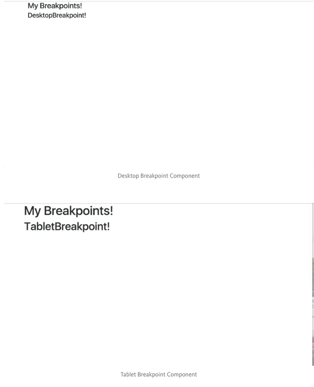
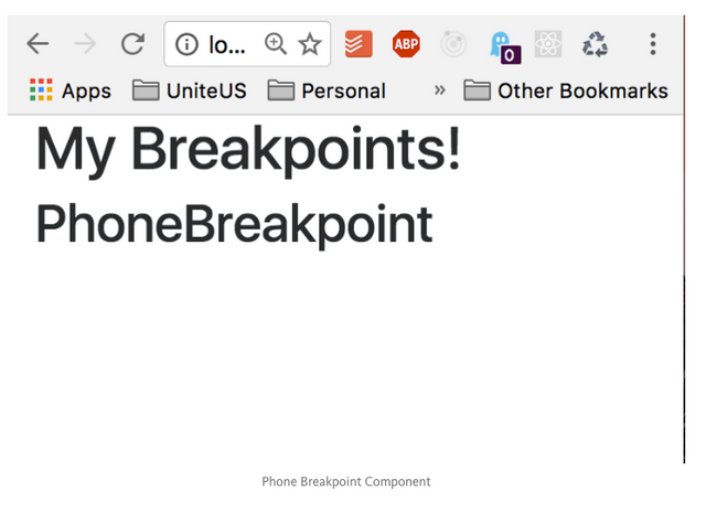
I placed some simple header tags inside each respective breakpoint.
Run npm start and you will see as you change screen size the content on the page changes dynamically as shown in the image below.
Desktop Breakpoint Component
Tablet Breakpoint Component

Phone Breakpoint Component

Conclusion:
So yeah that’s it! I think this method definitely saves developer time in terms of typing as the app get’s larger and you start utilizing this functionality more and more.
Let me know in the comments below if you have questions.
The original article was created on medium by me and you can find the link below
https://medium.com/@kkomaz/react-responsive-its-pretty-cool-d61e5ed56d95