Lesson #3 - Basic Photo Composition -
Lesson #3 - Basic Composition Techniques
In this tutorial I’m going to cover a few of the basic techniques of composition that will help you create images that are more pleasing to the eye.
Now you will here people call these rules and that you must follow them but I say bollocks, like any rules they are made to be broken.
Don’t be afraid to use more than one in an image also!
Rule of Thirds
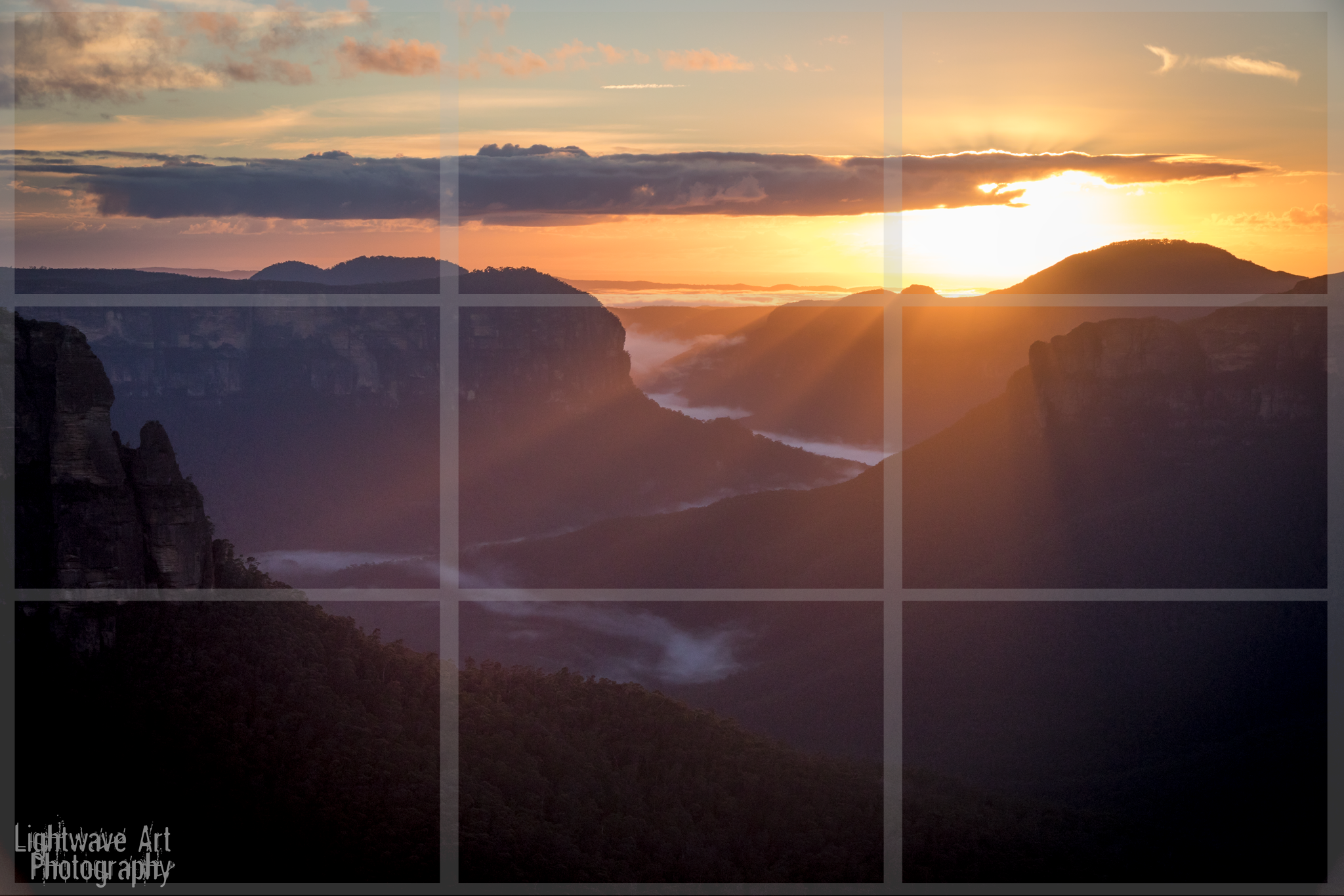
The rule of thirds is possibly the most well known of all compositional rules.
The idea is to think about your image as having a grid laid out over the top of 9 rectangles, 3x3 as you can see on the image above and you want to place your main subject or subjects on one of these lines or at the intersection as I have done above with the suns rays coming over the mountain top.
You’ll notice that I have framed the image so the opposing intersection is roughly where the sunrays hit the mountain slope in the foreground. I have chosen to do this to create a greater sense of depth but also to lead the eyes from where the sunrays begin (my main subject) to where the light lands on the slope (my secondary subject).
Leading Lines
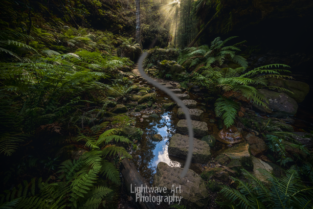
Leading lines are used to lead the viewer through the image usually leading the viewer to the main subject. Anything from paths, walls or patterns can be used as leading lines.
In the image above I’ve used the path to lead the viewer through the image to where the sun is shining through at the other end of the canyon.
Another composition technique I used which I won’t cover in this post was to place the reflection of the sky in the creek right near where I wanted the viewer to look first. The eyes will usually go to the brightest part of an image first but I’ll explain all that another day.
So I’ve used a second technique to reinforce where to start the journey. Pretty cool huh?
Symmetry
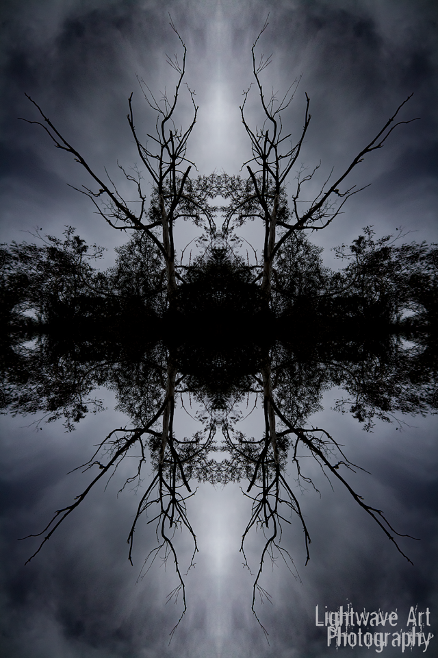
Symmetry is another powerful composition technique that can have some stunning results.
Symmetry doesn’t always have to be as centered as my image above is. A-symmetrical images can look just as good. If not better in my opinion.
Being a landscape photographer who rarely shoots man made objects. I rarely shoot images that are centered. Most the time I create something much more a-symmetrical, as you can see I had to stitch 4 of the same image together to get the center weighted symmetry that you see above.
Negative Space and Minimalism
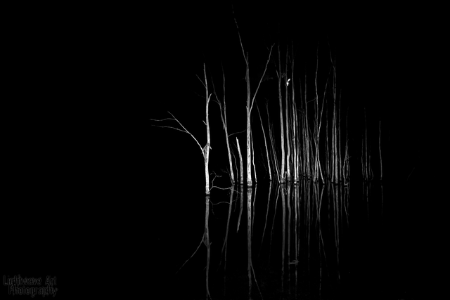
Leaving a lot of empty or negative space around your subject can be very attractive. It creates a sense of simplicity and minimalism. It helps the viewer focus on the subject without distraction.
As you can see in the image above I have left the space around the dead trees completely in the dark. Drawing all of your attention to them and their reflection in the water.
Foreground Interest
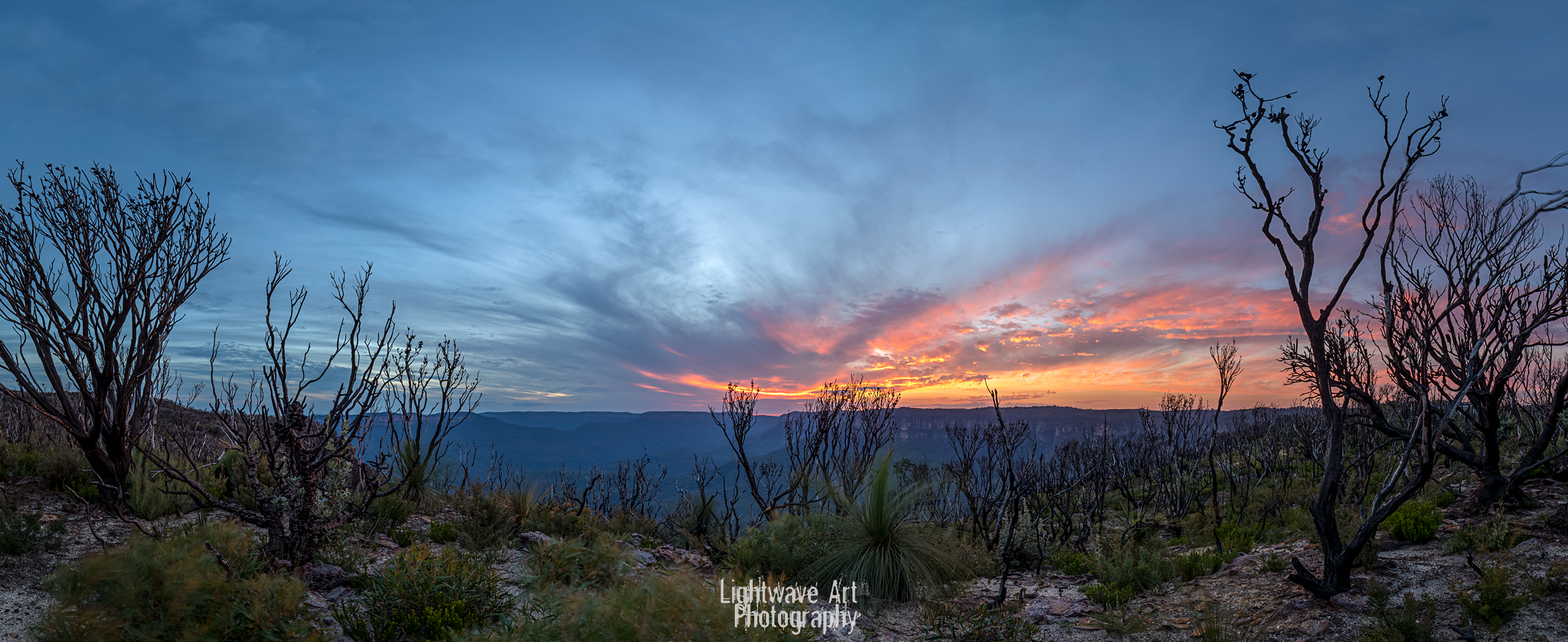
Still with me? Awesome! So this will be the last technique I cover for today and it is one that I think can really make an image.
Foreground interest creates depth and gives an image a more 3D feel.
As in the image above I could have gone to the edge of the cliff and shot sunset but instead I chose to walk back up the hill in amongst the burnt bushes and grass trees to give the image much more depth. By including the trees and shrubs in the foreground I have given the image far more depth than simply just shooting the valley and the sky.
Well I hope you have enjoyed this tutorial and i hope it can help you on your photographic journey. Or maybe you paint or draw.. all these rules (guidelines) still apply.
If you have a topic you would like me to cover let me know :D
Any feedback about my tutorial writing is always welcome as it is something I am quite new to. And if something doesn’t make sense or you would like to know more, please feel free to contact me at any time.
Happy Fotoging!!!
If you found this post informative, don't forget!
Upvote - Resteem - Follow
Don't forget to check out my Light Wizards Photo Contest!!!
Light Wizards Photo Contest
Very good work love the rule of thirds.. Thank you
Thanks you are very welcome :)
This is a very nice article and did what I taught over 3 months in college. Since i love photography and want others to keep learning this is a definite resteem. And now following you as well.
:) Thanks @Johnnyray Nice to have you on board! Have followed you back.
I love your tutorials. So easy to read, and grasp the concepts. And you photos are awesome.. Keep them coming.
Thanks for the feedback @geekgirl, very much appreciate it :)
awesome post. i shall try keep these things in note on my next outing
@originalworks ... I need to study this when my brain isn't in 40 different places at once. This is very well done and covers a lot of stuff I need. Thank you. Perhaps you could sometime let "newbies" submit some unedited shots and you could make recommendations on cropping?
The @OriginalWorks bot has determined this post by @benfenson to be original material and upvoted it!
To call @OriginalWorks, simply reply to any post with @originalworks or !originalworks in your message!
To enter this post into the daily RESTEEM contest, upvote this comment! The user with the most upvotes on their @OriginalWorks comment will win!
For more information, Click Here!
Special thanks to @reggaemuffin for being a supporter! Vote him as a witness to help make Steemit a better place!
I have actually been thinking about that idea. Just wondering how to best do it.
It's more of a hands on approach to teaching rather than just tutorials.
Maybe i could a weekly post and anyone can submit there photo's, hmm. NICE!~
Or you could go through the color challenge and find some you think could be done better and leave person a message to please contact you on Discord with your username then ask permission. ;-) But asking for submissions would be easier as you'd be sure to get people who wanted to learn that way and not someone who could be offended by the suggestion their composition could be improved. Also if the Photography channel gets more active, you could ask there if anyone had shots they were willing to submit for lessons and have done publicly.
Yeah i feel funny critiquing people work just out of the blue. Most people are ok but i've been burned in the past from precious people who take major offense haha
Yeah the photography channel idea is a good one. I wonder if there is a way to stream live video? Could do live tutorials!
@originalworks
Thanks again @pixresteemer!
This post received a 15% vote by @mrsquiggle courtesy of @choogirl from the Minnow Support Project ( @minnowsupport ). Join us in Discord.
Upvoting this comment will help support @minnowsupport.
Thanks for the post! Any chance for a mirror vs mirroless post/explaination? some pros and cons, maybe even abit more technical then that!
Sure, i will add it to the to do list.
I'm still an SLR die hard but Sony's new camera is pretty enticing.
Great idea thanks!
This post was resteemed by @boostupvote
All the best!
nice photography and thank you for share.
Thanks and you're welcome! :)