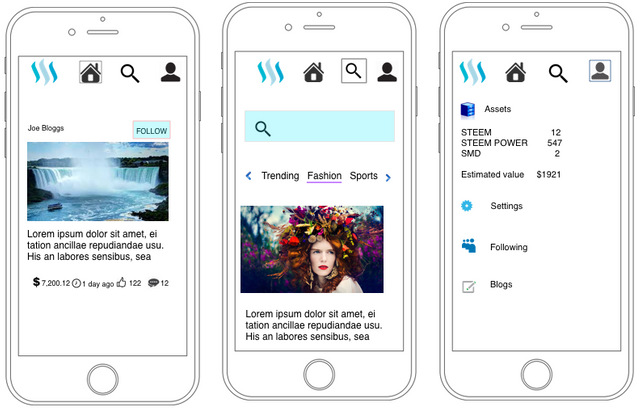
Steemit mobile interface design considerations.
I have experience with Mobile UX design , recently download steemit android app had a look at it from a UX designer perspective. Here's some ideas for a streamlined steemit UI as a mobile first approach.
Users are increasing going mobile and it’s not exactly an insight. This has spawned a new stream of mobile first thinking - there is an explosion new design patterns due to improvements in hardware, software capabilities ( gestures, shake , double touch, drag, pinch ) .Below is a simple 3 page UX design ( discoverable Menus etc not shown)

Trivial things like your icon, experience of first launch should be given a lot of thought - streemit icon has to compete with thousands of other icons on a user phone, first launch of the application has to be frictionless enough for the user to give the app a chance to prove it’s worth and earn it’s right to be on the premium memory space on the users mobile device.
Why Mobile first
Numbers are staggering. Today Facebook is a mobile company. For example Facebook revealed that 80% of its advertising revenue could be attributed to mobile. In other words: Of the $5.6 billion ad dollars Facebook raked in during the last quarter, about $4.5 billion came from mobile advertising.
Stated separately, people use Facebook mostly on mobile. Steemit probably will have similar device distribution in user traffic.
Mobile Focus
Focus on the most important task in mobile , Steemit’s primary function is to generate great content, however for mobile, exploration /voting functions are of higher frequency actions. On the other hand, selling SMD/STEEM. Power down requests etc need not be optimised for minimum clicks since they are infrequent functions. These functions are discoverable features that appear makes a gesture. Save the precious real estate for primary actions - create, curate content.
Explore Content - things that interest the user, this should be intuitive and based on previous user interactions. A great search function is also key. Once they ‘find’ what they like it’s important for them to go back to the content again for in other words make it easier to Follow.
Go for native App
Currently the Steemit app ( I use android) is not a Native, it’s just renders web version, that is mobile optimised - I think we would really like a native app for Android /IOS especially since the experience is a lot smoother and richer for the user.
On-boarding users on mobile
More users of the future will register for the first time on mobile which means special thought needed for on boarding journey
Consideration- Do we assign a password without the user typing it/How does the user remember it, can we email it - is there a security issue there ? Do we consider lazy mobile registration, if there’s a perceived friction in the registration process. etc
Simplicity in design
As a mobile designer, one of the key things we have to learn is to say ‘no’. One cannot add every user suggestion and still stay true to the products overall mission for simplicity and usability.
Stated in another way - users don't want to think, the basic task should be obvious even for the first time user.
Navigation -- Gestures and movements.
In mobile development we can use some important gestures users are familiar with for key functionality - Swipe left, right, pull down, up, Shake etc.
Swipe to vote ( copying Tinder swipe to Like?)
Swipe to navigate content? ( cards)
Conclusion
A sleek redesigned mobile app is very important to the success of the steemit. I do not know the current stats of users from mobile - It will probably contribute 75% of the traffic to steemit given trends in other comparable media sites.
The list is long , but I think for a social media site like steemit careful consideration should be given to the following!
Activity Feeds
Friend Lists
Follow
Vote to Promote
Direct Messaging
Single Share Button
Like
Find & Invite Friends
If you would like to see full design , if there is an interest from steemit team, I will be more than happy up mock up detailed screens functions along with best practices for a world class steemit app.
Have you used steemit app on your mobile ?- what features do you like to see, please leave your comments below .
Love this contribution because I also learn about UX design. Hope people contribute to the discussion and share ideas on how we can make it happen.
Looks good! You can check my previous UI mockup idea, I'll be uploading part 2 soon: https://steemit.com/ui/@moonjelly/remaking-steemit-s-front-page-a-very-quick-ui-mockup
Congratulations @thejas! You have received a personal award!
Click on the badge to view your own Board of Honor on SteemitBoard.
For more information about this award, click here
Congratulations @thejas! You have received a personal award!
Click on the badge to view your Board of Honor.
Do not miss the last post from @steemitboard:
SteemitBoard World Cup Contest - Final results coming soon
Congratulations @thejas! You received a personal award!
You can view your badges on your Steem Board and compare to others on the Steem Ranking
Vote for @Steemitboard as a witness to get one more award and increased upvotes!
my app for android
https://steemit.com/steemit/@rkpl/update-app-steemit-go-tag-app-for-android