The Wonders of ArcGIS
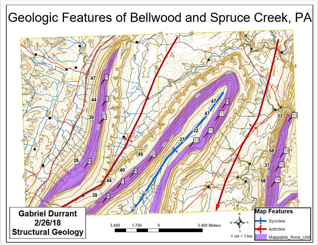
This is a map I created in a program called ArcGIS for a school assignment. This is a very complex and amazing program. Think of it like Photoshop for maps. Each of the features on here is a separate layer that must be stacked on top of one another, with the proper order, color, size, transparency, etc.
The underlying base map, streets, rivers, and contours, I can pull from various open online resources. The US Census Bureau has information available, as well as the USGS. For this map, I put slope measurements, numbered 1-16 along this map to show the steepness of these ridges. This was done by measuring with a ruler on a map and using trig properties to put the angles in a spreadsheet. That spreadsheet was then uploaded to the ArcGIS program, and formatted into the small red "T"s you see. These are called strike and dip lines, there the longer strike line is a horizontal line that intersects the ground, and the shorter perpendicular dip line represents the downward angle, or slope. The black numbers are the slope angles of those strike/dip locations.
The thick red lines denote anticlines, which are folds in the rock layers that are usually represented by upward curves, with the oldest layers closer to the fold axis. In this case, the top of the anticline has weathered away, so the older rocks near the center have been exposed. Due to the composition, some of the older rock has eroded quicker than the young rock, leaving the sides of the anticline higher than the center.
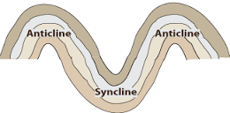
Here is a basic overview of what anticlines and synclines look like. When they have been around for as long as the Appalachian Mountains have, though, they start to get weathered. How much they erode depends on their composition, the acidity of the rain, and the surface area of exposed rock, along with many other factors.
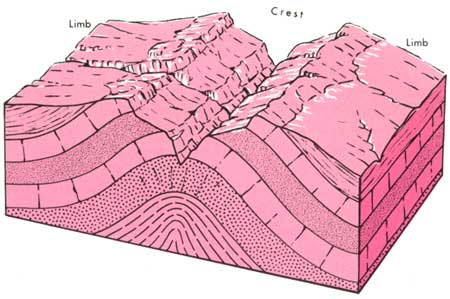
See above how although the layers were pushed up, the center of the fold has now eroded down to lower than the sides. This is exactly what has happened in this map, with the thick red lines representing the lower centers of the anticlines.
The blue line in the top picture is the axis of the syncline, which is the down-curved part of the fold. Anticlines and synclines always alternate, even though they might not look like it at first. This syncline, which is usually a lower dipping structure, is at a higher elevation than the anticline center, again due to weathering.
The amazing features created by Mother Nature are not always what you think they are. I for one am excited that we have this kind of technology to help us understand it all.
You received a 60.0% upvote since you are a member of geopolis and wrote in the category of "geography".
To read more about us and what we do, click here.
https://steemit.com/geopolis/@geopolis/geopolis-the-community-for-global-sciences-update-4
This is so cool! I absolutely love maps, so this is something I had a particular appreciation for :).
Thanks, I'll put more up as I make them!
This is very educational. I almost feel like I should be taking notes for the test on Friday. I'm sure I knew in some vague way how terrain was mapped, but I had no idea it was this complex!
Thanks! I'm in my first class dealing with this program, and it is a bit overwhelming. It has too many features! It took me literally all day yesterday to make that map.
I want to do this for my house and the surrounding area. So go ahead and pop my balloon by telling me how horribly expensive that would be.
Haha, well it's the program that's the expensive part. most of the other data you can find for free. ArcGis is about $800 per year for a subscription, or $1500 to buy. Then you have to figure out how to use it. Depending on where you are located, I might be able to create something for you for a reasonable fee.