It's Time for STEM to Have its Own Home on Steem: Announcing steemstem.io
Steemstem.io (Beta)!

For a long time, steemSTEM has been on a path of growth. Once a small group of friends curating on the old Steem chat, we are now a thriving community spread all around the world and one of the most trusted teams on the Steem blockchain.
With our ambitions set high, we have grown to include our trusted curators and honor members, allowing the management team to take SteemSTEM another step forward. The road has been long, but we are here now to present you with our brand new, dedicated-to-STEM Steem App: steemstem.io.

SteemSTEM began under the premise that somebody needed to clear out the science feeds on Steem. However, we started to realise that there was a niche that needed filling around the world: Science communication, without the middlemen. A direct line from dedicated scientists or passionate bloggers, to you - one in which standard blogging sites are unequipped to support.
What is steemstem.io for?
Though the open nature of the Steem blockchain offers many advantages to society, it can, in and of itself, be a hindrance to the nature of STEM subjects when one individual can have equal or more authority than any other based on their personal stake. This automatically allows misinformation to spread unhindered alongside legitimate reports, and it becomes impossible to distinguish which is which.
But the scientific method is one of the greatest tools humans have at their disposal, and its that innately skeptical nature and the rigorous self-righting mechanisms that we apply to information available on Steem; in our App, only posts approved by our team of curators will be featured.
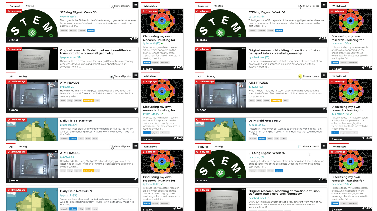
However, as we still value censorship resistance built into the Steem blockchain, there is an option to show all posts under the related tags allowing all STEM, supported by us or not, to be visible:

Quality Control
Steemstem.io also comes with a significant feature that has long been built into the SteemSTEM ecosystem. We, as a curation initiative, operate with three layers of review and scrutiny:
An experienced curator reads and verifies if a post is legitimate, searches for plagiarism and decides on the value of the post according to set parameters.
A second curator then double checks before the vote can go through.
Our fantastic team of honor members, as well as the public at large, can view our voting history, and act as a final barrier of legitimacy. Should they find something we missed, they can submit for vote removal and the user to be blacklisted, with evidence provided.
All these functions exist alongside the App to ensure that the most original and validated content is promoted, without the risk of any biased third party cutting in line. The result is a reliable, high-quality space for academics and enthusiasts alike to communicate all the discoveries of the Universe on Steem and to be rewarded for their efforts.
Be Promoted on steemstem.io
As you may have noticed, there is a header bar with 7 slots for posts on steemstem.io. This consists in 7 place holders for posts to be promoted. The way to get there is easy:
Write an excellent post following SteemSTEM guidelines.
After getting a @steemstem upvote, send a 3 STEEM/day promotion fee to @steemstem-io, with the link as a memo. This will book one of these place holders for the relevant amount of days. Note that the fee can vary (please verify on the @steemstem-io profile).
Reimbursements are possible only (and only) if there is no place holder left.
We hope this could get you some extra exposure, especially when steemstem.io will become one of the most visited places on the Internet.
Main features of steemstem.io
Steemstem.io comes with other features. On the front page, you'll find a permanent space for whitelisted users; well-known, trusted and high quality authors recognized for their hard work.
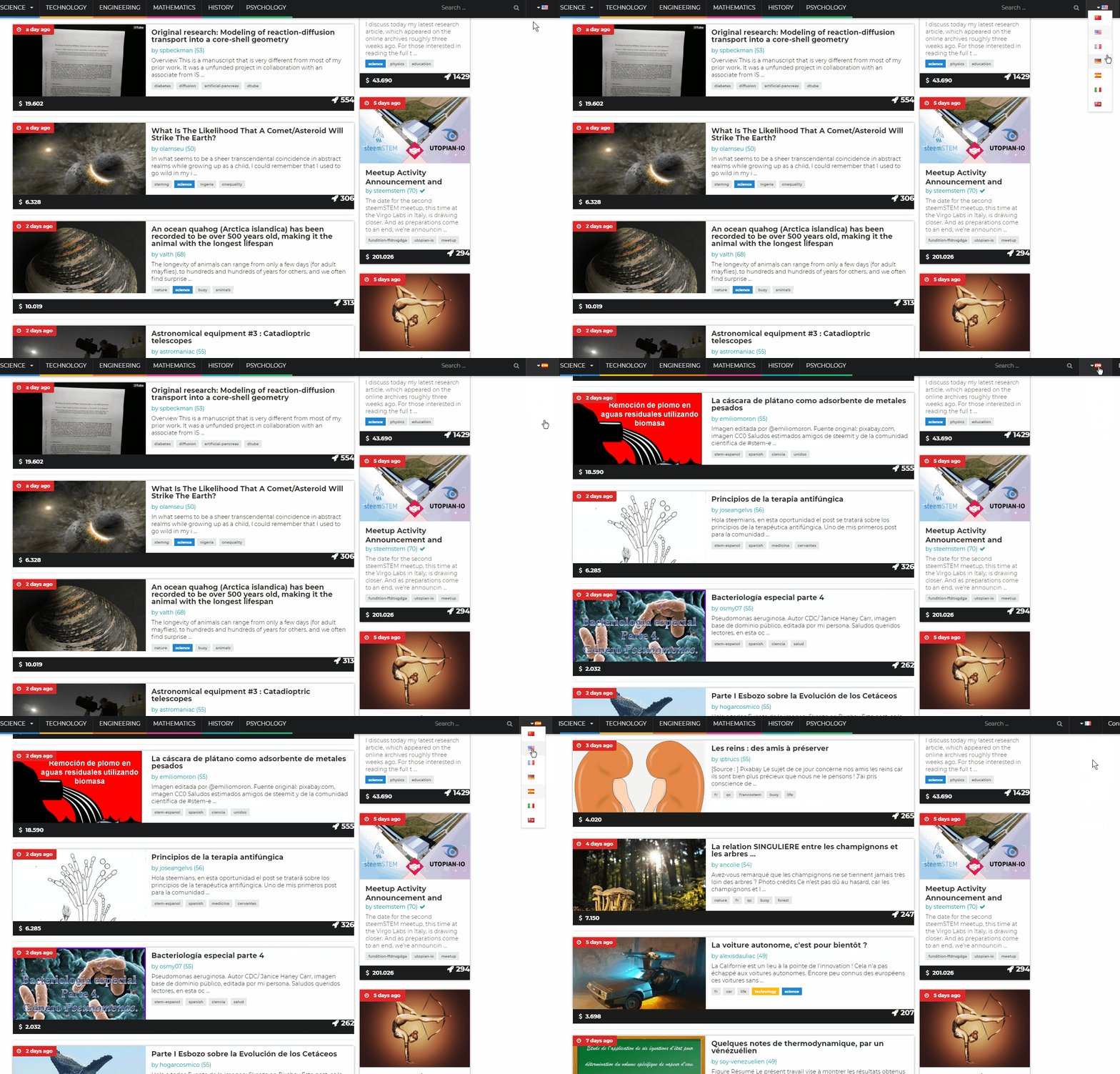
We could not have grown to what we are today without the growth of an international community. To date, we have self-sufficient communities working in 5 languages, all of which are available filters on our App: English, French, German, Italian and Spanish, with more to come!

This allows each of our foreign language communities to have their own unique, hand picked trending sections, subdivided by topic, allowing for better recruitment of STEM experts and enthusiasts who don't feel as enthusiastic about English to share their knowledge and improve science literacy around the world.
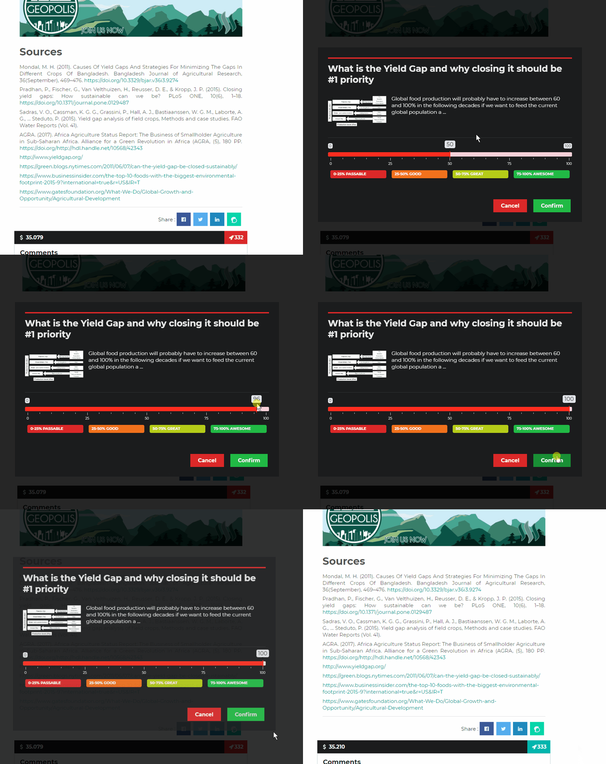
Steemstem.io can do everything you expect a front-end on STEEM should do. Users can login via SteemConnect, vote, comment, follow, resteem & share to other social media. Users can also manage their wallet contents as well as send and receive STEEM, power up/power down etc...
You can see suggested posts and recent activity of users as well as their wallet history and more.

The Future?
We will continue developing our App, having in mind the following main items:
- A SteemSTEM Store. The store will hold all manner of related merchandise, including Hand-made LED badges, hoodies & t-shirts, books and compilations from popular authors and more.
- The introduction of a SteemSTEM reputation mechanism
- Delegator/Investor rewards (our supporters should get a ROI.)
- Guest comments without the need of an account on Steem.
For now, feel free to explore the app, join us on discord and become a part of a growing Steem community - There's so much more to come!
Please answer this comment for bugs / suggestions / comments on the platform.
[upvoted for visibility and make the collection of all comments easier for us ]
[Well I made a separate comment and deleted it to repost here:]
Oh boy!
I'll skip the flattery and proceed to the constructive criticism! I always use steemit on a laptop, never on a phone. I think it would look better if the top part (header) of the screen were more substantial somehow. The steemstem logo could use some enlarging, and the promoted post section could have smaller headings, or something that won't obstruct the images so much. I like how the posts below the promoted posts look, for instance. Also something to more clearly set apart the promoted section from the posts below, cos as it is it looks like just a different arrangement of the same thing, horizontally vs vertically.
Other than that it looks great to me!
Awesome, thanks. I've been nailing down the aesthetics the whole time so I appreciate some more opinions. I will add this to the list and see what we can do in the coming weeks. We already have in mind some of the things you mentioned so you'll be seeing some changes fairly soon, I suspect
I've just read agmoore's new post on steemstem.io and I must say it looks gorgeous there! Very professional and stylish. The steemit version seems amateurish by comparison. I'll definitely be doing my reading there!
Having said that, a few observations and possible bugs:
I was looking at the comment section for a bit before I understood how to comment and how comments are grouped. The continuous border line gives the impression that it's a single comment, and the 'reply' nested within it makes you think you're replying to a specific comment rather than the post.
The 'follow' (the author) button was a teeny bit late to respond.
Are the comments deliberately shown in the order in which they were made rather than the voted amount?
I can't vote on the comments! ... No wait, I can. But my cursor doesn't change when I hover over the heart, so I didn't realize I could.
When I hover over the 'reply' button (reply to post, not reply to comment) the cursor changes to a typing tool.
When I voted on a comment, my vote didn't show until I refreshed the page.
The quote signs in the quotes, at least in the post itself, would be better-looking if they were bigger and if the second quote mark was placed at the end of the last line.
It may be just habit, but I have an easier time reading and responding to comments on steemit. Maybe it's a size thing again, maybe the comment section could be made a bit larger.
I checked out the posting interface. I clicked the button that expands it to the whole screen, and then didn't see any button to go back!
Btw I'm using the Brave browser.
Thanks for this second feedback. We have added everything to the list (OK most of it was already on it :p).
Note that the comment ordering thing will probably lead to two options for the user: ordered by value and by date.
Once again, thanks for this very detailed feedback. I cannot when those will be tackled, but they will be at some point ^^
A vote for poor mobbs for having to actually implement the constructive criticisms.
Beers are on me when we first meet!
True. It's easy to just look at it and sense that something is vaguely imperfect, than to actually come up with design ideas on how to fix it and implement them.
I was checking out https://news.bitcoin.com/ last night and I thought it was a good example of how they get it right (though I like the lower section of Steemstem.io more). But look at how they made everything in the top section bigger. Basically it's the same except the color palette and size.
It's not criticism, it's constructive feedback. You're a beta tester and we will have to all look long and hard for every minute thing we can find wrong, improve, change etc.
If we really want to change how science is discussed on the internet this beta release is the first step of a marathon run. However at least the race has begun.
Thanks for this constructive comment! Anything constructive is welcome! Always! In other words, any remark stemming from the community will be seriously discussed for v0.2.
Thanks!
This is fantastic. Bookmarking now!
My only thoughts right now for a suggestion is that the header links be separated by a solid line, otherwise it can be a bit hard to see where one link ends and another begins. I've mocked up what I'm thinking of below
I also felt the big images felt a bit messy, just thought I was getting old ;)
Hi igster, excuse me, that I disturb you again, but is white screen at Steemgar.
Then I'm getting old too.
We are all getting old. Unfortunately, no one can reverse the arrow of time ;)
But perhaps aging can be stopped or reversed, it's likely to happen at some point of time as our technology advances but perhaps it's too late for us. What a thought that is!
I am not sure this should happen, to be honest. I still see it better to leave room for the next generation. This is the only way for new brains to emerge, IMO. I know, this is a bit a drastic opinion, but it is mine ^^
"I still see it better to leave room for the next generation"
Luckily we have the whole universe to expand to, lot's of room for old and new. And we can't really stop that technology once it comes available, people will want to continue living. If there's demand, there's a supply, eventually.
Modern medicine has already greatly improved our life expectancy and it will continue to do so.
I do hope we can settle other planets by that point though or it will get rather crowded! Or have solved the issues that would follow with huge population boost.
High food production, free 3d printed houses, renewable energy used everywhere, high levels of automation.
That would ensure more people wouldn't result in more horrific "rat race" against everyone else after more limited resources.
Maybe...but question is when :)
If only one could actually click to enlarge on steemit... but yeah I see what you mean. Will add to the list, thanks!
Thanks for the suggestion! it is definitely added to the list :)
Thanks for the input T.
I'm not happy with the messy "second header" also and I'd love to have geology, history and meteorology at "science" in the header. I'd also love to have medicine sitting on its own point beneath psychology.
Which category is used for astrophotography at the moment?
The links in the footer ("About us", "FAQ") seem not to work.
For the "messy" thing, we are definitely on it and we added the link stuff to the bug list. But this will take time (days probably).
For the set of subcategories that are visible, we had of course to make a choice both for the selection and to organize it. It is here impossible to satisfy everyone, and the choice were mostly driven by the trends of the moment. I am nothing your suggestion and we will discuss it. THanks for the comment (if no one complains, we can't guess :D ).
Hi! I have already commented on how much I like this update, but let me post some remarks and questions here real quick.
The Featured posts on the home page don't seem to load? It could be my bad internet connection, but this is the only thing that does not work for me.
In the Comments tab on a profile page it only shows 'User' Commented on 'link'. I don't know if this is still planned to change, but isn't it more useful to actually display the comment?
And thirdly, when trying to view the page of a certain tag, the link gets changed to steemstem.io/#!//'tag' but nothing loads, and when I try to go to that link it is just a blank page.
This could all be still things in development, but I thought I'd let you know 😊
Oh and the steem-ua reputation system could be nice to display but since you are working on your own SteemStem reputation system waiting to use that one might be more logical.
Overall I really like how its looks and feels. Great work everyone!
Thanks for the comments and suggestions!
Yep, we will implement our own solution, tailored to our community specifically.
Thanks for the report. We have added all the items to our list (that is now super huge thanks to a great community feedback).
Concerning the reputation system, I am totally opposed to any curation mechanism based on the UA (which is what steem-UA is). This is just ill-defined.
This being said, for what concerns the UA itself, this metric is not appropriate for SteemSTEM. It measures the connection to the witnesses, and we don't want that. We want instead a metric that measure the implication in the SteemSTEM community. I am planning to post something new on this within the next 10 days (I first need to give a feedback to @flugschwein so that he could push his changes... @flugschwein please give me a few extra days ;) ). In short, please stay tuned ^^
No problem, I am glad I might be able to help.
That seems true indeed, but currently a reputation system measuring the 'social network' of users is still better than the default Steem reputation in my opinion. Of course one measuring involvement in SteemSTEM community would be even better in this case so we'll wait for that. I'm really looking forward to the announcement!
I also received some very nice inputs from @cryptoctopus that I would like to implement. Once again, time is the killer ;)
Hi, this is fantastic. The thing I'm not sure I like is the header with the promoted posts, it can be difficult to read. Looks to me the text should not be over the background image like that. Also, and this is not important at all haha, but could we normalize title capitalization somehow? Maybe the website could parse titles and capitalize them under one set scheme automatically?
I will ensure these suggestions get incorporated into our list. Importantly, you only dislike the asthetics of the promoted section, or you also dislike the concept of it?
Oh no, having those at the top seems like a good idea, it's just too noisy to read. I have seen others echo that thoughts here too.
Well the asthetics are subject to change based on community feedback, like what you provided above. :)
Thanks!
Thanks for the suggestion. Many users has indeed reported the same thing and we are definitely on it!
Wonderful, the page is really good, excellent all the innovative advances that are being made from the steemstem, a it´s pleasure to belong to you and the subcommunity stem-espanol. Let's keep moving forward and growing. Happy to meet you and share with you. Regards
Thanks for the feedback and strong contribution to the stem-espanol community. This is really appreciated. You can count on us to move forward at a faster and faster pace!
Great development!
I'm sure many have their own ideas about the main topic headings at the top of the site, but looking at More gave me an idea.
There is a degree at Oxford called Human Sciences - this would include Psychology, Sociology, Medicine, History (of Science), Biology etc. Perhaps Biology can be kept in its place, but the others could all be under Human Sciences, or just Humans.
This is exactly what I was looking for! Thanks a bunch! I have added this to our suggestion list.
i love the steemstem.io interface. It loads faster than the steemit.com at my end here.
i made some observations which i think others might have too(in case i repeat what others have written) but i can't go through all the comments.
Thanks for reporting those bugs. Even if your list starts t be pretty big, you managed to find 2 new ones. We will try to address (and fix) them as soon as possible!
wow this is awesome!! I have been getting into chemistry recently so it will be nice to share my experiments with the community.
Great! Looking forward to what you will create.
Please do so! We will greatly welcome your contributions!
Clicking there and I only see comments "https://testdev.fundition.io/#!/@steemstem/the-steemstem-badges-are-out"
Thanks for taking a look @transisto. The issue with posts disappearing, is known and should be solved, you may have to clear browser cache. You should also not use the testdev.fundition.io staging site, don't know if that's actually running the current version of the app, lemouth's link below Does show the post for me, while the testdev link still does not. Anyway I will make sure this is recorded in our documentation for further checking! Cheers!
We fixed this bug earlier (most probably after your message). However, how do you get the testdev address, as the right address should be https://www.steemstem.io/#!//@steemstem/the-steemstem-badges-are-out. Is it another bug where a faulty link is issued?
EDIT: I fixed the present post with the correct link ;)
Great! Resteemed!
Great to see @steemstem advancing with this news + the launch of @stem.witness :)
I know that there are some smart german speaking people like @sco, @reggaemuffin, etc. on the Steemstem team - however, if you should need any help with german translations of news, I can offer you my help. You can find me under this username on Discord!
Congrats on the recent process, as I already said really glad to see that!
I'll grab your contact now in case of any (possibly likely) future developmentst!
Glad to know that you would like to help! Maybe you should see directly with @sco as he is fully in charge of the German-speaking branch, to assess exactly the tasks for which help is needed?
For now, the official steemstem news are only communicated in English and it is up to the language communities to translate them. It is maybe the good moment to get more organized.
@sco know's where to find me, I have been in contact with him since his first days on Steemit - It's no coincidence that @de-stem was registered by one of my accounts :P
Aye. My noobiness and your helpfulness were a perfect match. ;-)
This looks like a clear connection :D
I can't stop saying how much I love to support SteemSTEM. It is such an undervalued project and I wish success, power and prosperity coming from all over in the near future!
Thank you for your support @elear, I hope that our collaboration continues to get better and better with time.
Thanks also to your support (as well as utopian support), and to the recent discussions we have. This was really helpful and I believe this will help SteemSTEM to grow like hell in the future!
Thanks for the trust, we would like to make it more relevant for the scientific community.
I was happy to hear about the continued support and happy to have met you.
Business decisions are not always easy but we are moving in the right direction.
The future sounds like it's ours :)
We value your support greatly and I hope this would be the beginning of better and greater things to come
With a category exclusively for psychology! 😍 I am in love!!
@dysfunctional, @saunter, @insight-out, @erh.germany, @nonzerosum
Please, look at this!! 😃
I know, right! I was very happy to see this tab! :-)
I knew you would be ;)
Invaders... :D
Lol
Thank you, for making us aware of this post, Abi, that is really good to know! :)))
😘
It has earnt its place! Pretty influential field in steemSTEM =)
❤
I won't repeat what @mobbs said, but psychology is incontrovertible!
Ow @lemouth, I am so, so pleased!!
You know well our commitment to Psychology :)
❤️😊
Congrats abii, that category is dedicated to you. You simply made it yours
You are my sweet pie 😘
excellent news
I find it too :D
Awesome!!