Cartographic mapping :An insight
Hello steemians;
Hope our day is going on well as planed? Today I will be talking to us about cartography in general ,the different cartographic map making techniques and how we can apply them to be useful as regards map making.
Cartography can be said to be the art of drawing maps. The special designs given to maps, lines drawn on a paper or on the computer. These drawings are drawn using a mapping technique which is called map projections. In the medieval periods, people drew line in most cases using their imaginations just to describe or depict the way a particular place may be and can be .these were mere descriptions which cannot be said to be totally true in most cases because the information could be bias or exaggerated.
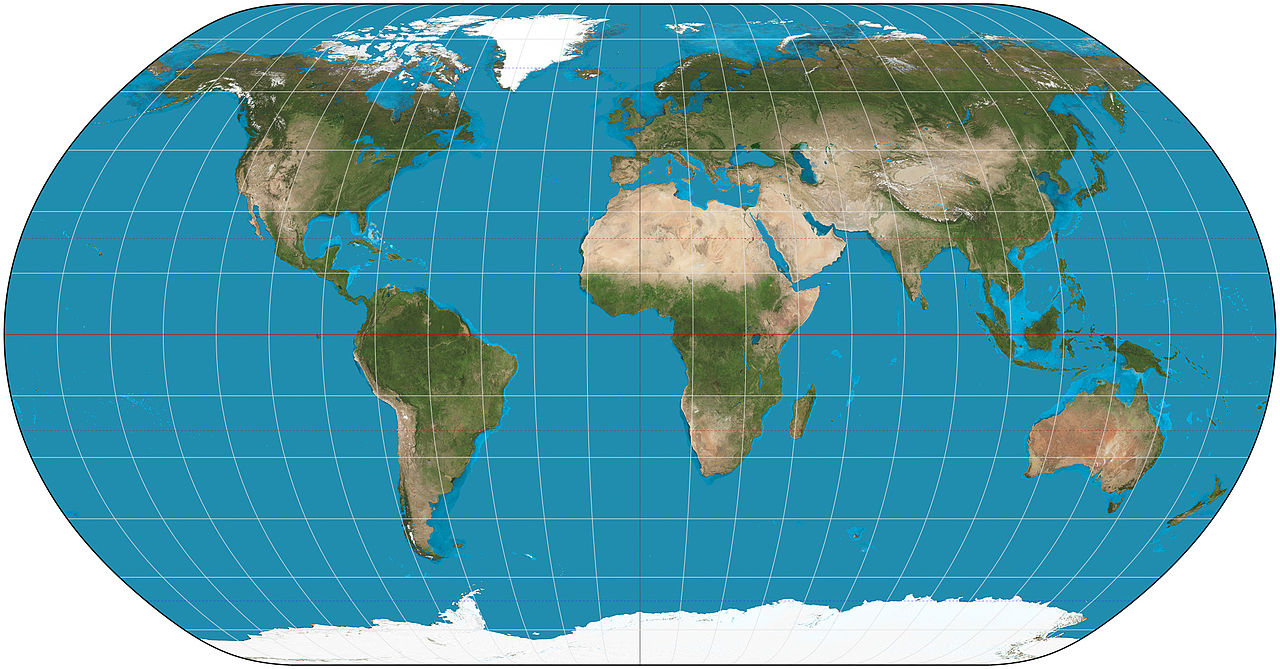
source wikimedia. A Creative Commons Attribution-Share Alike 3.0 Unported license. Author Strebe
A Greek cartographer called Ptolemy was the one who helped in translating most of the maps which were written in Latin in the ancient Greek to English and this helped made these ancient Europe maps to be readable which in the long run helped the rebirth of the new scientific geography in the early 15th century as this brought about a great revolution to map making in this era.
The main aim of every map is to convey a message to the map reader and if this message is not clear enough to the map reader then the purposes of the map will be defeated.
GENERALISATION IN CARTOGRAPHY
Generalization in cartography refers to the different symbols employed by the map maker in making the map. Just like the way a farmer can craft out different tools he would need to farm that’s the way a cartographer can make out tool relevant to him in making the map. In cartographic generalization, the intention of the map maker is to be able to make a small-scale map from a large scale map.
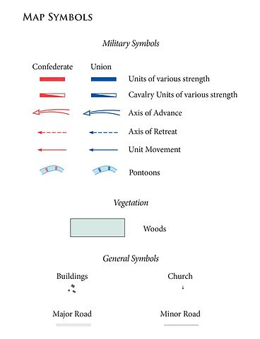))
basic map symbols used in the Battle of Chancellorsville. Source Wikimedia A creative commons license. Contributed by the United States Army Center of Military History
This small-scale map no matter how small should be able to show all the relevant information needed on the map without having to make the map clumsy or complicated. The data must be accurate and less complex.
If we look around us we will see that there are so many things in our environment that we cannot add to the map even if we feel we want to add all the information but the truth is that we cannot add all the features around us in a map just the few important ones that will represent the others.
For instance if we want to show the position of a university on a map we use just the symbol of a house to represent the university of which we all know that a university cannot just be a building. The map maker is just simply using the symbol to represent the so many structures that can be found in the university on the map of the area.
CARTOGRAPHIC MAP SYMBOLS
There are several symbols that we can use to depict whatever image we want on the map as long as it is obvious what the sign represents on the map and by so doing we make the make easy to read by the map reader. The information on the map should represent the features in the milieu. Milieu is a geographic term used to describe a person's immediate environment. The data must be accurate also. There are several features that can be used to portray using cartographic maps and these include physical features in the milieu such as rivers, valleys, highlands, vegetation cover of the area and the climate of the area. Other features like social and agriculture can also be depicted.
TYPES OF CARTOGRAPHIC MAPS
There are different types of cartographic maps that can be used in to pass information to people and these include the thematic maps, topographic maps, political maps, physical maps, climatic maps, resource or economic maps and road maps. But for simplicity, we will discuss about thematic map today.
THEMATIC MAPS:
Thematic maps are special maps that are specially made and designed to show a particular feature or a particular map theme which is associated with a specific geographic area. Thematic maps can be used to portray physical features of a given area for example rocks, hills, valleys etc. Thematic maps can also be used to portray social features, political features, economic features, sociological features, agricultural features and any other aspect of the area in view. This is because thematic maps are meant for one particular purpose.
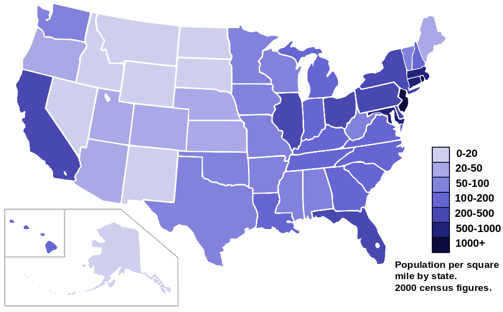
A thematic map showing the US 2000 census population density map by state. Source Wikimedia. A Creative Commons Attribution-Share Alike 3.0 Unported license. Author AmericanXplorer13.
There are also different types of thematic maps that we can use as well. Each of these different types of thematic maps uses different symbols to explain features on a map which makes the information on the map to be easy to read even to a lame man who does not know anything about the subject matter. Some of the various types of thematic maps treated below
Choropleth maps
these particular type of thematic maps are based on numerical data. These numeric data are always available for enumeration in its own distinct way. Choropleth maps are used to portray political units such as states and countries and these numerical values are used to show each of these distinct values into specific categories. For instance an aerial symbol can be used which is usually in a form of colors or shades (different shades of color) of the same color.
For example shades of gray can be used to depict how densely populated or sparsely populated a particular area can be as seen in the milieu.
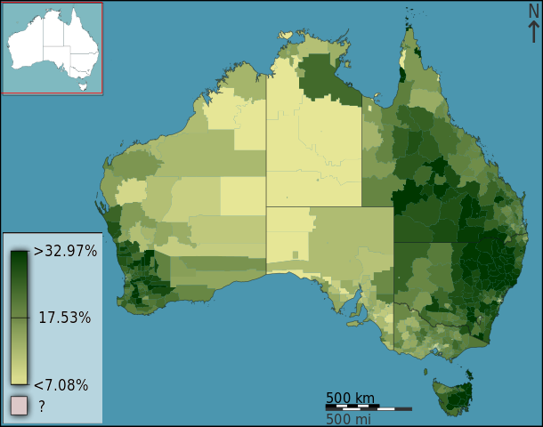))
Australian Census 2011 represented using a Choropleth map. Source Wikimedia Creative Commons Attribution-Share Alike 3.0 Australia license. Contributed by Toby Hudson
The light gray color can be used to depict areas that are less populated or we can say areas that are sparsely populated while the dark gray color can be used to explain areas that are more populated.
In the case of showing the vegetative cover of any region, we can use shades of green. Green represents nature and as such it’s the perfect color to represent vegetation. Those areas on the map that are depicted using a darker green color shows that the vegetative cover of that area is densely populated.
Areas that are depicted on the map using a light shade of green shows that those areas are not densely populated and that’s why it is lighter than the former. These choropleth maps are the most commonly used maps in thematic mapping because it is very easy to read.
Dot maps:
This particular type of map employs the use of dots to convey information about the milieu on the map to the map reader. The dots are usually used to enumerate a particular type of feature distribution as seen in the milieu. A single dot can be used to represent a particular type of occurrence with specific features on the map. For instance, a particular dot can represent the average population of an area which tells us the estimated population in the area. The dot can represent a figure like 100,000 people in a given geographic region.
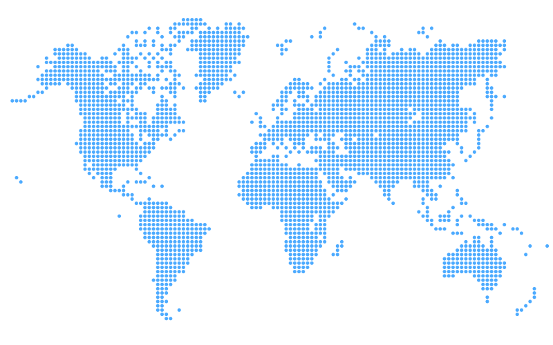
The world map in dot representation. Source wikimedia. A Creative Commons Attribution 3.0 Unported license. Contributed by sNowFleikuN
This simply means if you see two dots it means the figure is 200,000 people and if you see three dots, it means 300,000 people as represented on the map.in most cases the parameters used on a dot map that must be put into consideration are the sizes of the dots as seen graphically and the value each of the sizes represents. When using dots in cartographic maps we need to be very careful so that the map will not be clumsy with too many information.
Graduated symbol maps:
These are special maps in which the symbols used to represent figures on a map change in sizes. These change in size are usually according to the different values and attribute they represent on the map for instance we can use larger symbols to represent larger water bodies while the smaller ones are used to represent smaller water bodies.
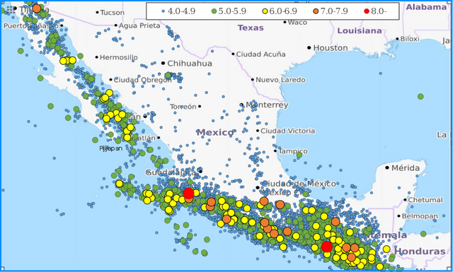
A graduated map showing the scales of earthquakes in Mexico. Source Wikimedia. A Creative Commons Attribution-Share Alike 4.0 International license. Contributed by Phoenix7777
It can also be used to show how the population distribution of a region increases or decreases across the region from the highly populated areas to the low populated areas. These symbols are usually in classes and this makes it easy for the map maker to be able to disseminate the information properly to the end user.
Isoline maps:
Isoline maps are special maps which employ the use of lines in map making. These lines are used to join or connect different places in a particular region that share similar values.
These lines can join continuous equal points which show featuristic distribution in the area of study on the map. In most cases isolines are used to show areas which have the same height usually above sea level. The temperature of a particular place can be portrayed using Isoline maps. A good example of an isoline map is the contour map which shows different elevations of areas above sea level.
Conclusion
Cartography can be very interesting when we apply the right techniques in making our maps. We produce maps using different scales for different purposes of which in this case map generalization comes in handy.it makes the work of the cartographer easy and less cumbersome. It is very important for the map maker to be skillful in creating a suitable map which can convey all spatial information in the milieu. The various types of thematic maps help to make our mapping skills sharper. There are so many areas of cartography that I will be discussing about in my next post. Thanks for taking your time to go through this post. Stay tuned
Till when next I come your way, your home girl @prettyprecy.
References
- Cartography ~Wikipedia
- The art of cartography ~oxfordcartographers
- Thematic map ~Wikipedia
- Choropleth Map ~datavizcatalogue
- Dot maps ~e-education
))
You received a 10.0% upvote since you are not yet a member of geopolis and wrote in the category of "geography".
To read more about us and what we do, click here.
https://steemit.com/geopolis/@geopolis/geopolis-the-community-for-global-sciences-update-4