SteemPeak - Update v2.2 - Better Publish page and improved vote value estimation
A new version of SteemPeak is now available. The main changes in this version are on the Publish page layout and the vote slider value estimation. Keep reading for more details ;)
The new release is now live at https://steempeak.com

1. New layout for the publish page
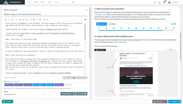
The Publish page layout has been completely updated to accommodate some of the requests of our users. Now the editor panel and the preview can both be SCROLLED SEPARATELY and the layout of the page is fixed. Should be much easier to use for everyone writing a medium or long post.

As always feedback are much appreciated as we plan to keep improving this page in the near future.
2. More accurate vote estimation
After HF21/22 the logic to compute the vote estimation changed and I've never found the time to fix the slider on steempeak.com. Finally with this release the slider has been updated and the reported value should be more accurate (huge thanks to @revo that provided the logic to improve the vote value estimation and is a beneficiary of this post payout).

NOTE: Keep in mind that it will not be perfect, just a better estimation that almost match the effective vote value.
3. Layout adjustments when reading a post
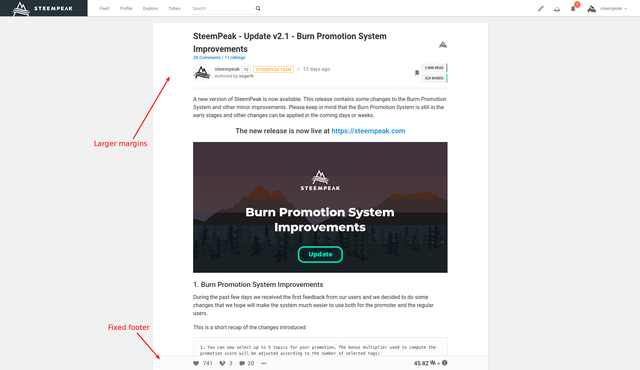
The post page have been updated with larger margins (suggested by @transisto) and a fixed footer with payout details and action buttons (thanks to @themarkymark).
This is a preview of the new page:

4. Backend rework and code refactoring
Also with this release I've started to improve part of the backend code to make it faster and easier to maintain. This change should make some part of the website faster without hopefully breaking anything :D
5. Reworked the 'action queue' to reduce errors
In the past few months I've seen some errors when casting multiple votes in a short period. This is more evident if using Keychain and was due to how the action queue processed the requests. I've reworked the queue to be more reliable (it was not originally conceived to work with Keychain) and the errors should not be too common now. Let me (@asgarth) know if you still experience some issues.
6. Remember the preferred view mode
This has been requested long ago by @jarvie and is finally available. Whenever you switch the view mode (grid/blog/list) the system should now save the new preferences.
7. Some minor bug fixes and minor improvements
As always some minor fixes and improvements across the website ;)
Support the @steempeak witness/proposals
Now is probably a nice time to remind you of the ways you can support the development of @steempeak.
Recently we submitted a proposal to the Steem Proposals System (SPS). You can review the proposal here and directly on the proposal page.
If you agree to the proposal and you think the points mentioned add value to Steem consider supporting it using the above links or directly with this link.

We also run a witness server to help produce the blocks for the Steem Blockchain. You can vote for our witness so we are in a position to process more of them.
Vote on out profile page: @steempeak
Vote on the witness page: https://steempeak.com/witnesses

- Using Keychain: You just have to click and approve the transaction
- Using SteemConnect: You'll need access to confirm the transaction with your Active Key at least
The SteemPeak Team
About us: https://steempeak.com/about
Join us on Discord: https://discord.gg/6hCAcVp
Amazing as always guys, thanks for making Steempeak the best frontend :^)
edit: Now that you guys are in the mood for changing vote related stuff, is it possible to do something like this?
Its just to make it so that you don't have to scroll down to find your own vote value in case you want to see it again?
Awesome suggestion. Added for the next release. A quick preview:
Such Speed! Amazing! Thanks for the nice upgrade :^)
;)
This may be my favorite update that Steempeak has ever introduced. I've always had an issue when viewing the site using a touchscreen desktop that I couldn't scroll properly with touch input. I would have to click the inner body and then scroll using the keypad. Now things are working perfectly just with swiping from the screen. I'm assuming some part of the changes for the layout have made this to where it's working perfectly. Great work @steempeak!
Thank you very much!!
Steempeak just keeps on getting better! Thanks for the beneficiary. :)
Thanks for your help in figuring out the correct way to estimate the value ;)
Reading through the comments and the swift updates @asgarth made was just as entertaining as reading through the new changes. You guys are awesome. Steemit should buy you and replace their own frontend.
Thank you we'll take that as a compliment...
However, We need decentralization of front ends for steem... we like having Steemit around and other platforms it is part of the appeal of what steem has to offer.
Why would they need to be just like us?... people that like what we have to offer can just use our site.
You are right, decentralization is awesome and having many frontends as well. The only problem is, that most people just use Steemit, because they are too lazy to try out something else. They are clearly missing out. Steemit should just throw money at you and support your SPS proposal.
I am always impressed with the work you all do. This update is a little difficult for me. The space that I now have to write the text means that I will be scrolling soooo much.
You can see in the example below. I can see only one picture and one little paragraph.
Hi Sara, can you ping me on Discord when you have a bit of free time?
Silly, but I don't remember how to get on discord.
I've tried to increase the available space. The new version should be online soon.
Thanks Sergio. Just checked and the space is still the same. I'll check again later today.
I guess this could all be solved by allowing the user to expand the posting area. I think she doesn't care if the buttons and input area for keywords are all on the main view ... she'd rather scroll down to those.
The last update should already have this. At least in my tests.
awesome guys keep it updating :P
@steempeak, These constant improvements and efforts to make this Interface more user-friendly is very much appreciated team.
Keep developing this space and my good wishes are with you.
Have a great time ahead team and stay blessed.
Posted using Partiko Android
Thanks for the update! Particularly the vote estimation!
Let me know if it's accurate now ;)
it seems to be fairly accurate for posts. I'm not sure about comments. My estimate showed 0.002 and after refreshing my upvote on you it shows an estimated payout of 0.000 :p
Strange, also Gina gave me the same estimation:
Independent scrolling will be a huge improvement. Thanks!
I hope you can eventually also fix the problem where the beneficiaries (other than @steempeak) and author settings get blanked out whenever a post is reverted from "scheduled" to "draft".
Fantastic progress, and I like the new font when editing/commenting!