SugarSteem My Feed 4.0 Updated
SugarSteem My Feed 4.0 Updated
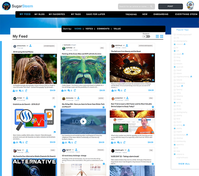
I wanted to show off the new "My Feed" redesign of SugarSteem. When you decide to access your feed aka your wall of all the people you follow there will be two views; a toggle between tile and list view. This will allow break up of content much easier and with a few new features.
New Features
• Saving an article at the content level for later in the top navigation "Save for Later". This is activated by clicking the "star" icon on each content post.
• Friending an author - click the avatar icon to save this author to your friends list but also by clicking this icon it saves this author to the top navigation "Favorites" which can be later shown on the "favorites" page to quickly access authors you prefer to stay updated with.
SugarSteem My Feed - Tile View - "default"
As a user i should be able to view my content in easy scanning. SugarSteem will offer a hybrid memory toggle between a tile and traditional list view. Set the view to your preference. I've added some great subtle features for content retrieval that I think will impact the experience greatly.


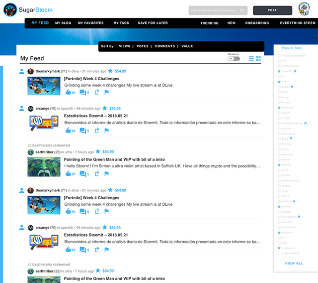
SugarSteem My Feed - List View -
As a user sometimes I prefer the traditional steemit view that allows me to scan more articles faster for content interest.


Sorting Features
Thanks for constructive comments @shadowspub for the sorting features. I have incorporated them into our mock up design and am discussing with our dev-ops to see if they are within reach of our MVP.
• Sorting Features - Sort Content in your feed by: Views, Votes, Comments, Value.
Thank You Steemians!
It’s you that use the UI and are the voice that allows me to help shape this community. Thank you for your votes, your constructive comments, and your re-steems, your voice is being heard and translated into features for @SugarSteem.
T-Minus 82 days to hit our MVP!
Personal Shout Outs for the generous upvotes to my UI contribution to the Steem Blockchain.

@cryptoctopus, @transisto, @donkeypong, @totolina, @arama, @analisa, @sykochica, @inquiringtimes, @demotruk, @timcliff, @z8teyb289qav9z, @fulltimegeek, @eroche, @ausbitbank, @drakos, @wesleybos, @bestbroplayer, @danielsaori, @whatsup, @arcange, @jesta, @ilanaakoundi, @hr1, @makerhacks, @davemccoy, @protegeaa, @blocktrades, @ebargains, @jamesbrown, @deanliu, @fabien, @drmake, @patrice, @sift666, @coffeex, @abh12345, @overkillcoin, @acidyo, @wackou, @therealwolf, @xaero1, @fredrikaa, @jerrybanfield, @lrock, @playitforward, @mod-tamichh, @noboxes, @aggroed, @kodaxx, @dbzfan4awhile, @teamhumble, @kimzilla, @scorer, @shawnvanderveer, @dshelton32, @yabapmatt, @carface, @slickwilly, @edwardlewis, @geofftk, @socky, @bbrewer, @etcmike, @austinhopper, @alexis555, @bue, @techslut, @protegeaa, @fminerten, @steempty, @stephen.king989, @ma1neevent, @spydo, @dedicatedguy, @personz, @v4vapid, @totolina, @leeuw, @morseke1, @cryptocat, @mes, @poeticsnake, @princessmewmew, @spiritualmax, @edb1984, @remcovdpluijm, @eeks, @clayford08, @etcmike, @mattclarke, @datascience, @netuoso, @followbtcnews, @brandonp, @steempty, @fminerten, @shadowspub, @ammonite, @themarkymark,

How to find me
Steemit: www.steemit.com/@theUXyeti
Steemit: www.steemit.com/@sugarsteem
Discord SugarSteem: https://discord.gg/25E7QtJ
Discord: TheUXyeti or TheUXyeti#5698
Dlive Channel: https://dlive.io/@theuxyeti
IG: thetravelyeti
Looking good!
Have you considered allowing the user to split the page and have several feeds at once ... each one possibly differently sorted?
And the more ways to sort, the better? Why not also value weighted by votes number?
Various derived statistical variables used to sort might be super useful.
So I’ve got tabbed sorting already as shown. I think showing more then one sort at this time defeats a lean ui but i have considered your first idea. I’d like to test the lean sort approach before confusing a user with multiple views at the top level.
The goal ideally is to build a lean ui that can onboard new users while retaining them as well as creating easy personalization for veteran users without over complicating ui.
As for value weighed , sounds great I’ll add this to the backlog. Def not for my mvp, but i like you’re thinking here.
I like the variables idea too, I’d need to know exactly what you think but again I’m trying to stay simple for now.
Great thoughts! Keep that stuff coming! Thank you!
oh!! it looking very good and great so I hop that your new sugarsteem go well ♥♥♥
You are killing it with this UI!! Love it. Keep up the great work!! Resteemed

Thank you!
Your new feed looks more user friendly, just resteemed.
Thank you for the support!
Can you make it so there is also another tiled type view? Like a combo of the traditional steemit feed bit sliced in half with thumbnails and very brief descriptions. I am a crazy mad clicker and the less scrolling i have to do to open up new tabs....
Good idea. I’ll back log this idea for a future build, this could be a good modality view on a future update. Thanks man!