Steemit Beginner Tips #1 - ''The 1 Image Rule for Steemit Posts''
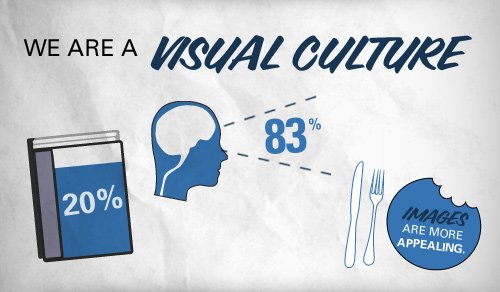
The emergence and power of visual platforms such as Instagram have highlighted the need for businesses to think visually, through the use photographs, slides, films, charts, or other graphic content
Did you know? To stay relevant with times, Social media giants such as Facebook and Twitter, have redesigned their news feeds to place more emphasis on visuals. Based on research alone, posting Images on Facebook tend to generate than 50% more likes than a text-based post
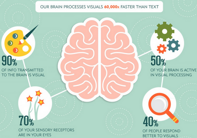
This means that if you’re still posting solely featuring plain written text, your overall social reach is bound to trend less as it may not attract a large enough audience to go Viral. If you're an Internet marketer or someone who wants everyone in the world to see your latest Steemit Post, then viral is a word you love.
Today, “going viral" refers to the sharing of something , however research indicates that often a Video or Photo have higher chances of actually going Viral
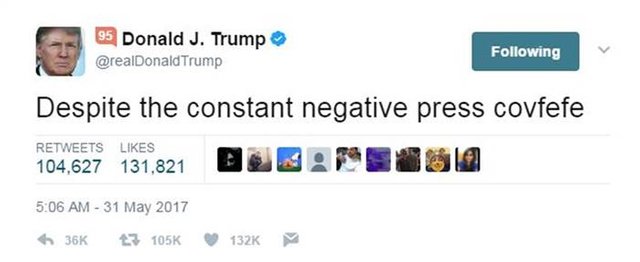
(Unless, you’re Celebrity on Twitter where plain Tweets can trend like no tomorrow like how Donald Trump Tweets about his political Agenda)
While Twitter's real value proposition is audience reach at lightening fast speeds, the use of Imaginary was only introduced in 2011 when users were allowed to upload Pictures, Video and GIF's

Based on official Twitter's Report, Tweets with photos from verified accounts indicate a 35% boost in Retweets, indicating the most of trending Content will feature either a Imagine or Video when compared to plain old boring Text
Twitter has come a long way since then, but it seems like almost of all the Social Media Giants, allow their Users to upload their own visual content. You can take advantage of this boost by sharing photos on Twitter, this applies to Steemit as well as I highly recommend to have at least 1 Image featured in your Post

If you don't use at least 1 image, you'll end up with no Thumbnail for your Post. Thumbnail, basically is your Display Picture when submitting a post that is featured on Steem's Social Network and practically the 1st Image your Audiences see's when browsing the ''new'' Steemit post Feed
So I kinda made it a habit to use a minimum of one image with every Steemit post. Why?
Because images speak a thousand words but the most important reason is to display kind of eye-catching Thumbnail which makes your Steemit posts look more visually appealing.
.jpg)
You're more likely to get people to click on your Post through the use of a Thumbnail, while this is not a rule to follow for all occasions, I would definitely enforce this Rule to people planning on publishing their first ''Introduction Post''.
Also try to use High Definition Images & Graphics, as it will also compel users to share your content on their social media networks so it may help you to drive more traffic from Social media sites. It's just a really good idea to feature at least 1 piece of Content that can be visualized , but you can always go full ''Text''.
Steemit to me has a strong Minimal design, a bit of Graphics is not going to be heavy on the eyes, so make sure to utilize all this empty white space which I'm sure many of you appreciate (Some of the Worlds most popular sites like Google are practically plain White) but let's add some color to the Screen
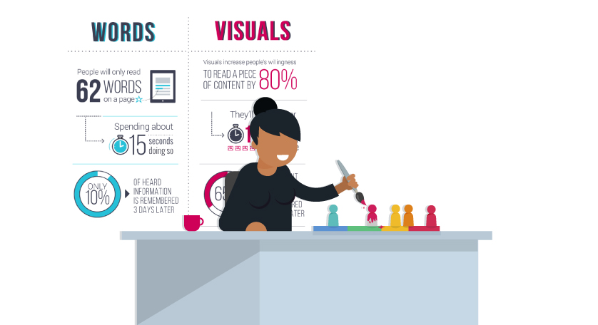
Visual content marketing is more successful than any other form of communication and those on Steemit who embrace visual content reap the rewards of higher returns – in terms of more Followers & Readers
%20%E2%80%94%20Steemit%20-%20https___steemit.com_%40steemitguide.png)
%20%E2%80%94%20Steemit%20-%20https___steemit.com_%40steemitguide.png)
%20%E2%80%94%20Steemit%20-%20https___steemit.com_%40steemitguide.png)
%20%E2%80%94%20Steemit%20-%20https___steemit.com_%40steemitguide.png)
%20%E2%80%94%20Steemit%20-%20https___steemit.com_%40steemitguide.png)
%20%E2%80%94%20Steemit%20-%20https___steemit.com_%40steemitguide.png)
%20%E2%80%94%20Steemit%20-%20https___steemit.com_%40steemitguide.png)
%20%E2%80%94%20Steemit%20-%20https___steemit.com_%40steemitguide.png)
What a wonderful guide. So well organized and structured.
I like the thing about the thumbnail. For me, they are really important that's why I put a lot of effort into it.
Thanks for sharing this awesome guide.
I already wrote also some Steemit Tipps, but they are not comparablee to your post :)
Ray Yabo aka @modernpastor
thank you for this wonderful post..its very helpful for me
Thanks for this awesome post...Image provides excellent explanation of your content. It is much boring to read paragraphs continuously. Using images attracts the readers and they get the enthusiasm of reading more posts. Good way of attracting people to your website and also a good method to decrease the bounce rate.
very true, I personally tend to skip over the post that do not have a thumbnail but on the other hand if I read posts with pictures that are totally not relevant to the written text I tend to be dissapointed and feel a bit cheated...
Thanks for the info! I will check out your links for the guides and tutorials :))
Thanks for you sharing this knowledge. Greeting steemit
Thanks! this is useful! I agree with that information!
Amazing statistical analysis and conclusions plus Greatwork! 😎😎
Thanks for sharing
it's a great piece for newbies like me
thank you for the helpful information.