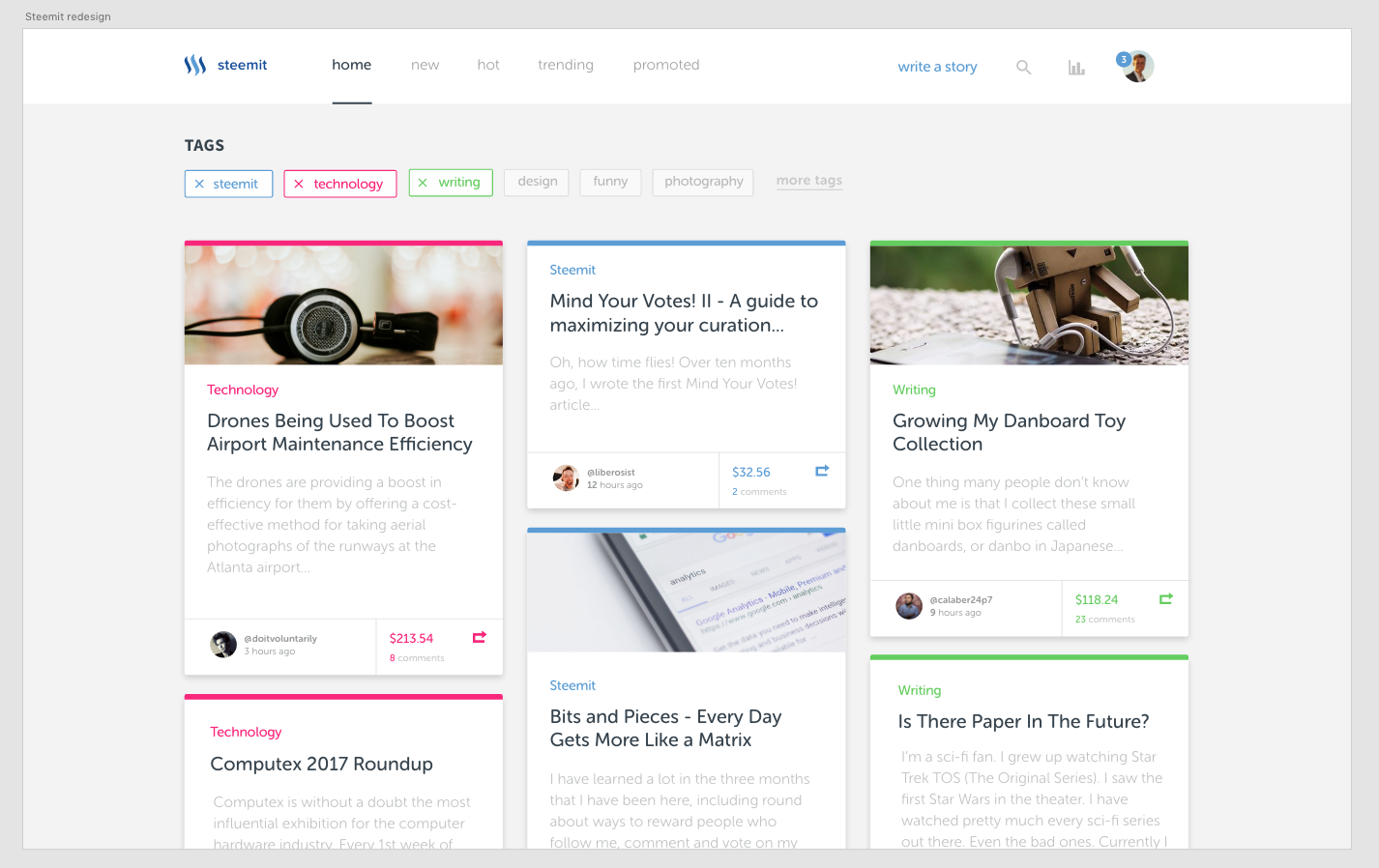
Redesigning steemit-beta for fun.
Me being bored equals making redesigns for existing sites. This time I tried to redesign Steemit-beta. Just a quick mockup, but I like it somehow. Any suggestions :)? link to bigger pic

Just to be clear; I am not working for Steem atm. Just trying some stuff out. I wanted to make the topics more distinct and also give a better overview of all the (new) articles.
Anyways, don't forget to follow @staystrong and let me know what you think.
Looks like Pinterest but wouldn't mind as long as it is usable and stable. Changing the design would change the way we are percepting other people's contents so many more good quality content could arise from being low paid.
This actually looks better than the current website :P
Hey there @staystrong, very nice work. It's clean and fresh and I like the idea of color coordinating the categories/tags. I also like that you have brought in more visual interest with the author avatar image. Overall the layout is excellent and feels overall simpler (which is a great thing).
I think there are two downsides to this design
Keep up the great design work, thanks for posting here for others to see and give feedback. Following you to see more of your design work!
Thanks for the great feedback! This was just some practise and made in under 2 hours,but you made some valid points. Perhaps I will design it further :)
Much better layout/design. I hope Steemit will update theirs sooner than later. The current format is not as attractive as it could be which I think might put some people/newcomers off. I personally try to encourage friends to join Steemit but most of them don't like it. I remember my first contact with it I had the same first reaction. Now I'm visiting it on a daily basis. Also thinking to buy much more Steem as well.
Thanks, Steem on!
Cool)))
I really like this design.)))
Very nicely done design! Keep at it... I think steemit oculd also use a private messaging seciton
Something like this would be really useful!
Nice article!By the way,I have upvoted your post,can you upvote my new post? Thanks
clean and interesting design good work!
Good Job