Hello everyone! I created a new website design for Steemit
Hello everyone on Steemit!!!
I have created a new website design for #steemit
I made a simple and elegant design. I wanted it to be a modern, readable, and contains colors from the logo.



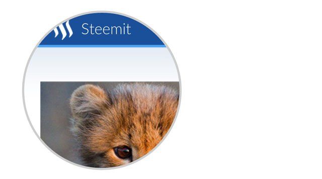

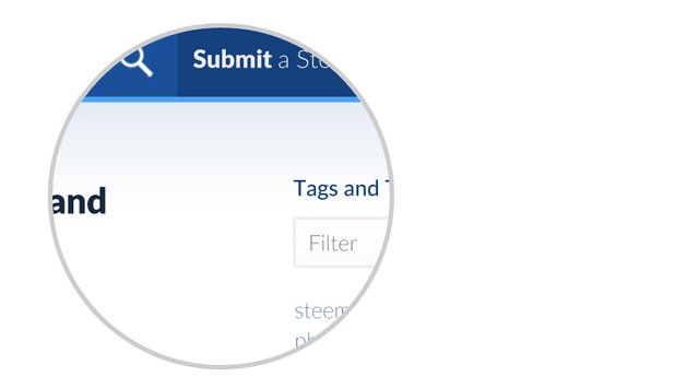



I hope you like it.
I used to project images and texts, which were on the home page Steemit by:
@baharoba @kaylinart @nonlinearone @anyx @cheetah and @inboundinken
wellcome
Very sharp! I could get used to that. Much better than the Spartan look we have here currently...I nominate you to the STEEM UI team!
;)
This is a clean redesign @projekt!
Love the clean and simple approach that you took, and the negative space around the posts really does help to keep readers focus on the content.
Thanks for sharing this.
Thanks!
My pleasure.
nice layout - could go with this
thanks, I tried to do it well
Good article
Nice post!