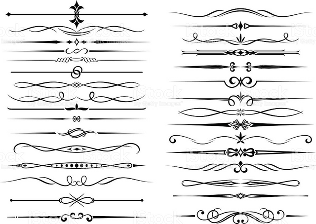
Attract more target audiences thru the use of border elements

Polishing your shared content is one of the best way to please and attract your target audiences. A presentable and interesting content deemed to have a high quality of elements, design, effects and arts. It can be more eye catchy, as well as more amusing to visit. People's eyes and tastes are very subjective. Some can be easily pleased thru each simplicity of works, while some seek for more. But always remember, of course, that the "CONTENT IS THE KING". All I knew is I need to make this quite informative article to inspire and educate more people to always seek for a quality content.
That's the reason why, you should always give your best shot to find various ways to attract more new potential or returning target audiences. You can easily do that thru using a proper formatting of text with your shared content, which I already wrote before. Another way to do that is to align those images in the appropriate location. So, it can be more pleasant and more presentable.
In this content, I am going to teach you, some other ways to add more variance with your content, thru the use of border elements or can be also called as border illustrator. I already saw some people who used that border element, and I also know its real purpose, but to just put a certain boundary with each sub topics in your content. Although, it doesn't directly adds quality to your work, but can still adds some eye catchy stuff or a decoration with your works.
There are lots of free borders elements online, which can be freely used with your shared content. Some of them, doesn't own a copy right, while some have and sponsored. So, always give credits to those citations.
If you want to learn on how to make your own border elements. You can try watching this YouTube video.

