The perfect dimensions for the main image in your Steemit.com post are...
Well, it depends...
- It depends what screen sizes you are optimizing for.
- It depends how fast you want the image to load.
- It depends on the composition of your image.
Although “it depends”, for most people:
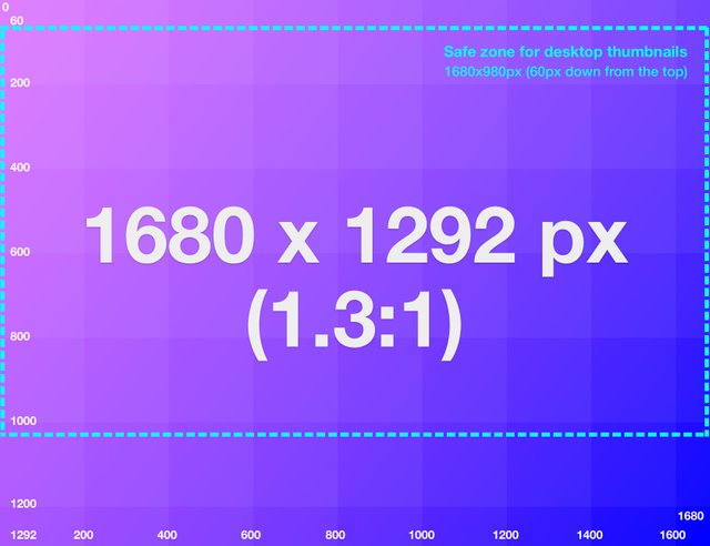
Dimensions of 1680x1292px works best for your main image
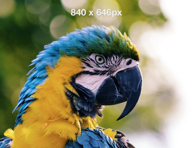
(Smaller images with the same 1.3:1 ratio also work well, like 840 x 646px)

Within the main feed on Steemit.com, this image when presented as a thumbnail should display in full on smaller mobile screens, while the area within the ‘safe zone’ should be visible on desktop.
Why 1680 x 1292px?
The first (or main) image in a post, has a lot of work to do:
- It has to look good small, as the thumbnail preview image.
- It also has to look good large, as displayed in your blog post on desktop.
After some experimentation, I’ve found that images with width to height ratio of 1.3:1, give the maximum visual impact for the preview thumbnail across a range of screen sizes. When this image is cut at 1680 x 1292px, it will also look super sharp within your main blog post.
If you don’t know anything about image editing or how to export images, don’t worry. Steemit.com automatically intelligently handles the main image to look good both as thumbnails and within blog posts.
The rest of this post is really for pedantic pixel pushers who want to get deep into why I think 1680 x 1292px is the best ratio for the Steemit main image.
The main image as a thumbnail preview
On mobile (or screen sizes less than 640px):
- Steemit.com displays the main image at maximum height of 480px
- Note: Steemit appears to automatically resize every thumbnail down to this maximum height.
- Since there is padding around the edges of each blog post, the actual maximum width of a thumbnail image is 622px.
- Therefore, a ratio of 1.3:1 (622/480) will give your image the maximum possible height when displayed as a thumbnail. This is likely to maximize it’s visual impact on mobile.
- Images greater than this ratio (e.g. a 2:1 wide landscape), wont display fine, but won’t take up all of the available possible height.
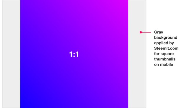
- Images less than 1.3:1 (e.g. a square or portrait), will not use up the full width of the image container (and will display a gray background in the unused areas). See below:

On desktop (or screen sizes 640px and above):
- Steemit.com displays the thumbnails as a CSS background-image at 130x76px (at a ratio of 1.7:1).
- Since these background-images have a background-size of 100%, the entire width of your image will be displayed.
- Images with a ratio less than 1.7:1 (e.g. square and portrait images), will have the top and bottom parts of the image cut-off on desktop screens.
- Images with a ratio greater than 1.7:1 (e.g. widescreen landscape) will have reduced visual impact since, they will not take up the full 130x76 container (and will display a gray background in the unused areas). See below:

Safe zone:
- Since the optimal ratios are different for screens above and below 640px, we need to introduce a safe zone. Within the safe zone, you should place all the parts of the image that you absolutely want to display at all screen sizes. Areas outside this zone will be cut off in the desktop thumbnail preview.
- This is the dotted line in the main image of this post.
- The safe zone essentially becomes a 1.7:1 area which sits inside the recommended, 1.3:1 image.
- Because Steemit.com sets the background-position to 20% vertical height on desktop, this safe zone falls slightly higher than a pure vertical center.
The main image as the hero within a blog post:
The maximum possible width of images displayed on Steemit.com is 840px. To cater for those fancy people with ‘retina’ screens, doubling the number of pixels displayed at a 840px width will ensure sharp images. This means exporting your image at a 1680px width.
Performance (website bloat)
For small screens, Steemit automatically downsizes larger images. This means that you don’t need to worry too much about performance when cutting up the main image, since Steemit will deliver a smaller image than your original to mobile devices.
For the main image within the blog post on desktop, exporting an image at a:
- 1680px width, should ensure crisp images but it will take users longer to download.
- 840px width, may result in slightly blurry images, but will be quicker and less costly for people to view.
Here are two examples. If you have a high resolution screen, you’ll probably notice that the second image (840px) is slightly blurrier. Look at the blue feathers at the bottom.


Disclaimers:
- Steemit.com could change the dimensions at which it displays the thumbnail at any time. That would make this post almost completely useless :)
- This post is specifically for displaying the image on Steemit.com. However, steemit.com is but one front end “explorer" to this blockchain. Other front-ends like eSteem and Busy.org can display images at any dimension they choose.
--------
So keep Steemit.com beautiful, and hopefully earn some extra cash money with optimized images. Use an image ratio of 1.3:1 (or 1680x1292px) for the first image in your blog post.
Thanks! Very informative!
@pkattera siguiendote y votado. gracias por el contenido. Te invito a seguirme. @diegocruz
This post has been ranked within the top 50 most undervalued posts in the second half of Dec 30. We estimate that this post is undervalued by $8.60 as compared to a scenario in which every voter had an equal say.
See the full rankings and details in The Daily Tribune: Dec 30 - Part II. You can also read about some of our methodology, data analysis and technical details in our initial post.
If you are the author and would prefer not to receive these comments, simply reply "Stop" to this comment.
I feel like this post is still ranked as one of the top 50 most undervalued posts to date! lol
Great information! I've used wide dimensions on my last few images to fit better with the article view, but it has looked quite bad on the thumbnail view 😅 lol this is good info for that, thanks! 👍
This is perfect! Exactly what I've been looking for. Thanks for sharing this, man. A real help to the community.
@pkattera hi, thank you for your continuous support.
Write again!
AHh epic! Thanks for this.
Thanks @pkattera for the info! I learn here!
Thank you for your vote and concern about my @steemitjp I followed you. I do my best to boost steemit Japan as frontier. and Until now 800 X 480 size is perfect for steemit. Today I learned from you. Have a Great Day to you and your family. From David
Thanks, this was pretty informative and hadn't seen it mentioned before.
No worries, glad I could help!
Another dude loving this post and want to thank you sir! <3