You are viewing a single comment's thread from:
RE: Steemit Home Page Redesign Part IV - By George I think we've got it!

Hmm, reading, reading, reading, see new design proposals.
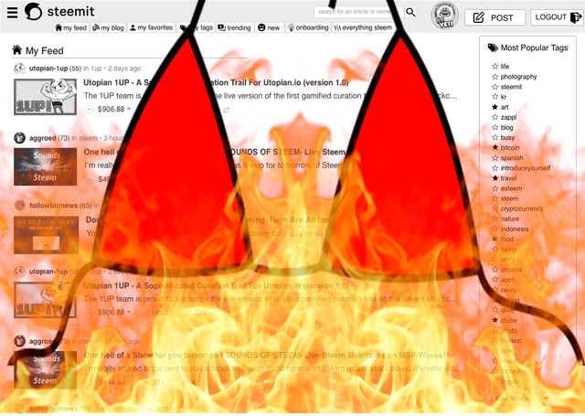
Looks pretty darn good. The only true way it could be more awesome is if it had breasts and was on fire. See example below.

Very creative man! Thanks for your comments and support. Cool graphic you totally gave me a wtf as i scrolled on my mobile phone lol