Why Steemit should change his layout/design everywhere
Hello,
I am pretty new here, maybe you, the one you are reading this too.
Steemit seems to be a very great platform for very great possibilities. It sounds like the future, it is completely different then all other platforms. The system is awesome. But why, why or why do we need then this copied 0815 design. How can i convince people to join Steemit when for ex. D.Tube is looking like a simple 0815 copy of YouTube? Why do they call it D.Tube? Thats uncreative compared to what Steemit basicly is!
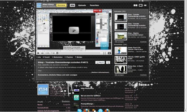
I personally missed all the userfriendly features that YouTube got in the early days. I was able to customize my channel in the font, background color, transparency...as i like. I was able to personalise me on my channel. I was able to show the world, what i like.

And all that goes down for YouTube.
Now D.Tube comes over, and make the same thing, the same white spacefull site, but with a great system behind.
Do you know when you use Google or something, and you find some sites that embedded YouTube videos? Or like a simple copy? Steemit in overall looks like that. And that makes me sad.
Steemit wants more people right? Thats what we need right? So why we not represent that, what the site really is?
When we want to have a chance, to get big, we just need to do something new! completely new!
Nothing copied. New and great. Thats what we need.
Be creative, be different, be Steemit!
What do you think? Let's talk
#makesteemitbetter #bedifferent #change #improve #increase #push #dtube #steemit #design #layout #personalized