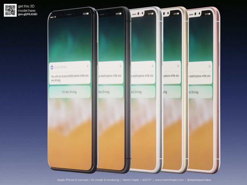
New iPhone 8 leak reveals the precise dimensions of the phone’s display

We’re closing in on Apple’s fall iPhone event where this year’s iPhones will finally be unveiled. After months of iPhone 8 rumors (topped off by an unexpected leak coming directly from Apple) we have a pretty good idea what to expect from the next iOS flagship when it comes to design and features. But the massive HomePod leak isn’t done giving away secrets about the new iPhone yet.
Steve Troughton-Smith, the developer who unearthed many secrets buried in the code of Apple’s Siri speaker, found new details related to the iPhone 8’s display this week. In the software, Apple has detailed the precise measurements of the edge to edge display, something developers will need when preparing their apps to take advantage of the iPhone 8’s entire screen:
These are the metrics used by the status bar on the edge-to-edge iPhone, including notch height and ear width. Designers, have fun pic.twitter.com/lPD2RbEJFA
— Steve T-S (@stroughtonsmith) August 10, 2017
And this is what the usable space of the iPhone 8’s screen may look like:
Props to @charavel for a quick mockup taking these numbers into account. This is what I expect usable screen space to look like on iPhone 8 pic.twitter.com/wyCmfHtusO
— Steve T-S (@stroughtonsmith) August 10, 2017
Does that mean developers will be able to use the top corners that hug the camera notch? If that’s the case, let’s just hope the notch cut out will not be included in screenshots. It could happen:
I do wonder why the precise metrics for the notch are in UIKit. Perhaps the notch cutout will be included in screenshots?
— Steve T-S (@stroughtonsmith) August 10, 2017
Others have used the measurements to come up with exact iPhone 8 mockups:
Sketch source file based on @charavel and @stroughtonsmith's info with exact screen measures for iPhone 8. Download https://t.co/efcm8fRjYt pic.twitter.com/6nB9CKRm2e
— Jonatan® (@jonatan) August 10, 2017
Others figured out exactly how much extra screen space the iPhone 8 adds compared to previous models. As you can see in the following mockup, it’s a lot. And from the looks of it, Apple plans to make the most of it:
Red = New New iPhone “function area” and status bar.
Blue = Current iPhone 7 content area.
Yellow = Minuscule extra content space.