Secrets of the secrets of web design for non - designers
In this article we will give you some suggestions to get very great results for your designs, this article is somewhat specialized in web design. But these principles can be applied to all types of designs.
You may be surprised that the most beautiful designs are the smallest detail, and you should know that not following the design rules can cause the destruction of any work and leave the design seems unprofessional and can cause some design implications. Fortunately, there are some guidelines that can Use this to improve your design. Before you publish it, this is a 20 trick to save and follow .....
1- Line Height:
2 - Use two types of lines:
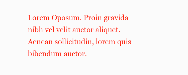
Most of the design consists of typography, which makes up 90% of the design. For this reason, how to format is the hardest part. Set font height 1.6 on all text elements in the CSS file to get readable texts.

3 - Type texts within columns with a few width:
In fact, the method of choosing fonts, and comparing them is tired, to make it easier you choose two lines and make one for text and another for titles. Make the font size of the objects larger than the size of the text line at two and a half times. If you choose a 16px text font size, you must choose a font size of 40px for the titles.
4 - Employment of Leon
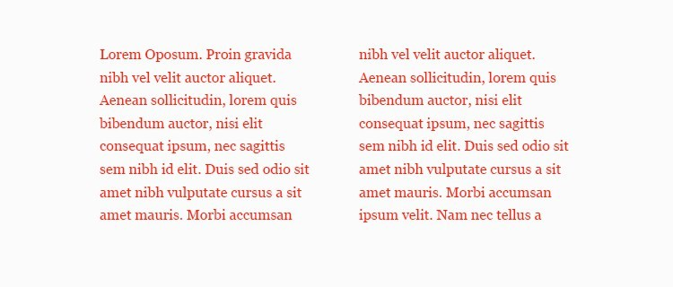
Try to read a topic in a magazine. You will notice that reading the topics that have been formatted within small columns of the display will make readers of the subject matter in a single column layout. When you read a topic, you are looking for the beginning of each line. When the line is long, it is difficult for the eye to find the beginning of the new line compared to the low-width lines.

5 - Use your intelligence in theft:
Be sure to use the color you choose carefully and do not use your senses to match the color even if the color appears to be identical by looking at the design mode on another screen or if the color will be different, use the Color Picker tool to get the Color Picker color.
Choose two colors to work on, and choose one of them and make it the color of the elements that perform tasks, such as buttons for the Forms tables. And the other color of the elements. For example, if you are working on a site design, choose the red color for the cursed and the black color of the text and also use the red color on the elements that you feel it is important to highlight.
6 - Add a line under the heading:
If you look at some of the designs of websites, you will find that most of the sites are currently designed with similar patterns. Their interfaces are easy to use and simple to use. For this reason you can mimic some ideas with minor modifications without anyone being aware that all sites currently use the same design principles.

- Hierarchy:
The need for frequent use of texts in design, especially in web design, adds some challenges to the designer to get to clarify the main points among a large number of sentences. Try adding a line below the Underline and you will find a huge difference in your design, in this way you have separated the title and the content.
8 - Repeat using some elements in other pages:
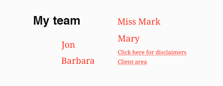
In order to understand the content of the hierarchy simply hold the paper and pen and arrange the elements of the importance criterion Put the important element at the top and then the item below it down and the elements next to the importance next to each other This method helps you save a lot of time and effort.
The elements at the top of the hierarchy should be given importance. For example, they should be bold. For example, the elements at the bottom of the hierarchy can be in the light line. Similar elements must h
ave the same design characteristics. To things that are important to your design.
9 - Leave blank spaces with your design:
If you are a web designer there are many similar elements such as headers in the site (Header) you can design this Nasser in the beginning and then repeated on all pages in this way have provided yourself a lot of effort.
10 - Sort the elements according to their similarity or type:
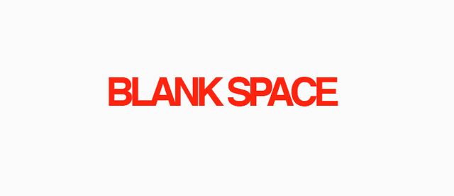
It has to be out of the ordinary sometimes, leaving a white space around some elements in some places gives it a beauty and you should not look at this distance as a blank space but see it as a tool of design that gives your design a beauty.
nice sharing