Steemit new design
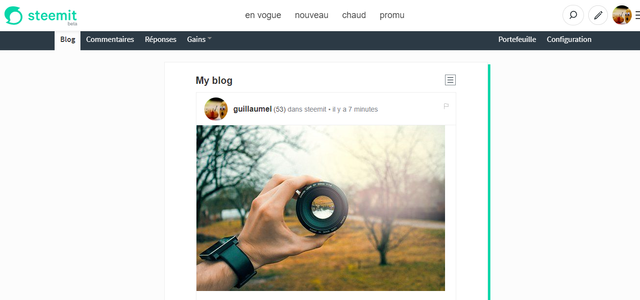
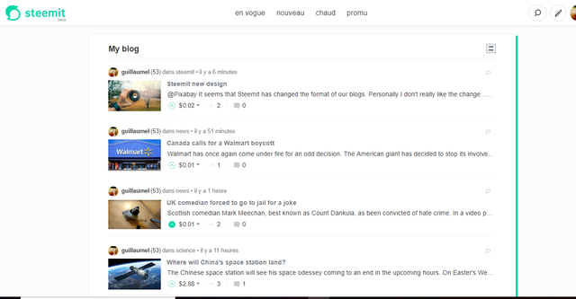
It seems that Steemit has changed the format of our blogs.
Personally I don't really like the change... The area for the blogs is too small while white space on each side are way too large... It seems that we're only using 33% of the screen...
Is this simply a bug or a long term change?
New Steemit

"Old" Steemit

