Steemit Gets A Small UI Update-Ask And You Shall Receive?
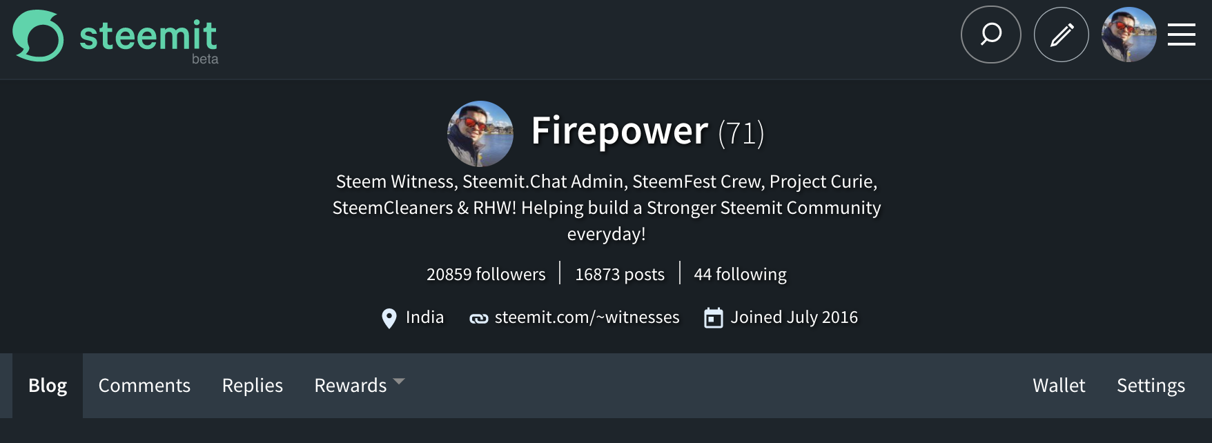
The front page is far from palatable but the slight UI changes are quite welcome. It looks better than before at this point the update seems like a minor one.

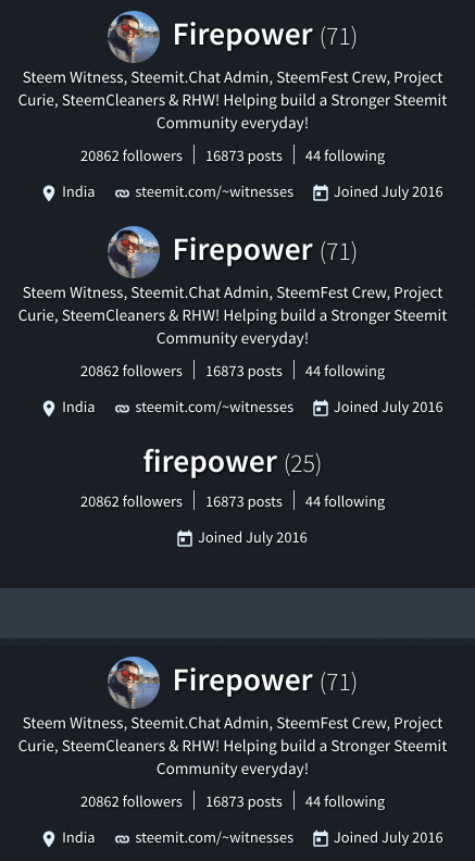
While it seems they've attempted to the fix the reputation bug, the wallet page continues to display rep (25) before switching over to the actual one. I hope it gets fixed once and for all. Here's a gif that shows you the issue.

As a witness to the blockchain I'm curious to know where the HF20 development stands today. I hope Inc decides to release new updates on the development of the blockchain soon. Mobile apps are another area that needs a faster solution as everyone on this platform wants to use one today and we're nearly 2 years into this platform without a working native app.
Some of these questions are always asked in most discussions I've had with users I meet during offline meets. Unfortunately I've never had a believable answer to these. I guess a few months from now is as good as it gets?
Thanks to @good-karma for the functional and productive Esteem app which has made life easier for most Steemit users out there.
It has been 8 months since HF20-Velocity was proposed on the Steemitblog. I hope the delays result in some exciting new features if not at the very least get these proposed changes out and running.
Do you think a couple of updates from Inc on the overall developments of the platform in a month is a good idea? I certainly think so. However, Inc has a certain way of going about their business and we have no choice but to wait and see how we progress from here.
At the moment, a lot of users feel the development is a bit slow. I'm just trying to gauge what the community thinks on these matters. I'm happy to see some really small changes take place, but I really hope Inc does something about the trending as well as improving the algorithm to combat abuse.
Lemme know what you think in the comments below.
If you like my work kindly resteem it to your friends. You may also continue reading my recent posts which might interest you:
- Steem.Chat Contest #19 + Contest #18 Winners Announcement!
- Why You Should Vote For @firepower As Witness—Witness Campaign Post From India!
- India Steem Meetup #4—An AWESOME Meetup In New Delhi—India's Capital and 40+ Attended!
UI gets back to same as it was before..
"At the moment, a lot of users feel the development is a bit slow".
A bit slow? Really damn slow LOL. For a company that has a market cap of hundreds of millions, its quite embarrassing.
Love Steem but I seen sites worth couple hundreds of dollars do fixes and updates in a few hours. smh smh.
I was trying to be nice...I guess.. :P But thanks for hitting the nail on its head!
We already had enough patience to be nice LOL ... let's get them to take some action. 😂😅
Yea and the fact that account opening still take much time is embarrassing introducing steemit to people..
Hi @firepower , Really liked your way of expressing, Kindly visit my page on Dtube and Steemit and provide your valuable feedback please. I will be greatly honored.
fixed for ya
Certainly I Add my voice to yours ... the inc ( just knew about that today) should do something about these matters
Your absolutely right @firepower. The features are still missing. A lot of developments need to be done. I feel in just two years a lot of developments have come up.. And it won't take long for the rectifications to be done in the system. The people need to join the platform irrespective of the challenges they are witnessing.. Knowing joining now is the best time since they will be early enough to grow with steemit. Joining in the near future might be hard. Some users are expecting charges to sign up in the future when steemit has fully grown.
It does look better, nice work all involved. Any changes even small ones in the right direction are always good.
@firepower Steemit is almost 2 years old now but is still in the beta stage! That itself shows how slow the development is. I understand that designing and maintaining something this big can be tedious and require a lot of rework as well. But being a developer myself I also know when the deadline's been stretched too far :D
As the community grows, there'll be more pressure to maintain the db, server etc which is understandable. But atleast the bugs in the UI can be taken up and resolved sooner is what I feel.
You're smart. I hope there is a new change. maybe it was their negligence. try to give them feedback
What kinds of changes will be coming with HF20, do you think? I'm so low-tech myself that a lot of things don't bother me much.. but even things just running a little bit quicker would be a huge thing lol.
Cool. I should say Steemit is a sleeping Giant and soon the pace will pickup
This is a new development from steemit I can see the new interface on my mobile phone, a tiny pen and magnifying glass, this is awesome.