I love the Steemit interface
Smooth, simple, inviting.

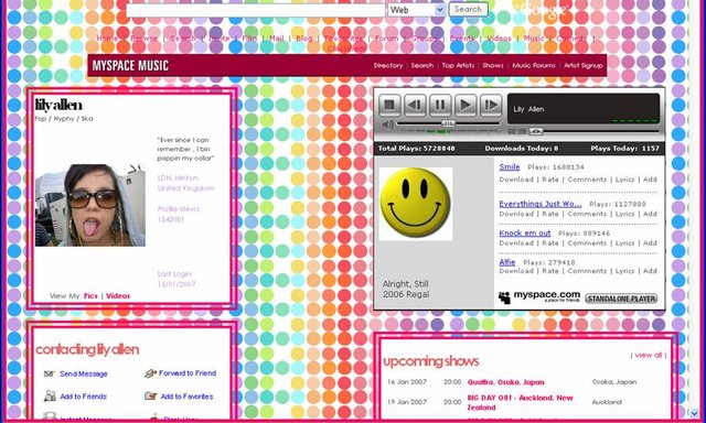
Part of the exodus from myspace to facebook was facebook's simplistic design and lack of clutter. Remember - each myspace page was custom; with the background, navigation buttons, and music all randomly decided by the author. It was a jungle of self-expression, with edgy neon palettes assaulting you from all sides while you madly grasped for your best friend - the mute button. In 2017, Clutter is out. Slick is in.
Bad


While adding more features, I hope the steemit team keeps the elegant flow that we have now. Even older users have no trouble finding the important buttons and aren't slammed with too much info too fast.
Good job Steemit web team!
P.S: All i want for Christmas is a dark mode :)
Congratulations @daxed! You have completed some achievement on Steemit and have been rewarded with new badge(s) :
Click on any badge to view your own Board of Honnor on SteemitBoard.
For more information about SteemitBoard, click here
If you no longer want to receive notifications, reply to this comment with the word
STOPBy upvoting this notification, you can help all Steemit users. Learn how here!