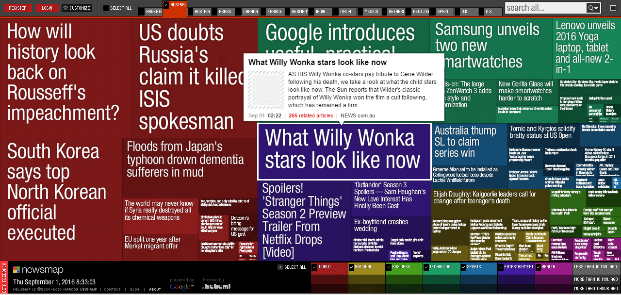
Visualisation of Steemit | Map view
This is a proposal for a visualisation map of #steemit, similar to the way that Japanese news website newsmap works. In other words, a different way to view and interact with content. More successful posts, take up more room.

I think this could be an interesting, and useful way to interact with posts.
Similar coming soon to a button on #steemit soon?
Thoughts?
p.s - not necessarily a fan of the colour palette being used in my example, but the idea behind it.
They need to make something different . For now it's manageable coz ther is not much users . But what to do when steemit gains 1M or more . Even now user has to fast track whats in a new section , what is in hot , where's that user post , omg . Imagine 5 milion users , 10000 placing new blogs in 2-3 minutes , how will i as a user find a good one in a sea of posts? They need to make some changes regarding sections and notifications like maybe separate for US,Europe,Asia and so on and in that subsection or something .
Preeeecisely! :D
I think the concept is awesome, I would choose what tags, what feeds and color code it myself to my brain waves.
I would have hot and trending along the bottom and other stuff flowing from the top left and right at my desired speeds. When I am typing a reply everything would slow down as my console was programmed.
This might make it workable, but the current format of post delivery does not seem that great in reality...
/ hugz ; )
These are awesome ideas. I am a dev, so I may even be able to create a prototype using the #steemit API.
I do not know anything of programming or development, I have a website or two using WordPress after some playing around with BASIC a millennium ago.
You should do what you know and stick to things that interest you and you can get good at; I have found that the secret to my success.
After decades of research and self analysis I have found the secret to my success; sofa lounge, potato chips and remote control seem to help me produce my best thinking : )
/ hugz ; )
Great post, thanks for sharing!
That looks great! Reminds me to http://finviz.com/map.ashx?t=sec