Comic: Black Cat Page 1 [Process]
Page 1 | Page 2
GUESS WHAT EVERYONE?
I'm drawing a comic! It's been a goal of mine for a few years now to write and draw a narrative comic, and I resolved at the start of the New Year that I'd finally buckle down and do it. Presenting: the first page of BLACK CAT, a comic about two guys, a cat, random acts of kindness, and also the Russian Mob.
I officially started this project on New Year's Day, but the reason I'm only coming out with pages now is because I spent all of January doing all the preproduction. It was a completely new process for me so it took probably longer than it needed to lmao — and also, I'm completely making things up as I go along, I'm not an expert on any of this, so please take everything I say with a big chunk of salt lol.
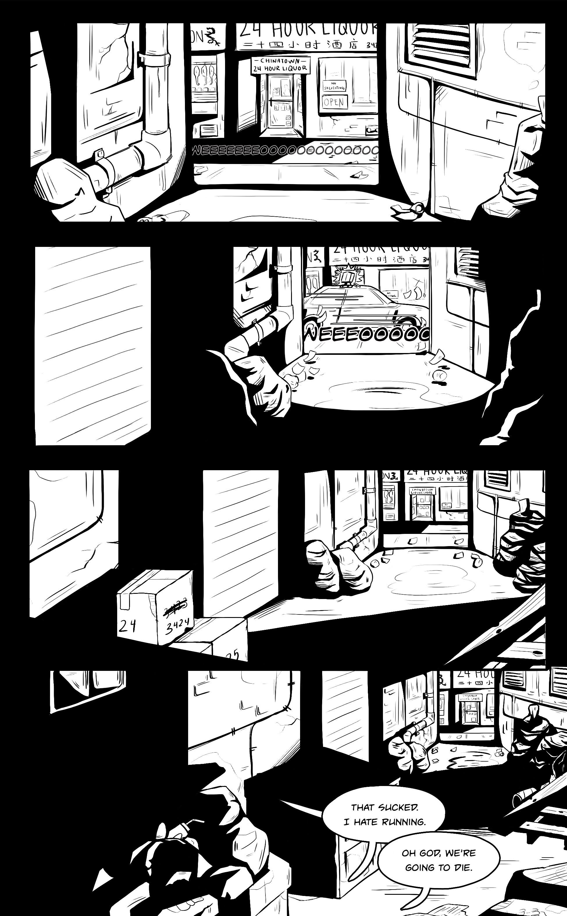
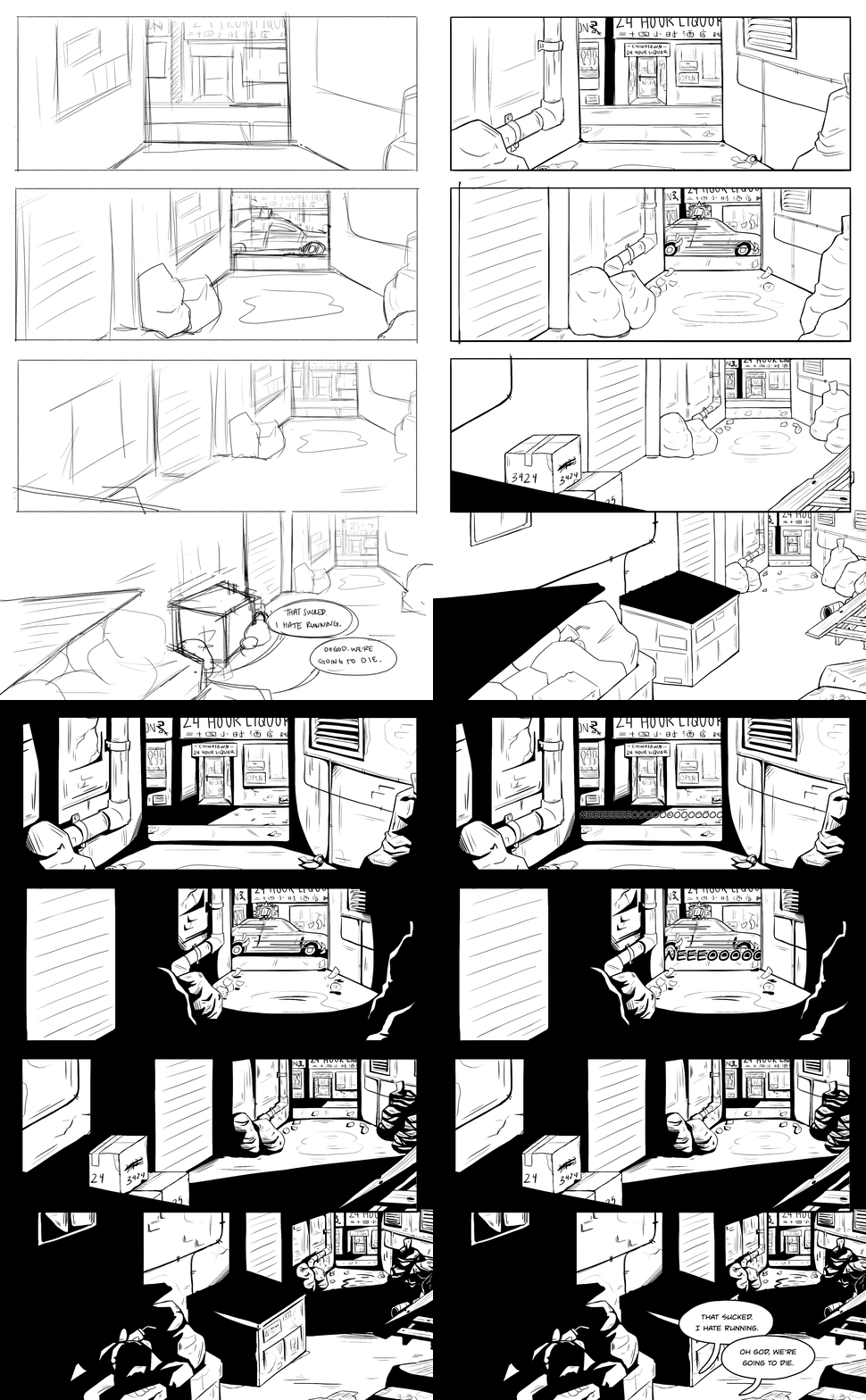
Because I know y'all love process shots, here's how this page came into existence. First, I started with the script.
Yes, this comic is fully scripted! You'll notice it's in screenplay format (vs. actual comic script format) because I went to school for film studies and it's easier and more familiar for me to visualize narratives this way. This probably won't fly elsewhere, so it's a good thing this project is a one-person effort because I can do whatever I want.
You can also see where I split the script into panels and did a thumbnail drawing. I also made a note "pan out," in order to remind myself the visual movement I want in this page. I'm basically treating these like camera shots — the concept for this comic actually came from a script I wrote in film class years ago, but I cleaned it up a lot since.
All this translates into ... the sketch!
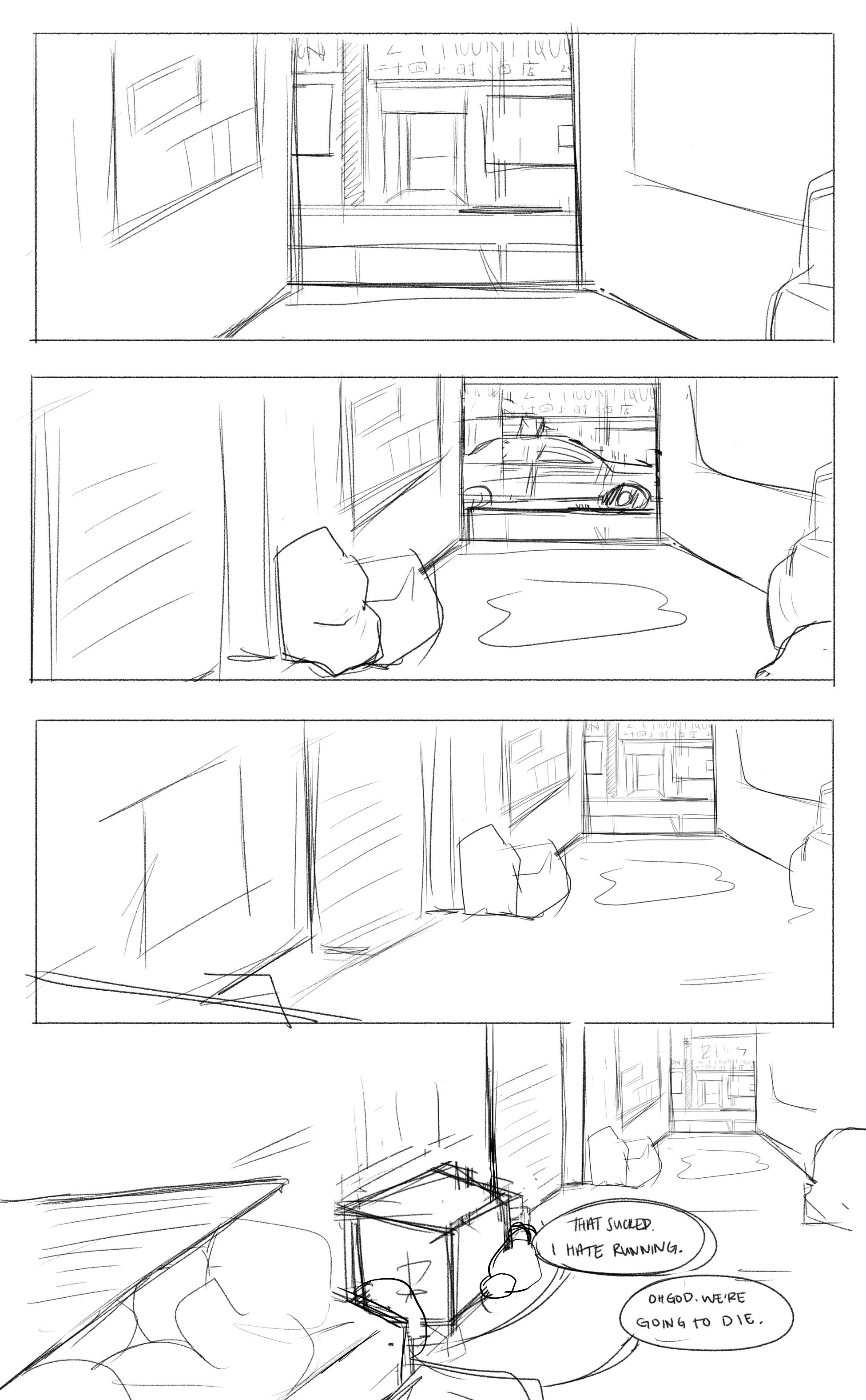
Here I opened up Photoshop, set the right dimensions, and went about translating that terrible sketch and that mess of notes to myself into something workable. This part took the longest because this is pretty much the final composition. This sketch went through several iterations that I didn't bother saving, but this was the angle and perspective I finally decided on.
Next up ... lineart.
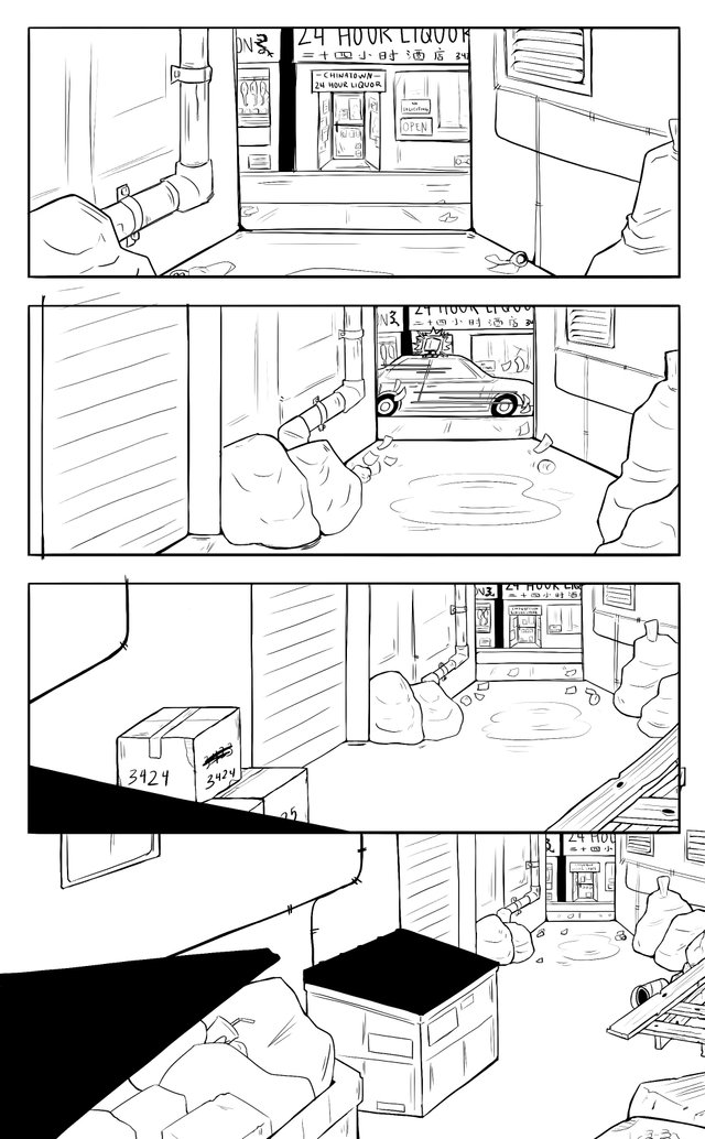
Basically just traced the sketch and added an unnecessary amount of detail. I honestly kind of screwed myself over here because I just covered a bunch of the detail with shadow later, but that's cool. This first page was meant for me to iron out my process and style anyway, so I'm keeping that in mind for page 2.
Next, it's time to add .... atmosphere.
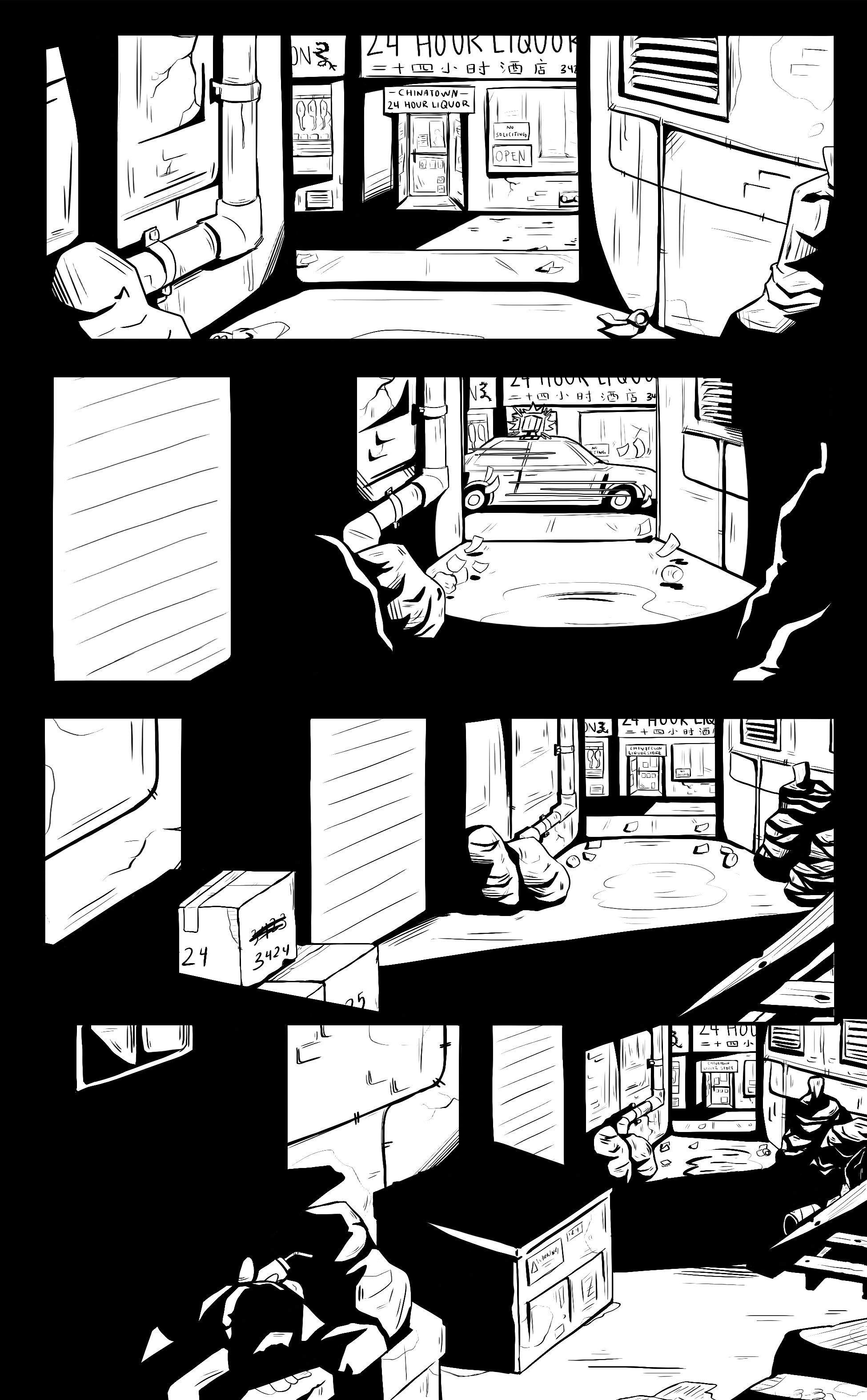
I really debated with myself whether or not to make it a color comic, but I'm not really that strong with colors yet and besides, the script is heavily noir inspired and almost entirely takes place at night, so keeping it black and white actually serves the narrative better (most importantly ... LESS WORK FOR ME.)
I went with strong light sources and graphic shadows for ~visual interest~. For some reason, this turned out to be my favorite part of the process. I used to really hate shading, but it's kind of an interesting mental exercise for me now to figure out how light interacts with various objects at various angles.
And then finally ... text!
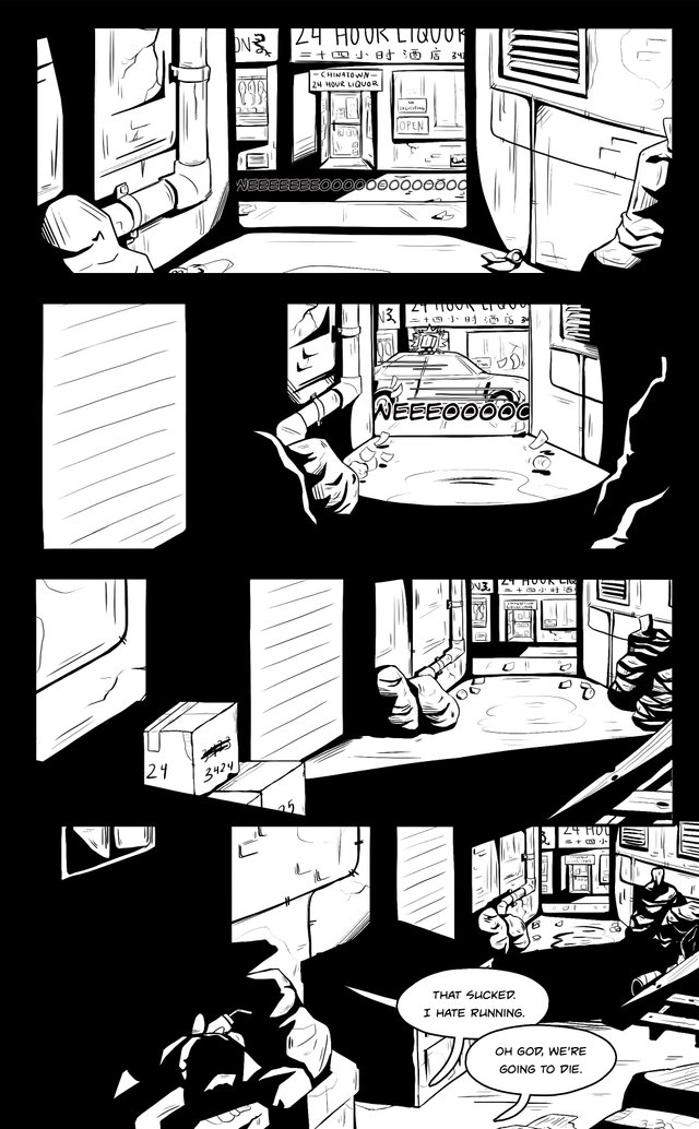
(I don't know how to translate the sound a police car makes into text lol).
The dialogue, of course, follows the script. I'm really trying not to stray from that too much, though you'll notice that though the two characters are introduced in the script, they don't show up here. That was an intentional directors choice ... I just thought it'd be funnier if they were complaining off screen. The characters will show up on page 2 though, so stay posted for that!
tl;dr here's the gif:
Your post is very nice,it is really attractive and helpful!!!
thanks!! :)
helll yeahhhhh. already making 10x more progress than me on my comic lol
This was an amazing post to read. Last year I did a small comic so it brought back memories. It's interesting to see the different ways people work in these types of projects because we all end up doing something different. Great coloring too! I really like the two tone atmosphere you are going for. Please keep us updated!
wow, thank you for the kind words! your work is really great, so that's really flattering :) i'll definitely keep posting these, but i really liked your character design guide and would love to see more process/tutorial from you too!!
It's a good job :-) The back travelling works, and the black areas are well done. It makes me think a little bit of Hellboy. You're right to keep it in black and white, your drawing don't need colors to be understandable. Or perhaps just something very simple, like flat colors.
I just have a little observation : in the last box (don't know if it's the right word :-) ), the left side is black because there is lot of shadows. I think you should continue the black on the right and in the bottom, like around the other boxes. I have no problems with images that take the full page, but in this case it's a bit strange because of the shadow on the left...
I'm curious to see the people on page 2 :-)
Thanks for the kind words :) Being compared to Hellboy is definitely very flattering, haha. And also, thank for your really good suggestion! I assume you're talking about the panelling — I hadn't noticed how strange it looked before. I definitely want to keep the bottom panel full-page and without borders, but I think I have a good idea how to make it look a little less weird. Appreciate it!!
This is great! Your inking is wonderful and the way you plan for the page is really creative :) I wish you great success with this comic!
upvotes
thanks, i appreciate it!! i have a pretty good feeling about this, hopefully it goes as well as i think it will haha.
super cool stuff!!! you should make my comics xD
hehe, thanks!!! your comics are great all by themselves, man, you can do this!
Thanks for the motivation :D
It is looking good! I love the heavy black fill it gives it a great mood. Interesting to see a comic "storyboarded" in screen play format :) Great post!
Much love - Carl
thanks!! it's a style i've been playing with for awhile now, so i'm glad i could apply it to something bigger. the storyboarding really helps organize my thoughts, but i'm thinking i should learn to write in actual comic format at some point :P
Hi Just came to say that I appreciated your post, I am an artist too! so always love to see other artist work. If you would like to see my art you can here @debart have a nice day.
thanks!! your stuff is great, you definitely have a unique style :)