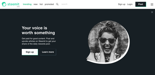
New banner on Steemit Home page
If you visit https://steemit.com (you might need to logout if you are always logged into Steemit like I am) you will realise that there is a new banner that is coming.

The message on this banner is much better than the earlier banner.

In addition to the cosmetic changes like these we feel that improvign the overall UI of steemit and reducing the approval times of signups will drastically improve the adoption of Steem .
What are your thoughts? What can be done to improve the adoption of Steem blockchain.
Looks good
not yet
Shorter times for new sign ups. Then some marketing. Steemit is gonna be great.