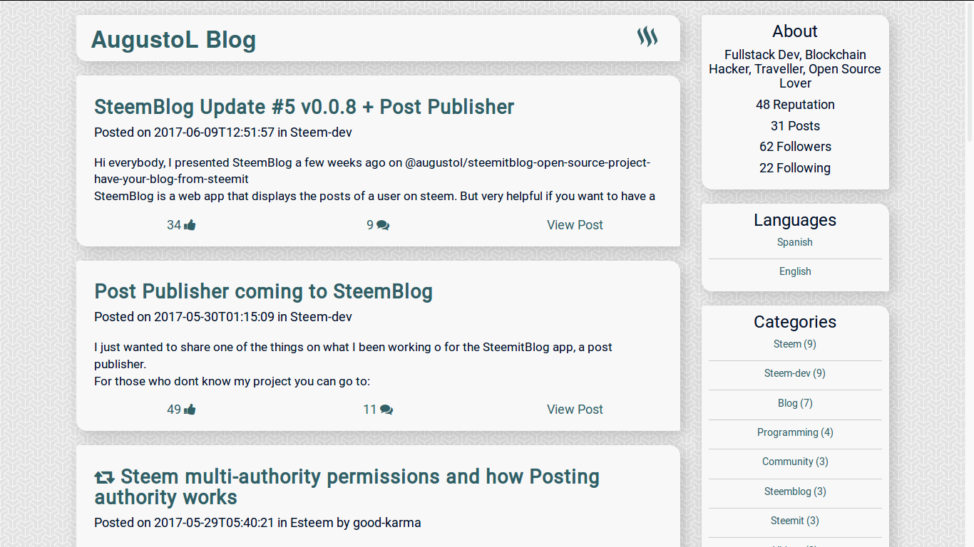
New look and styles on Steemblog.io !
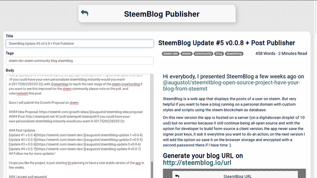
After the reviews received on the update of Steemblog 0.0.8 I ask for a friend that works as web designer if he can help me to redesign some styles in the website, based on the feedback gathered by users on the past updates and this is how it looks now:
@augustoL Blog View

Publisher View

URL Generator View

Let em know what you think of the new design!
Last Update -> Steemblog 0.0.8
Follow me for more updates !
I hope you like the project, is just starting Im planning to have a nice stable version of the app in few weeks.
It's move to the right direction that's for sure.
Enabling users to choose their own background image easily and making divs transparent could make it easy to have personal and sweet site to show people.
ahh... not bad. would adding in CSS or interactions make it better though?
Now it looks much better, but adding more funcionality to it like a blog directory and upload of configuration on the steem blockchian for the blogs will make it much better for me. That is the next step.
ah, im looking forward to it! i followed you
thanks!
@steemitqa and @sarasate what do you think?
Yes, the ugly background needs to go! ;)
Amazing! I LOVE it! :)
Getting better ;)
But please remove the ugly background!!
This looks like a very enjoyable direction. I can't play with it right now but I wanted you to know that the links at the Steemit App Center just take people to an error page. There's no direction on how to create ... the ... url of some sort. I'm sorry. It's late. I hope you can get what I'm saying.
Congratulations @augustol! You have completed some achievement on Steemit and have been rewarded with new badge(s) :
Click on any badge to view your own Board of Honnor on SteemitBoard.
For more information about SteemitBoard, click here
If you no longer want to receive notifications, reply to this comment with the word
STOPBy upvoting this notification, you can help all Steemit users. Learn how here!