[TUTORIAL] Stacking Watercolour Gradient Landscape
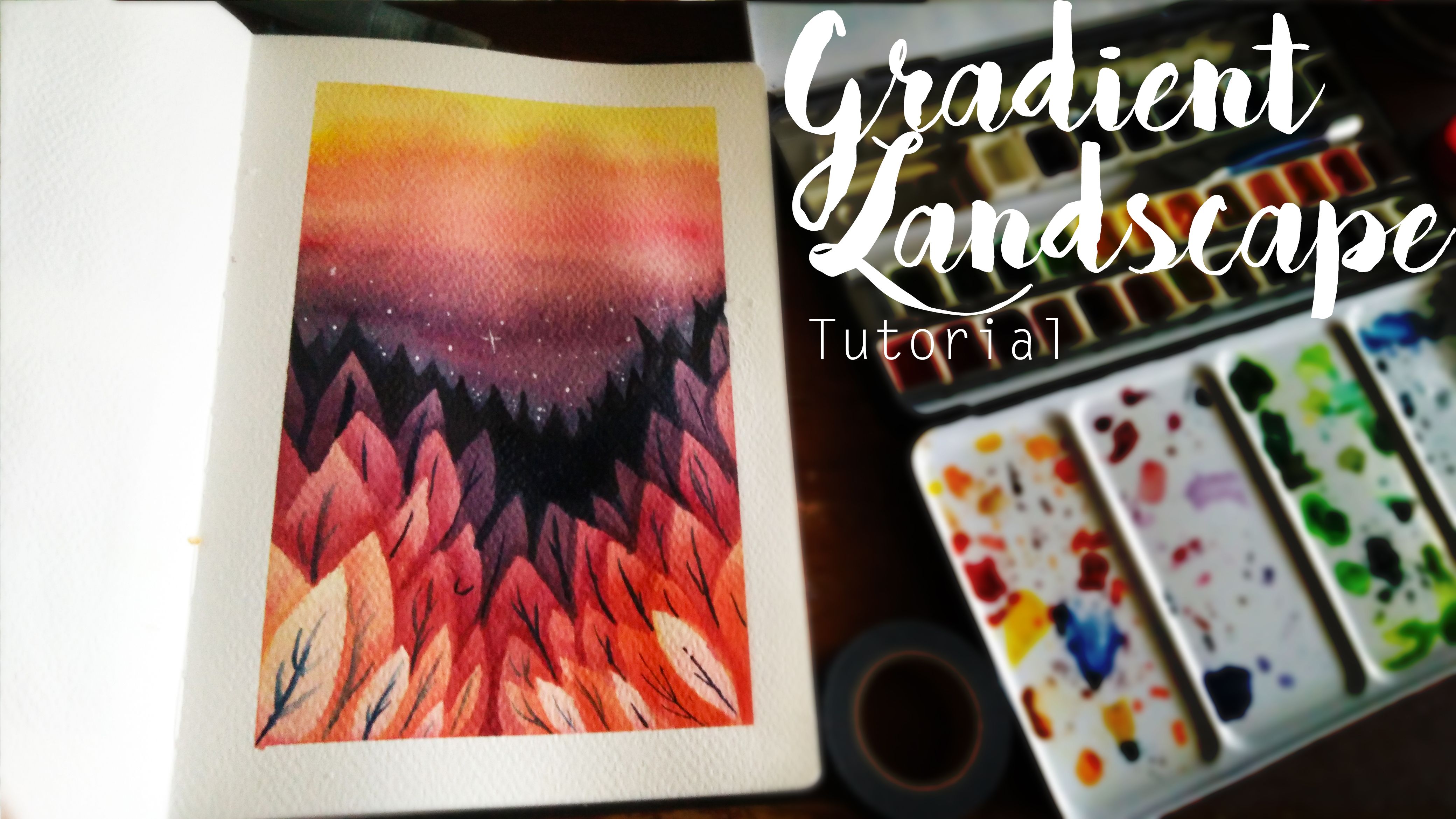
So in this tutorial/demo thing, I'll be showing the application of using this stacking gradient technique in creating a graphic scene of a forest. All you need is some watercolours, your favourite point and flat brush, a good paper and a bit of patience.
So let's get started!
Step 1: Tape It and Wash It!
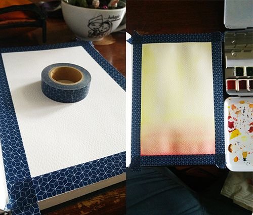
Step 2: One Layer At A Time
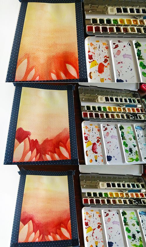
Step 3: It's Only a Theory...A Colour Theory!
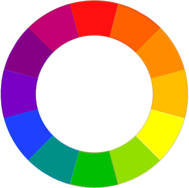
Understanding colour theory can really help in creating beautiful coloured drawings. One of the main problems I had when I started out in painting was being too overwhelmed with such a huge array of colours so the best thing to do is to limit the number of colours in a piece. This also helps in unifying the whole thing, making it pleasing to the eye.

For this drawing, I'm using this analogous colour palette and it's a common choice of colours when it comes to sunset shots.
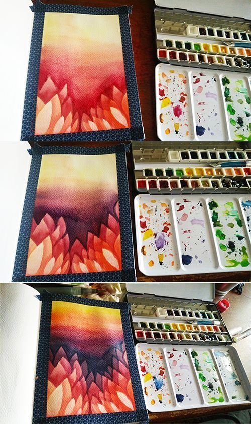
So it's a simple rinse and repeat of stacking each colour of top of another until being satisfied. This is also a good chance to intensify the sunset to really make it pop. However, keep in mind that unless you have something like a heat gun or a hairdryer to speed up the drying process, each layer of watercolour is going to take a while to dry.
Step 4: Some Last Touches
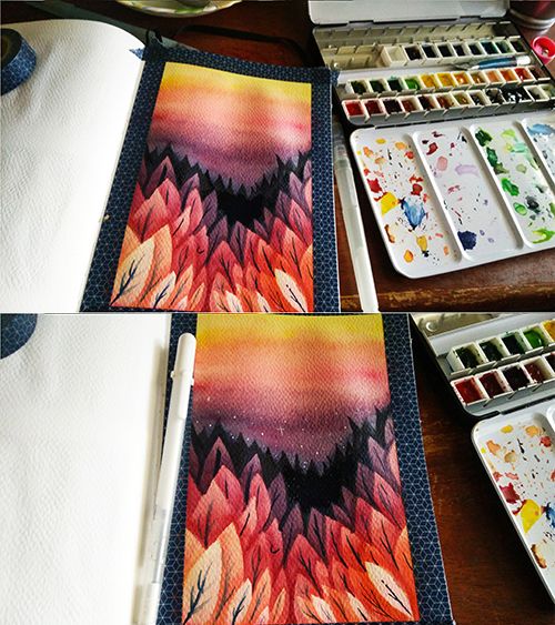
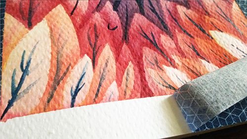
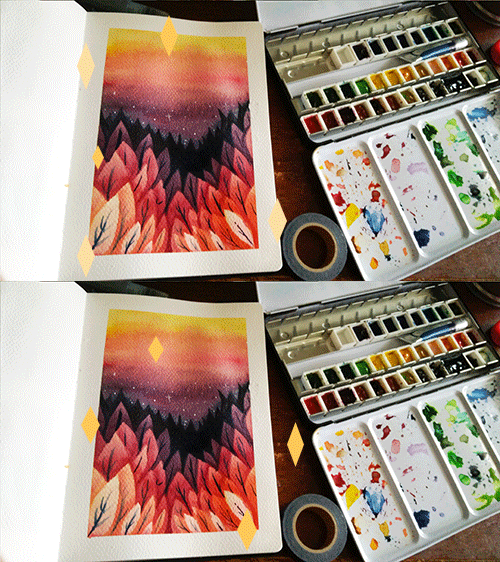
Almost finished by adding some silhouettes of trees in the back and lining the branches of the trees with the same blue used in the gradient. Using something non-black helps in softening a drawing and making it not as stark as black.


Hi @hanbun, first of all, that is amazing art and I see that you're very talented. You did well no matter what the medium is- be it digital or watercolor- you used colors so professionally and vibrant I feel like capturing (or artnapping) them to frame those in my house :) Hope to see more awesome artworks from you <3 Tip of post formatting though. Try not to use centralized the body of your post because psychologically, it's not really conducive and appealing for your readers. Meaning it's more difficult for your readers to stay tuned to your post. Also the eyes movements work either two ways- the Z or F reading (where eye movements follow through like the Z or F strokes). Unless you're writing a poem, save the centralized body format for only poems and haiku. Otherwise, keep your body to the left :)
This amazing post was nominated to, and upvoted by @curie. Support what we do by voting Curie as a witness
Thank you so much, @deborism. I'm humbled by all the kind words you have for my art and your expressed interest in artnapping them xD Alright, I'll try keeping my posts formatted to the left from now on. I had no idea on the psychological aspect of reading so I think I need to do more reading on it. Thank you again for taking the time for giving me such valuable tips and the work @curie has been doing in the Steemian Community :)
Hello! I find your post valuable for the art community! Thanks for the great post! ARTzone is now following you! ALWAYs follow @artzone and the artzone tag, and support our artists!
Thank you, @artzone. I've been a lurker for a while so I'm glad to finally post something in #artzone ^w^
You’ve been upvoted by TeamMalaysia Community :-
To support the growth of TeamMalaysia Follow our upvotes by using steemauto.com and follow trail of @myach
Vote TeamMalaysia witness bitrocker2020 using this link vote for witness
I get so happy when I find people like you, spreading truly unique art. Thank you for sharing this! :-D i'll be following you from now on!
Aw, thank you, @yasminep. I'm glad you think so of my art and that you liked my content enough to follow uwu