Hi @dantekuro, beautiful drawing!
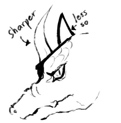
Just a suggestion here ^^, perhaps you should consider varying your lineart value? Try using more brush sizes, especially bigger ones to highlight the different parts of the dragon ( curves, fur and scales. )
Different stroke thickness can vary the look of the drawing, and can have a major impact on what the viewers focus on first.
The white background can kinda swallow up the drawing when the lines are too thin and making it hard to see.
But maybe that's just me XD
Anyways, if you decide to try it, have fun!

Hi @ellyn-suraya,
Thanks, I really appreciate the feedback. I'll be sure to apply your advice to my next piece of work.