New Style Drawing- OC The Legion - Fenrir Class
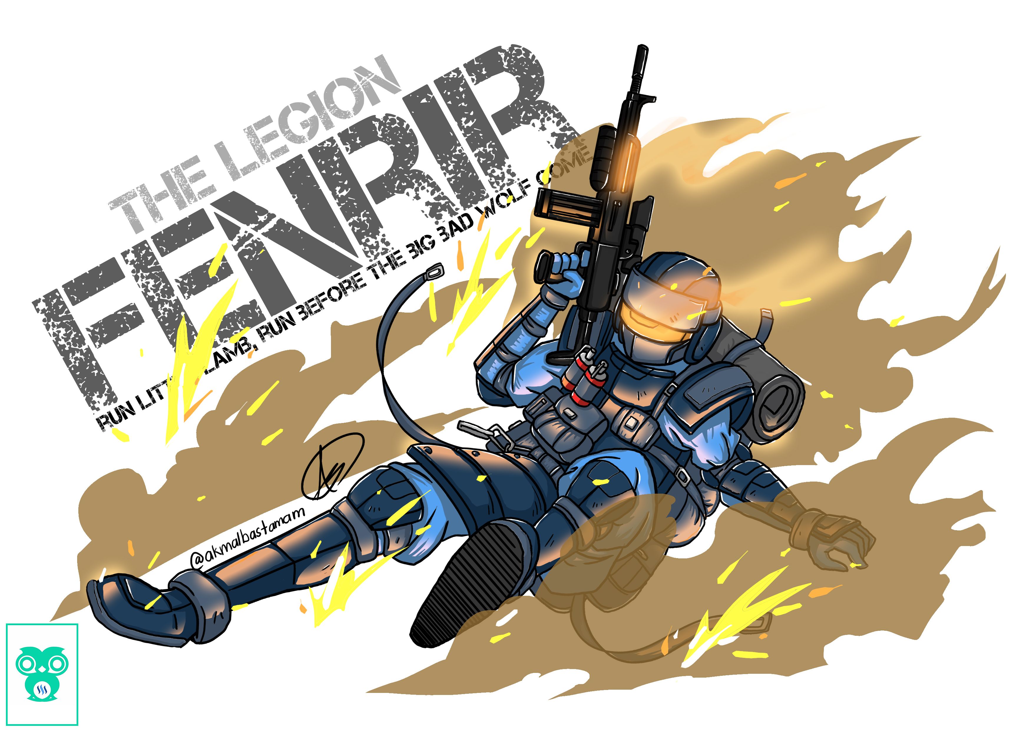
The Legion
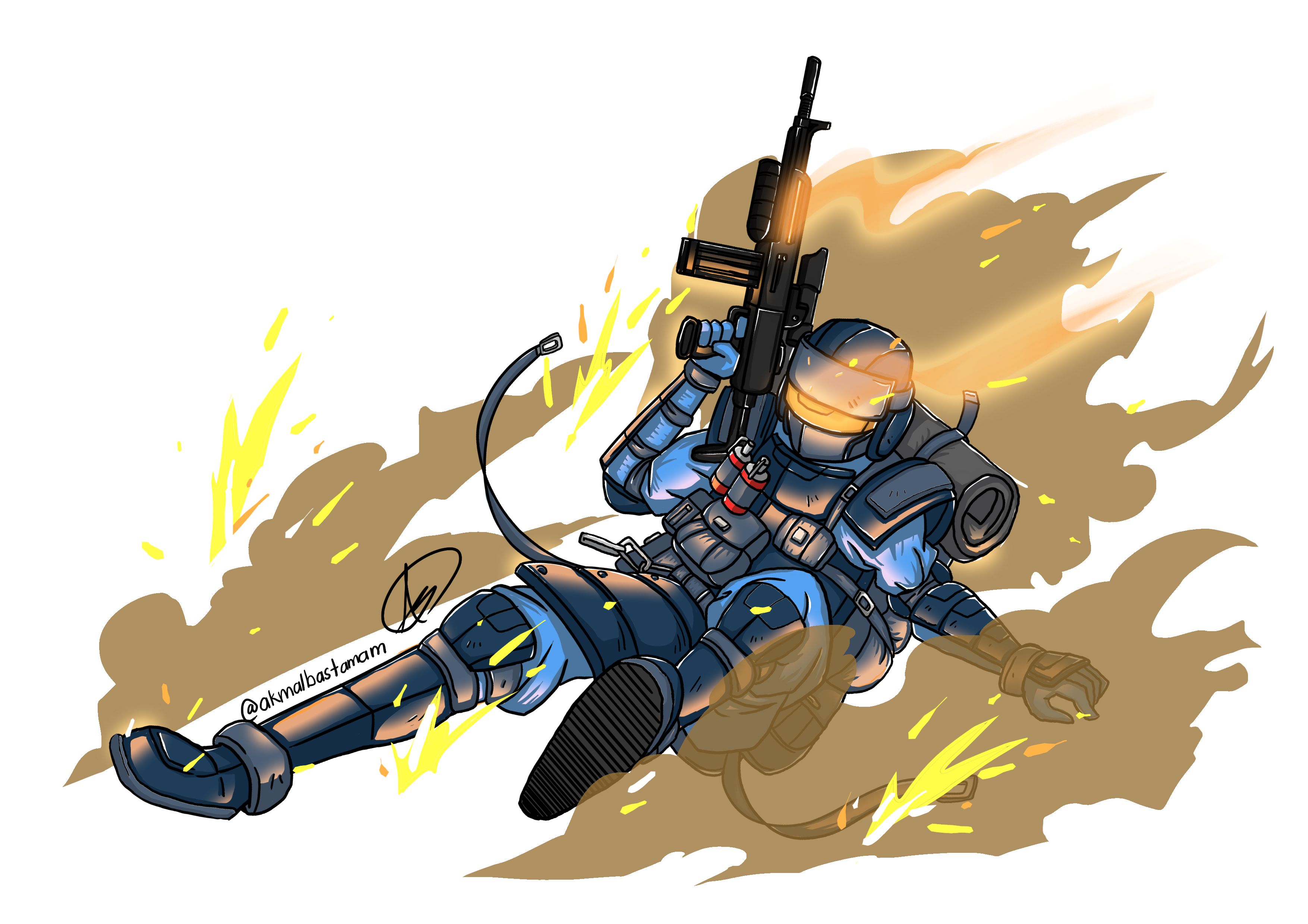
Lately, it started to bloom inside me, the feeling of wanted to create my own characters. When I surfed the internet, there were many artists that had made their own OC ( Original Character ). I want to have my own characters too. I love army, armor and war kind of stuff and I loves to play shooting games such as Battlefield, Call of Duty, Counter-Strike, Team Fortress and many more. I really like how the soldier gear up their equipment and weapons. So I decided to make my OCs based on my recently found love for armor and soldiers. Thus, I had made 'The Legion'. It actually sparks me when I attended my character design class. My 'boss' wanted us to create our OC based on what our liking and preferences. Just like Team Fortress game, there are two sides, Blue and Red but in my case, there are 'The Legion' and 'Spiders'. I start with 'The Legion' first. For now, I only had 4 members on it. There the tank class, 'Goliath'. He's the big guy that acts as a shield that protects his allies. Healer class, 'Heka' that heal and buff allies. 'Artemis', basically a sniper class and the close quarter combat class, 'Fenrir'. Today I want to share the process of creating 'Fenrir'.
Early Sketches
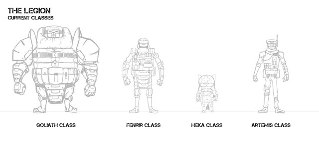
Fenrir
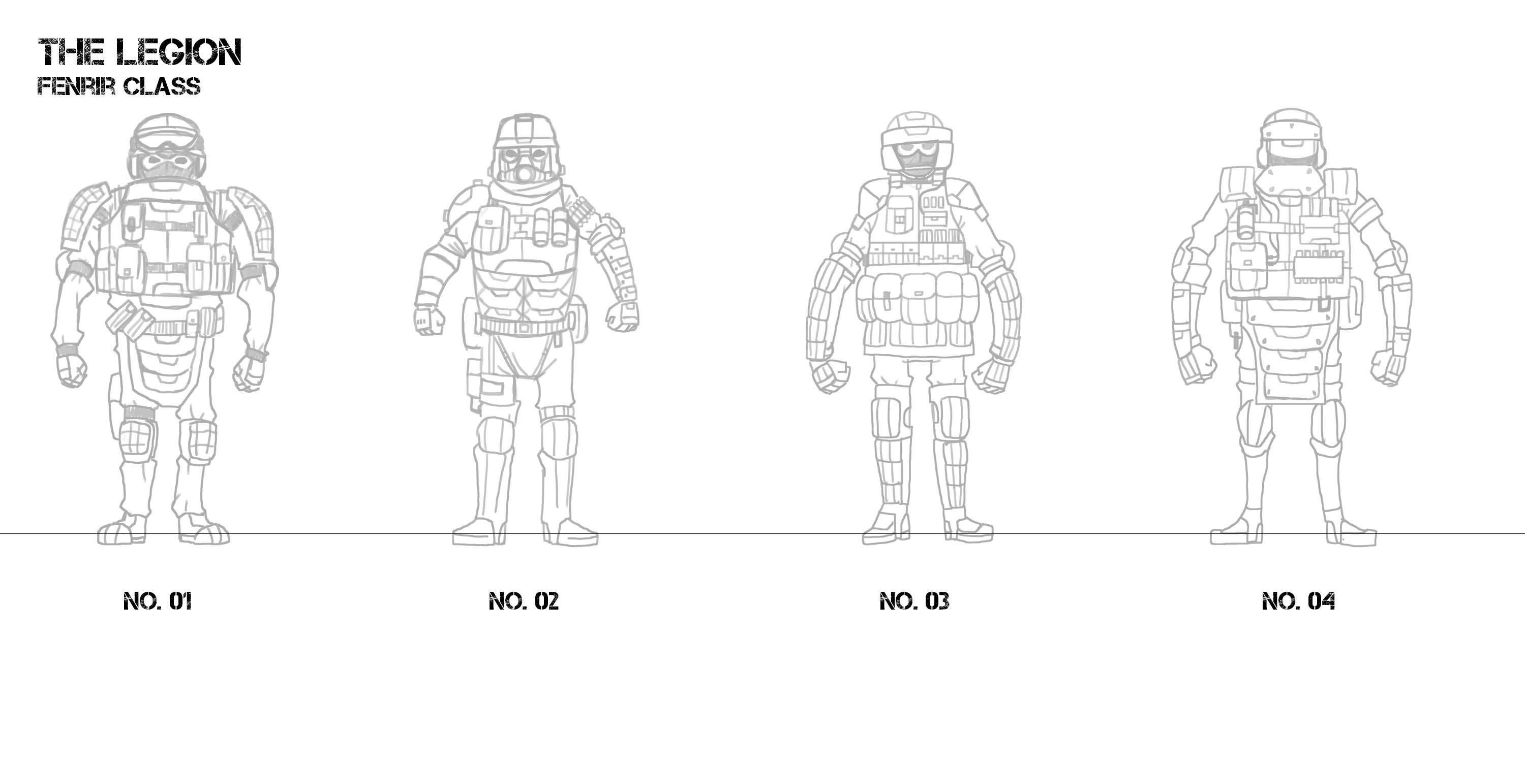
- Fenrir, like its name, suggests (Norse Mythology) a wolf-like monster, chained by Gleipnir but destined to be released during Ragnarok. They are the hunter, experts using close quarter combat weapons and have swift and agile movement like wolf. I like at add that they have like this skill that 'chain' them and when releasing it will give them temporarily boosts in strength and speed. Their visor will glow when they active this skill. Hahaha, this looks like skill in a game right? I think that this skills will be a good reference to the Fenrir in Norse Myth as it's been chained and will be released during Ragnarok. ^-^
You can check the Goliath Class here > OC The Legion - Goliath Class
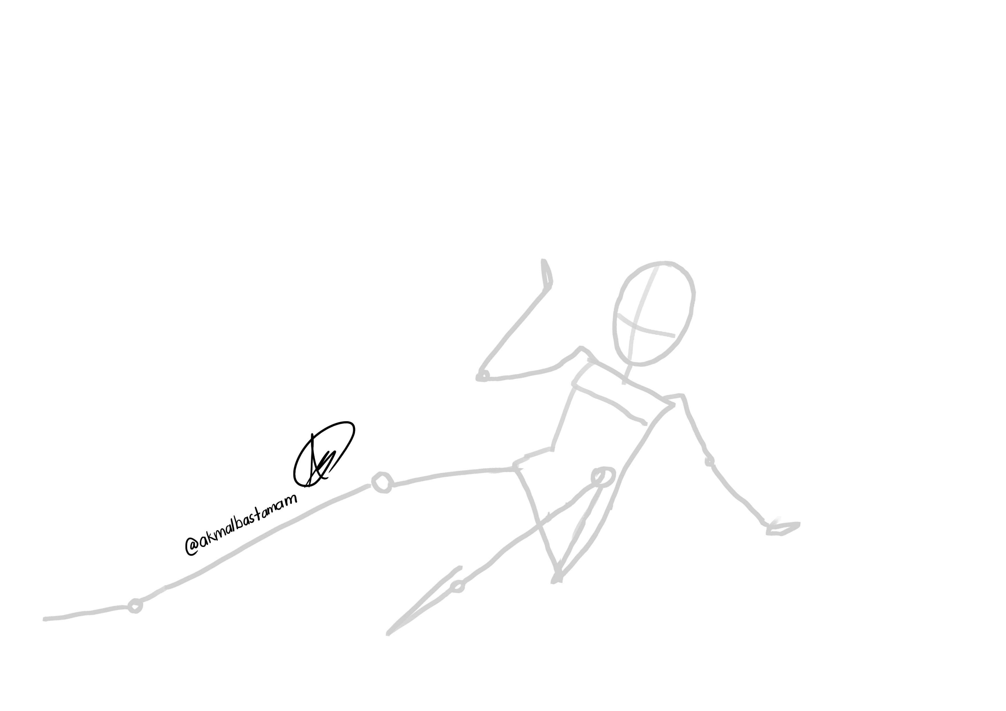
Gesture
First, we must focus on the gesture first. It acts as a guideline for our Fenrir's pose. For this, I had to borrow a reference on the pose by johneugene. Go check him/her out, there a lot poses on guns.
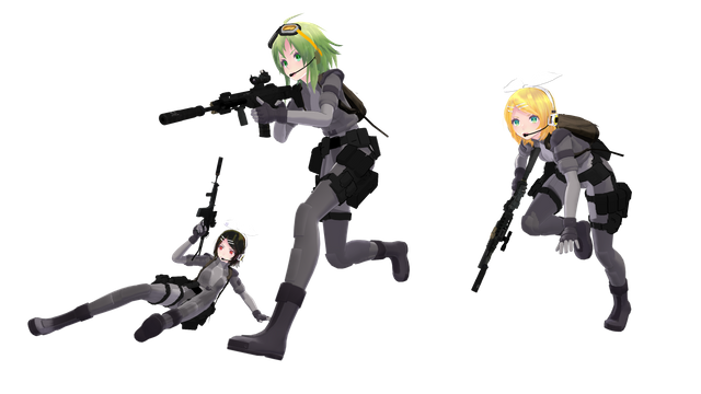
Based on the black hair girl, I drew a simple gesture. I like her pose cuz it can visually enhance my Fenrir's agility.
Shape
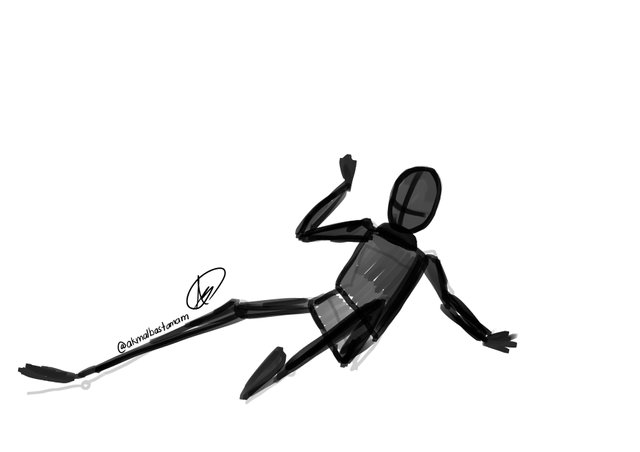
Based on the gesture, we can make the block of shapes that act as a silhouette for Fenrir.
Sketch
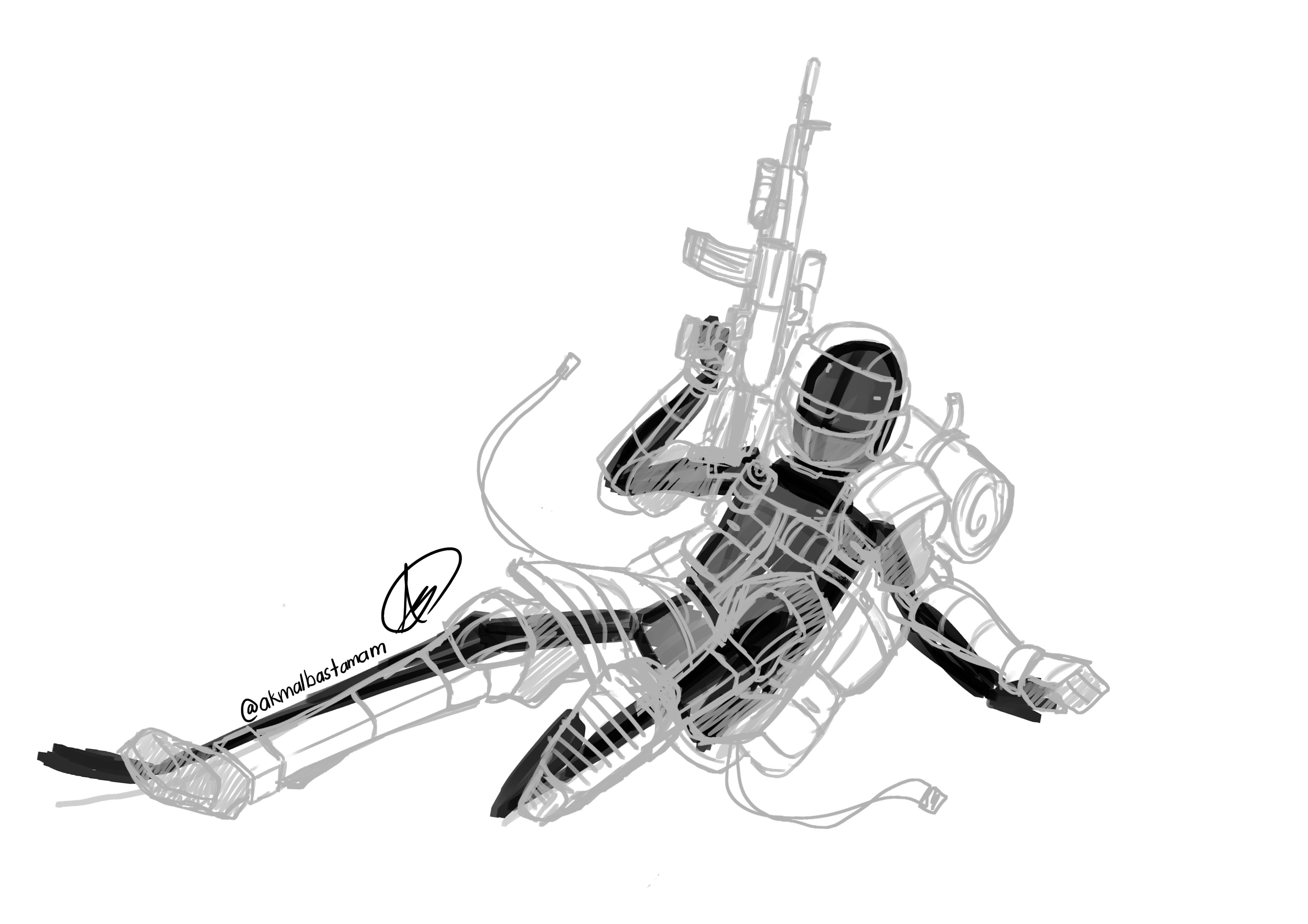
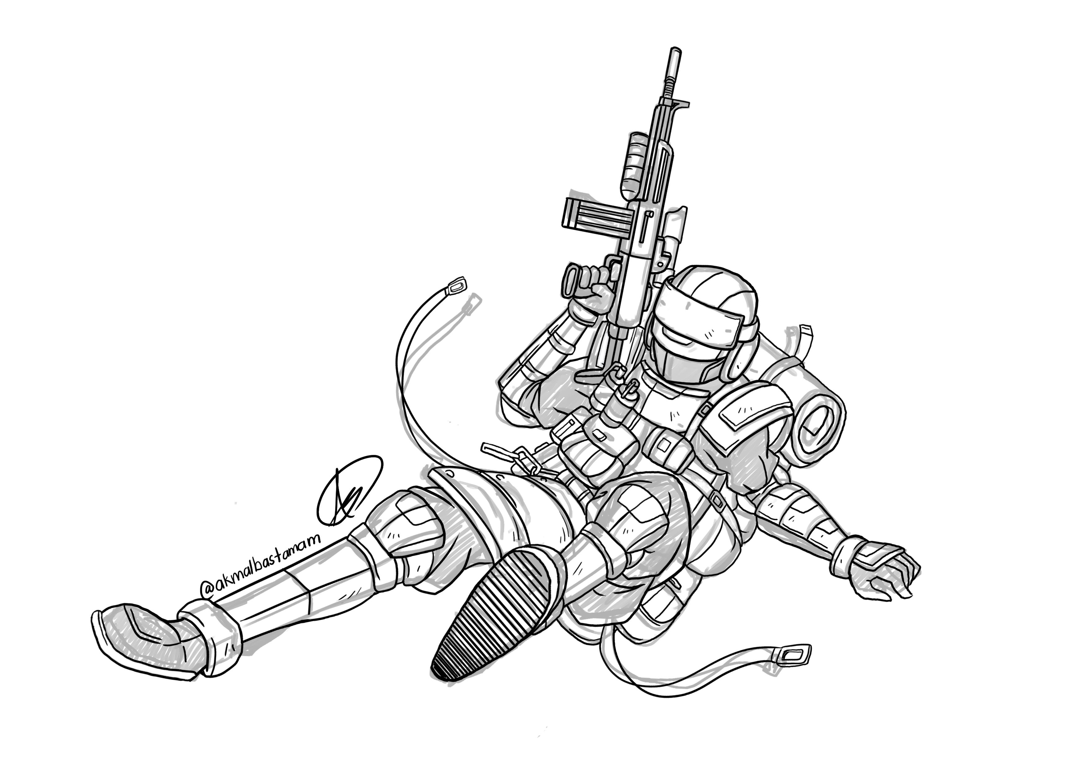
- The design was base on the early sketch that I made but with some twerks and add-on.
Line Art
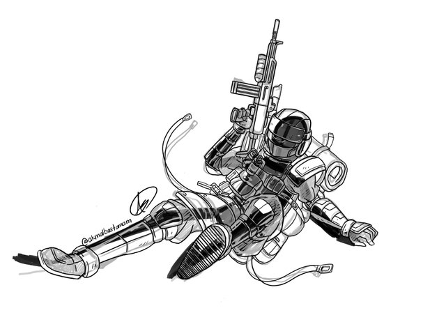
Base Color
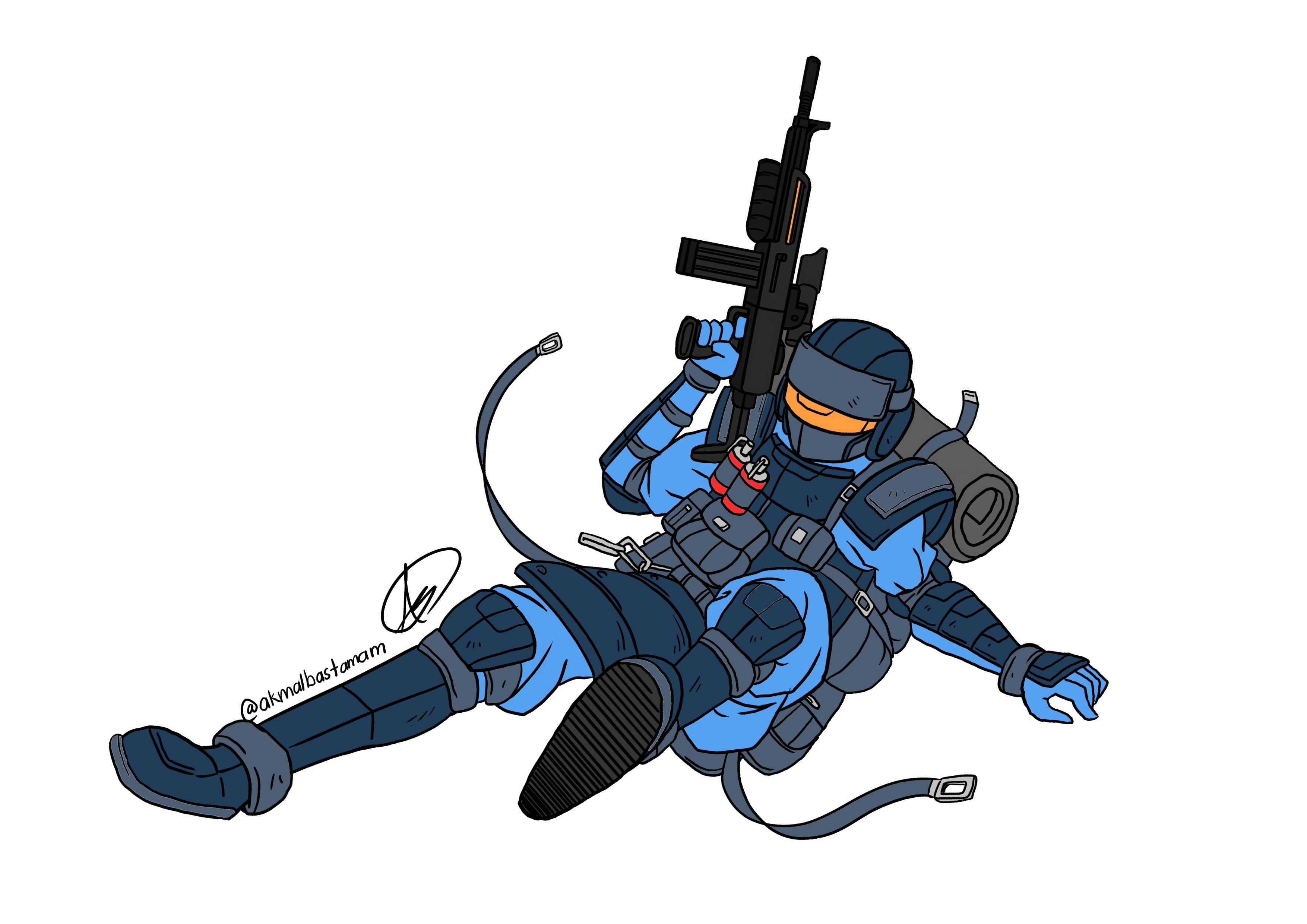
Now that we have finished with the line art, we can proceed with the coloring. For the color, I choose the same color pallets as my Goliath Class because they are from the same group 'The Legion' of course they need the same color uniform. ^^
Shader & Lighting
Let's add some shaders and lights to the base color. Without these two, our Fenrir will look plain.
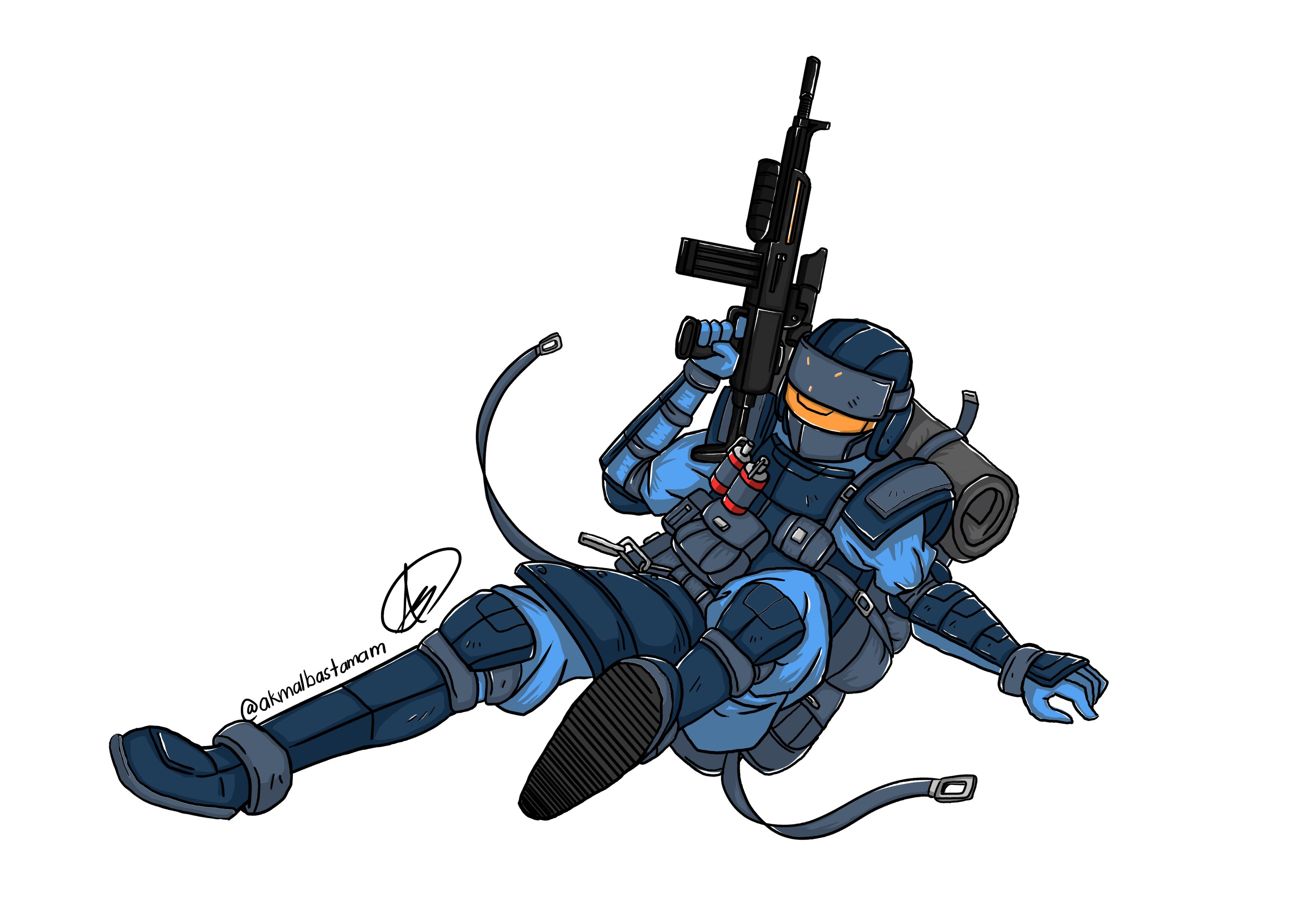
Smoke Effects
We can add some smoke effects to it. Now Fenrir will look like he sliding. He looks Cool!!
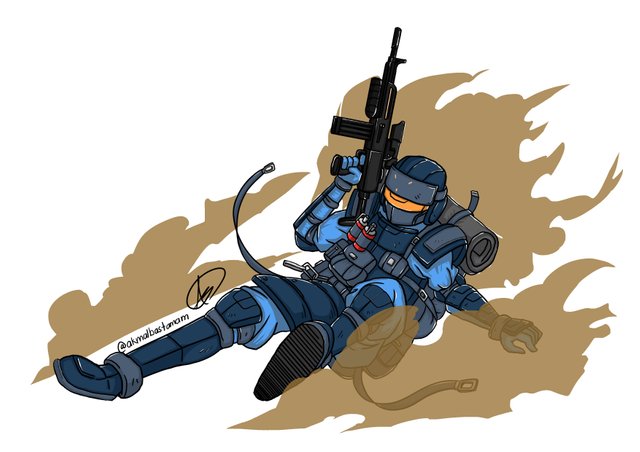
- To make the smoke see-through, I just lower the opacity of the color.
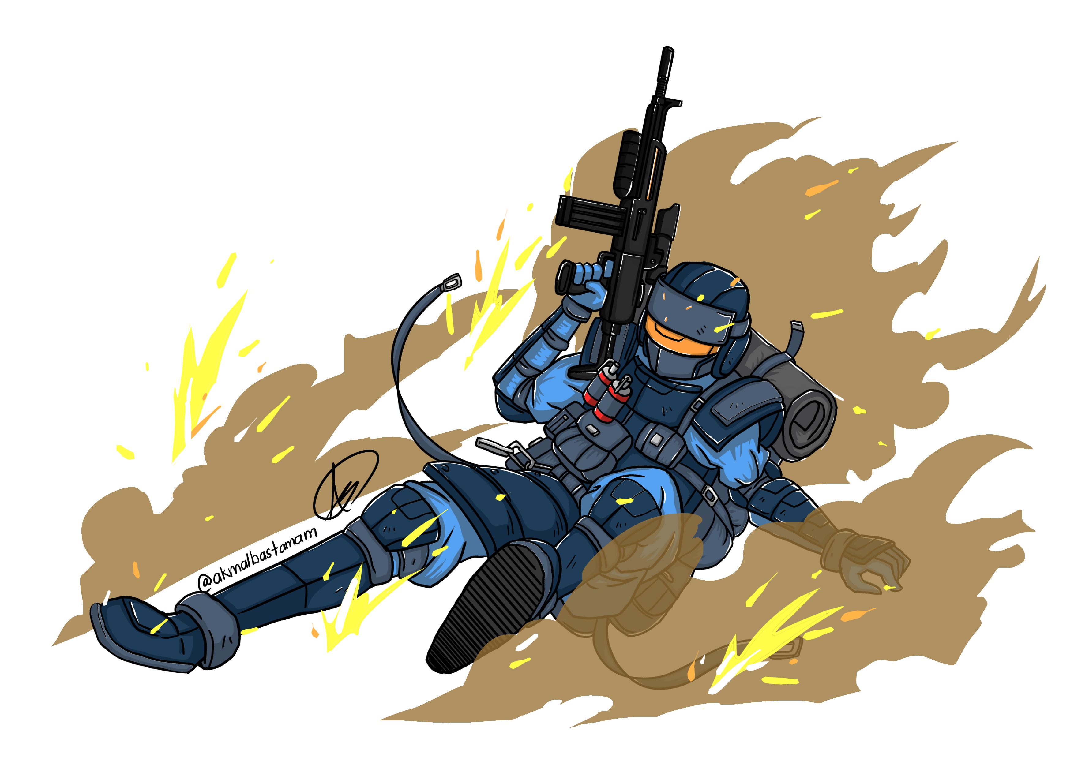
Gun Shots Effects
Not enough with the smokes, we add some gunshot fire effects. Bang! Bang! Now Fenrir looks even Bad ass as he is sliding through enemies line hunting for his prey.
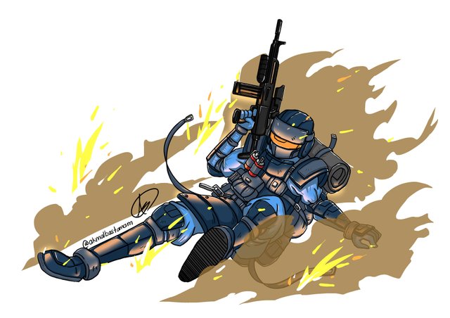
Glow Effects
Next, we can create some glow effects on Fenrir. It can show the reflected light from the gunshots and his skill effect.
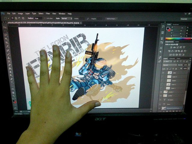
Fonts
Now let's add some fonts. I use fonts from Koczman Bálint. It has army look if it suit for Fenrir.

- Cool line for Fenrir 'Run little lamb, run before the big bad wolf come'
- I toned down the glow on his visor a bit
- The art may seem different from my Goliath Class because I trying to experiment with different style.
Here the Gif on the progress :

Yay! Finally finish! Here you go, The Legion Fenrir class. Goliath and Fenrir done! Heka and Artemis on the way. I hope you guys able to learn something from this. I also hope that I can get better in drawing and to improve my skill in the future. Bye guys! See you guys in the next post!
Bye~ Bye

Animated by zord189
Banner by zomagic
Logo Design by Cartoonist Pandan
It's always good to get references, but there are things to beware when it comes to poses, especially referencing straight out of 3D characters...Imo, the references you used have decent line of action, which is usually stem out of either bad poses, cam angle, or over-accurate anatomy(this is rather apparent with 3D newbies since they usually don't apply exaggeration, and stretch & squash in 3D).
Avoid tracing the pose could help, but if u do, stylizes it abit with S-curves or similar.
That being said, this is just my opinion, could be wrong or right. 030
#jangankecam
ayyy... abam sifu!! mana saya tahu, 3d punya poses ada flaws, saya x dapat cari pose yg sliding guna weapon, tu yang saya guna 3d pose tu. hahaha well it only for the reference I think, later let me take a photograph of you doing poses that I want ok? I belaja hahaha. thank you for the comment. Muah cikid
#jangankecamsayadalamvanguard
Punca flaw references 3D bukannya sebab dia 3D, tapi depend on rig, & poser nya. Selalunya kalau posernya tak mahir, pose dia buat akan rasa kaku.
Anyway kenapa pula nak guna aku jadi reference, norbert kan ada? x'D
nobert hilang *blink *blink
yelah tu
uish epic bro improve bnyk nih! XD gud job
Thank you bro, seronok bila try lain style. ^^
mantap bro...
Terima kasih bro ^^
This looks so cool ^^
Thank you, so do you see the beauty of armor design? come join in... let it bloom inside you ^^ jk jk
Yes I do and I think people in armor are hot jk jk :P
Effects ko dah improve, wei 👌
Thanks wei, still x leh lawan style mecha hang ^^
terbaik design ni..mmg lawa!!
Terima kasih bro ^^
Great work :)!!!
Thank you ^^
Resteemed your article. This article was resteemed because you are part of the New Steemians project. You can learn more about it here: https://steemit.com/introduceyourself/@gaman/new-steemians-project-launch
Thank you ^^