What to know about the kits to be used by the 32 teams in the 2018 world cup (#part 1)
The 2018 world cup is around the corner and everyone is excited to see the 32 teams show off their best in the greatest soccer competition. Lets take a quick look at the kits that the teams will be using to play in the world cup. i will be providing some ratings and also give my thoughts on what i think about the design of the jersey
TUNISIA (3/10)
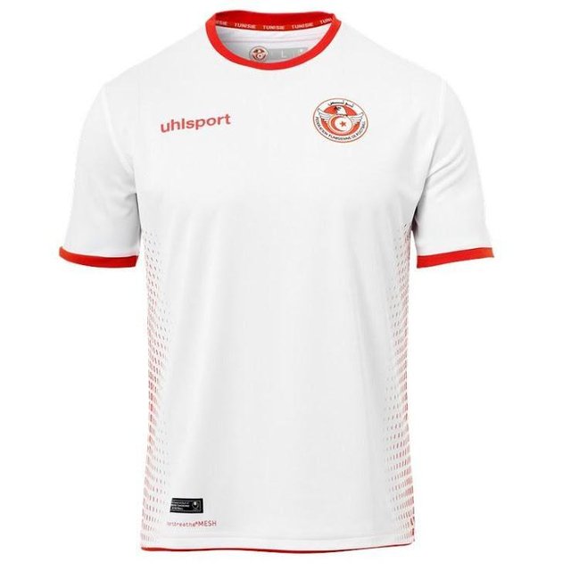
"Well the basic crew neck design (this time from Uhlsport) forms the new Tunisian kit is not so bad tho.Tunisia’s strip is a pretty bland offering." "The very complex dot pattern on each side of the white shirt brings a little flair to what otherwise would be actually be a pedestrian outfit."
PORTUGAL (3/10)
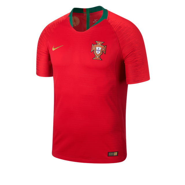
"Portugal’s regular dark red and green strip surely provides arguably the least effective of Nike’s Vapor Aeroswift template appearances in Russia." you will agree with me that the Gold Nike logos lift the design on the jersey slightly but in truth the kit is actually not much of a move on from the previous design used by the country.
SOUTH KOREA (1/10)

"The South Korea kit is just pretty uninspiring, Unlike the Poles’ strip though, this particular shirt features no additional design elements whatsoever."
COSTA RICA (4/10)
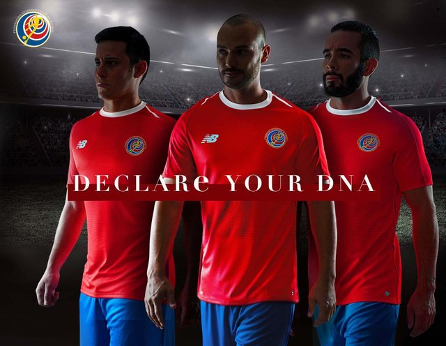
Costa Rica’s kit is pretty similar to a number of others kits to be seen. A fairly sober design from New Balance (one of two kits the US firm have in the 2018 World Cup) is enlivened by white darts on each shoulder.
IRAN (4/10)
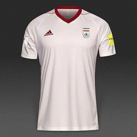
Well, It seems Iran will sport Adidas’ Tiro 17 teamwear template in Russia, but frankly their kit is yet to be confirmed. If the design is as expected, the white shirt will defintely be joined by red trim in a functional if unremarkable outfit."
POLAND (4/10)

The very beautiful and quite elegant jersey design obviously provides a good outlook on what is otherwise a very little single colour approach from Nike for Poland.
👍
Great analysis... At least none of them is busy! i like simple...