SEC | S20W3 | Data Analysis with Excel: (Charts, and data analysis techniques.)
 source source |
|---|
Hello teacher,
It's week 3 already and am here again. Learning for me never ends. It's been interesting exploring the excel sheet.
Explain what you understand by Excel charts and discuss three (3) types of Excel charts that you know with clear screenshots |
|---|
Excel charts from my understanding are charts used for representation of data in a worksheet. These Excel charts can also be called graphs. These charts helps us identify information virtually just by looking at the chats. For instance we can make comparison, see the highest value and lowest and we can also see trends on the charts just by looking at them.
3 types of Excel chats I know
- Area Charts
An Area charts is a chat used to show progression on how values change using shaded lines or colours. They are used to compare and analyze trends using time. These charts can also be used when we do not have so many values to compare.
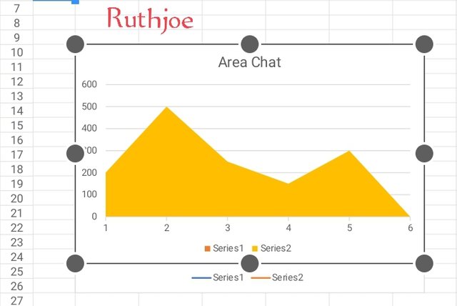 screenshot of an Area charts screenshot of an Area charts |
|---|
There are 3 types of An area chart namely:
Spine charts
Stacked charts
Step charts.
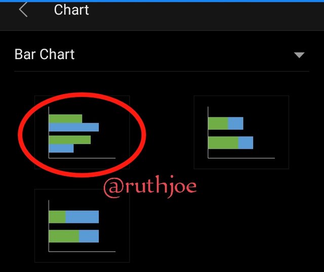
- Bar Charts
Bar charts are charts or graphs showing graphical representation and comparison between values using bars. The bar graphs is divided into two sections, the bar and the axis. The bars shows the number of items we have on a group.
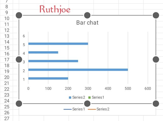 screenshot of a Bar chart screenshot of a Bar chart |
|---|
- Scatter charts
A scatter charts is a graphical representation use to show the relationship between values of variables usually two set of data. A scatter charts may be confused to be a line chart by some people but it's not a line chart. It is said that a scatter chart use coordinates system owned by Cartesian.
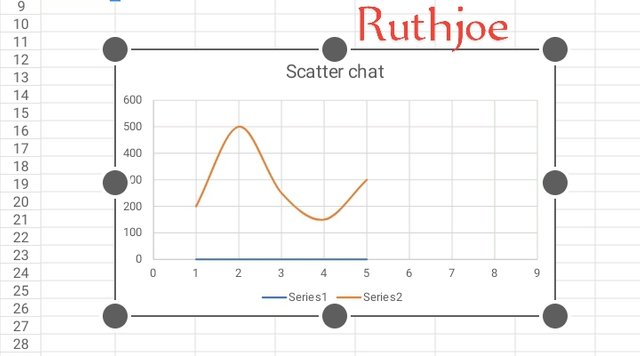 screenshot of scatter chart screenshot of scatter chart |
|---|
A scattered chart has 3 types namely
Negative correlation, positive correlation and no correlation. Generally a scattered chart is used when one variable can be measured and the other can not be measured.
Verify that you can read the information regarding chart location and creation in Excel and interpret it correctly using Bar Charts based on the data given below |
|---|
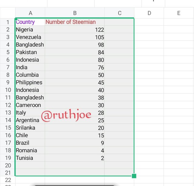
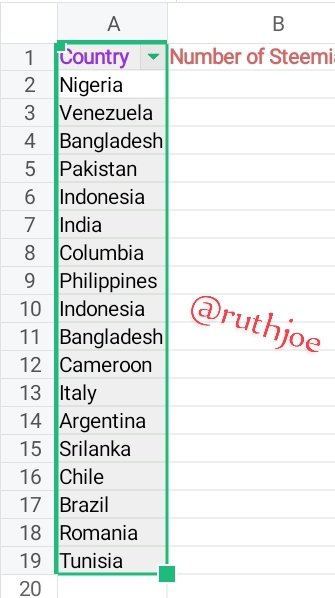
After filling in my figures on the worksheet I highlighted all of them as seen in screenshot A
Next I clicked on the tool bar and select insert then I locate charts as seen in screenshot B
 screenshot A screenshot A | 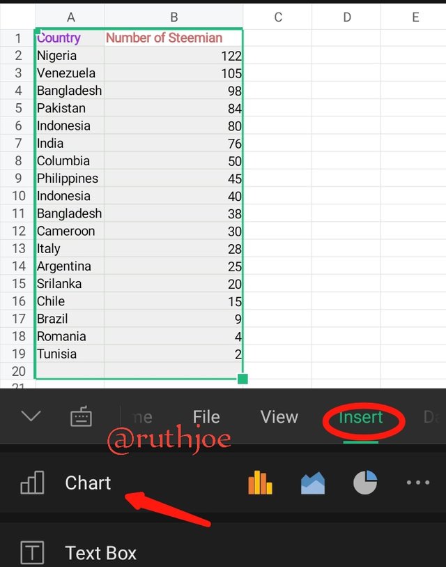 screenshot B screenshot B |
|---|
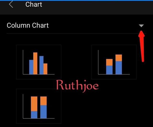
Next the when chart opens, I click on the drop arrow as seen on the screenshot C so that I can select the type of chart I want.
Then I select Bar chats as seen in screenshot D
 screenshot C screenshot C | 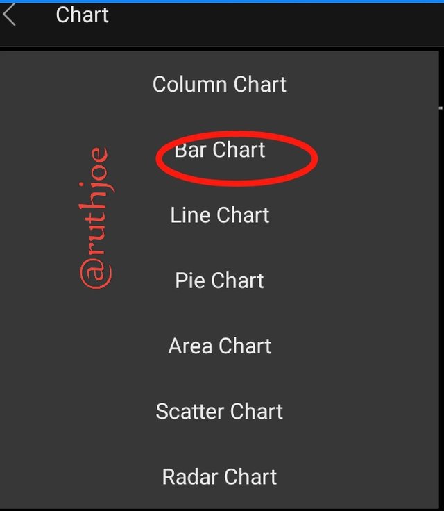 screenshot D screenshot D |
|---|
When bar charts open I select the one I want. As seen in the screenshot E.
The bar graph reflects on my sheet immediately and I click on chart title to change the title of the bar as seen on screenshot F
Next I put in my legend on the chat too after putting in the title as seen in screenshot G
 screenshot E screenshot E | 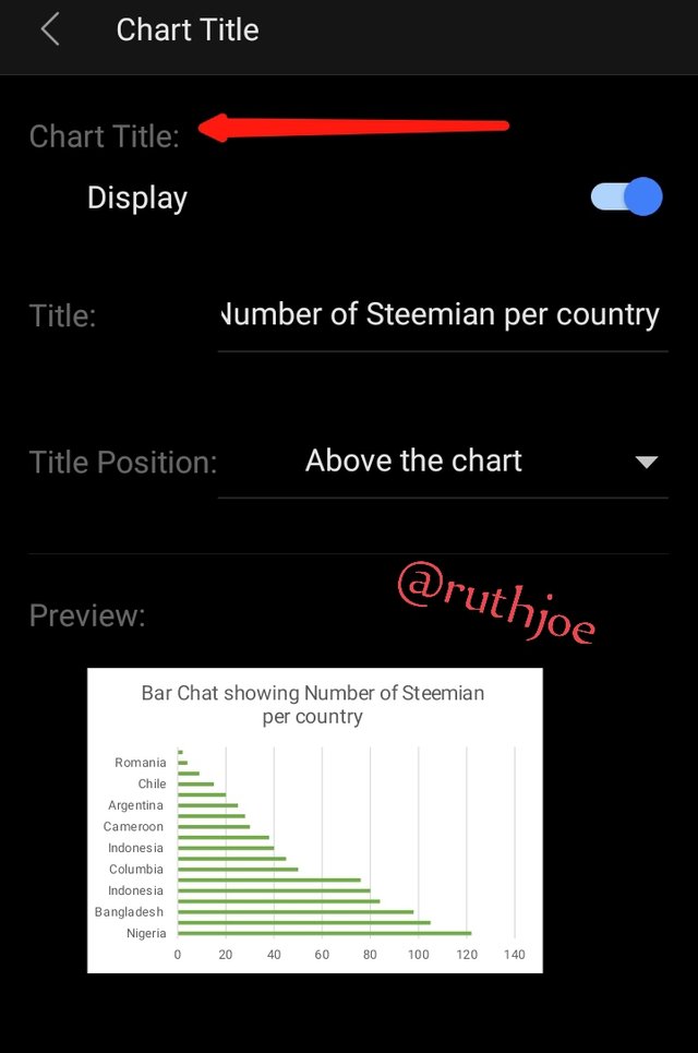 screenshot of F screenshot of F | 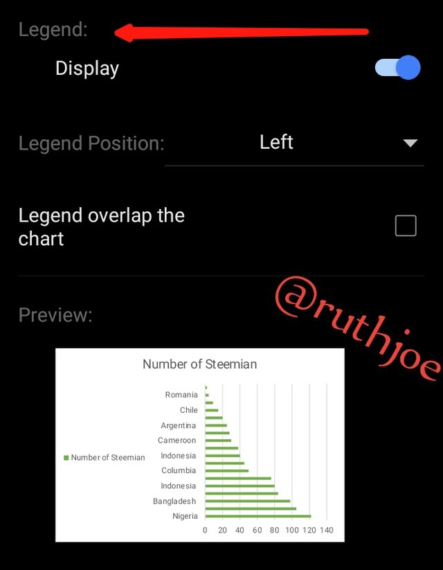 screenshot G screenshot G |
|---|
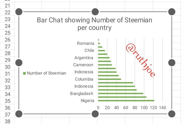 Final view of the bar chart Final view of the bar chart |
|---|
My interpretation of the bar charts
From the bar chart , The country with the highest number of Steemians which is 122 is the country Nigeria
The second highest number of Steemians is Venezuela with 105
The 3rd highest number of Steemians is Bangladesh with 98
The fourth highest number of Steemians is the country Pakistan with 84
The next is the country is Indonesia with 80 Steemians.
The next is India with 76 steemians
It continues until it gets to the country with the lowest number of Steemians which is Tunisia with 2
Briefly discuss Data Analysis Techniques In Excel and tell us how we can organize data in Excel for analysis |
|---|
Data Analysis are the process involved in the analyzing of data in order to get information needed to make a decision. Data Analysis helps us to make predictions and see trends on charts.
They are generally the process taken to interpret data using some techniques. Data analysis helps us make better planing In our personal lives and business for instance in business, we use Data analysis to predict the sales, get new marketing strategies and build growth.
How to organize data in Excel for analysis
- Format the cells and highlight them
- Sort your data and filter
- Apply your formulas
- Add a name to the cells
- Finally group into rows and columns
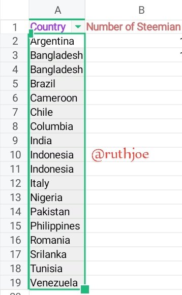
Using the data given in question 2, arrange the names of countries alphabetically using data sorting techniques. Screenshots are needed |
|---|
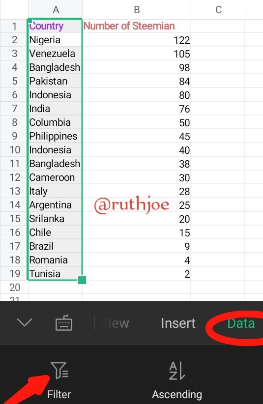
- First step is to highlight the countries given and click on the tool bar
- On the tool bar I select data and clicked on filter.
 |  |
|---|
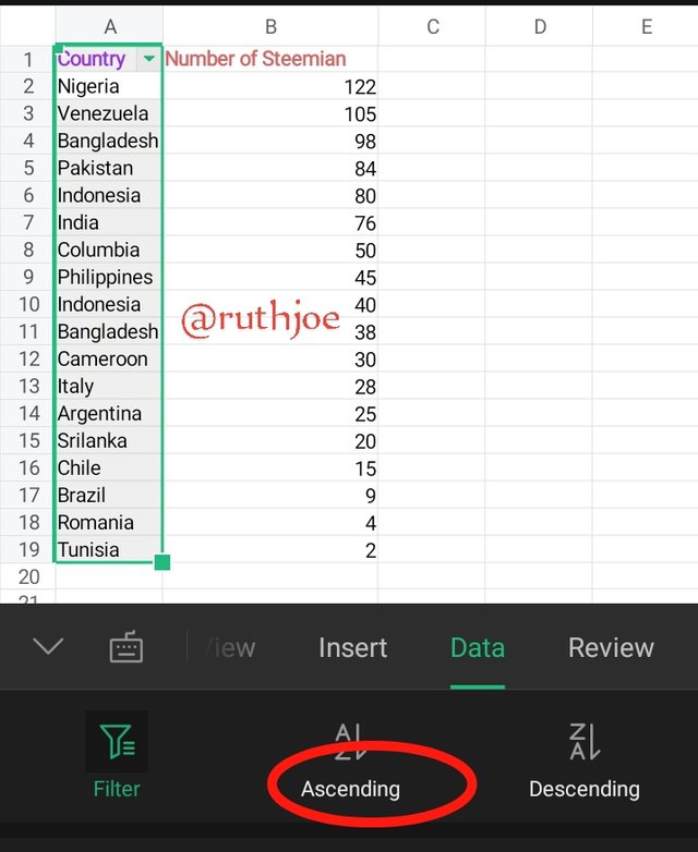
- In front of filter you will see ascending, descending. I selected the ascending since I want the countries to be arranged in alphabetical order
 |  |  |
|---|
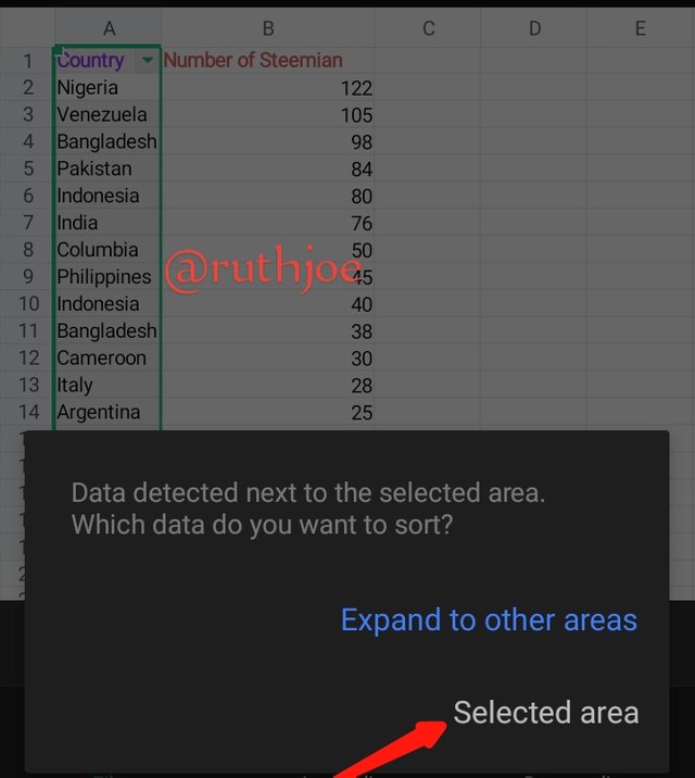
- An instruction pops up for me to select to other areas or selected areas, so I clicked on selected area and my countries are arranged into alphabetically in an ascending order.
I have come to the end of this week's home work. I would like to invite my friends to join this contest. @okere-blessing @jovita30 @sahmie
Upvoted. Thank You for sending some of your rewards to @null. It will make Steem stronger.
This post has been upvoted/supported by Team 7 via @philhughes. Our team supports content that adds to the community.
Thank you so much @philhughes