"SEC | S20W3 | Data Analysis with Excel: (Charts, and data analysis techniques.)

Hello Teachers,
It is another beautiful week with an interesting topic. So far so good and I must commend you all for the hard work you put in to teach us. I hope I was able to meet the questions asked as I present my homework below...
Explain what you understand by Excel charts and discuss three (3) types of Excel charts that you know with clear screenshots |
|---|
An Excel graph or chart is a visual interpretation of a worksheet's data. These charts allows us to make comparison, and identify the highest or lowest information given in a data.
There are countless types of Excel charts and they are; Histogram chart, Bar chart, Surface chart, Pie chart, Line Chart, Scatter chat, etc...
For this question,I will be discussing just three types:
• Bar Chart
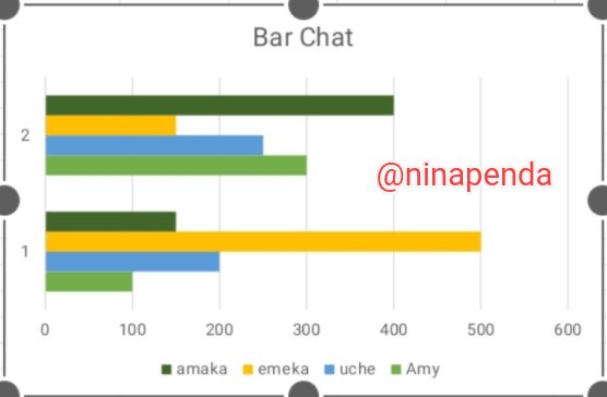
This is a graphical interpretation of data or number using bars. They are used to compare different types of data values or related categories.
• Pie Chart
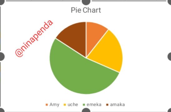
This is a circular kind of statistical chart which is divided into different slices to illustrate the proportion of a whole. All the different slices of the pie Chart add up to make the whole equal 100 percent (100%) and 360 degree.
• Line Chart
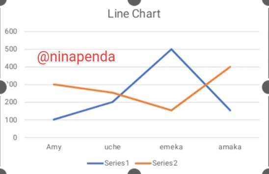
This is also known as curve chart and it is a graphical representation used in identifying data points connected by straight lines. It is a way of using data points on a line and to also show trend data.
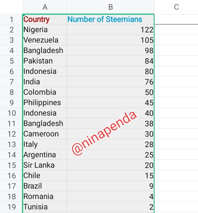
Verify that you can read the information regarding chart location and creation in Excel and interpret it correctly using Bar Charts based on the data given below |
|---|
1• Select your working data
2• Click on the menu bar to select insert and then select chart.
3• Click on the pointed arrow to select your preferred chart.
 1 1 | 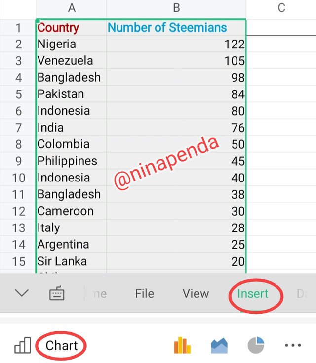 2 2 | 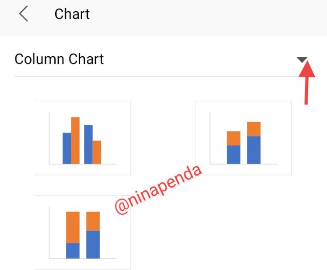 3 3 |
|---|
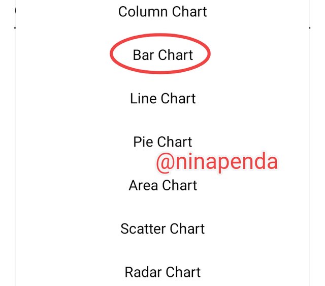
4• Select bar chart
5• Select the pattern you want the chart to appear
6• Change to your preferred color and select
 4 4 | 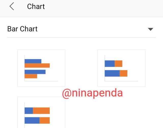 5 5 |  6 6 |
|---|
7• Click on chart title
8• Add your title
9• Lastly, we have the final result showing a bar chart of number of Steemians per country.
 7 7 | 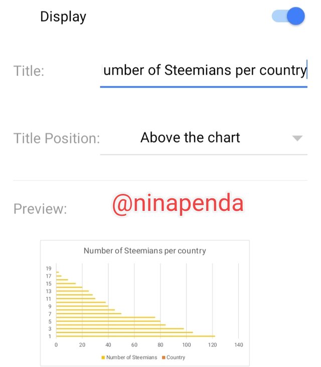 8 8 | 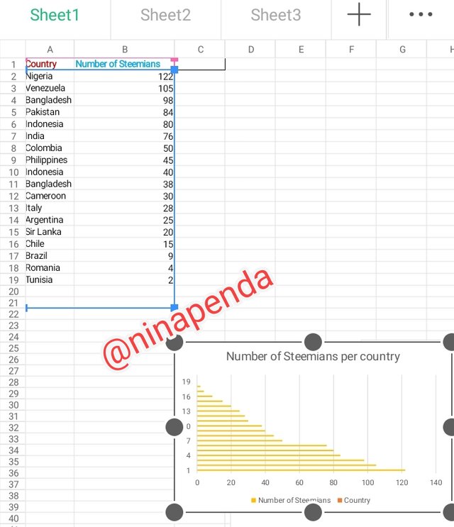 9 9 |
|---|
From the Bar chart, (we are checking from bottom to up which is descending order). We can see that;
• Nigeria which is the number one, has the highest number of Steemians of about 122 members.
• Followed by Venezuela 105 Steemians which is the second in the chart.
• Next is Bangladesh 98 Steemians which is the third in the chart.
• Fourth is Pakistan with 84 Steemians.
• Fifth is Indonesia with 80 Steemians.
• Sixth is India with 76 Steemians.
• On the Seventh row, we have Colombia with 50 Steemians.
• Eight is Philippines with 45 Steemians.
• We have Indonesia as the ninth on the chart with 40 Steemians.
• The tenth is Bangladesh with 38 Steemians.
• Eleventh is Cameroon with 30 Steemians.
• Twelfth is Italy with 28 Steemians.
• Thirteenth is Argentina with 25 Steemians.
• Fourteenth is SriLanka with 20 Steemians.
• Fifteenth is Chile with 15 Steemians.
• Sixteenth is Brazil with 9 Steemians.
• Seventeenth is Romania with 4 Steemians.
• lastly, we have Tunisia with just 2 Steemians.
Using the color beside the number of Steemians in the chart, I was able to read the information regarding chart location and creation in Excel.
Briefly discuss Data Analysis Techniques In Excel and tell us how we can organize data in Excel for analysis |
|---|
Data Analysis Techniques In Excel
There are so many features of Excel that allows us perform data analysis which includes; pivot table, charts and formulas.
From my observations so far, data analysis helps us to see trends,make predictions and sport outliers. It also helps us understand our data better in other to make good decisions, and data analysis isn't just for businesses, it can also be used for personal purposes like; tracking your fitness progress and monitor your spending habits etc.
How to organize data in Excel for Analysis
• Format cell to highlight
• Sort and filter data
• Apply formulas
• Assign a name to cells by creating name ranges.
• Using outlining to group rows & columns.
Using the data given in question 2, arrange the names of countries alphabetically using data sorting techniques. Screenshots are needed |
|---|
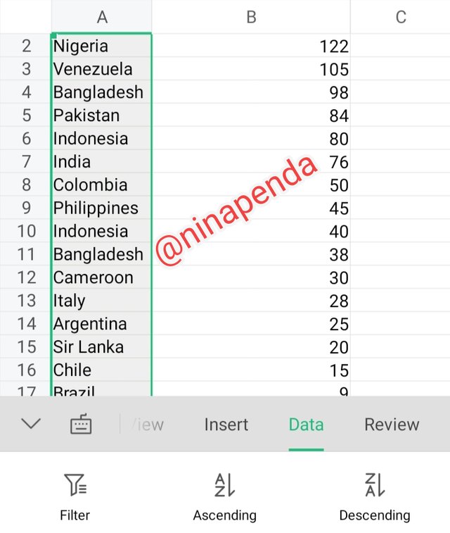 | Highlight the working data |
|---|
| Select filter | 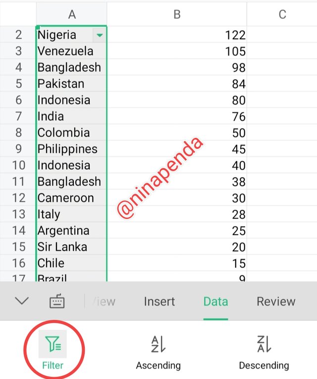 |
|---|
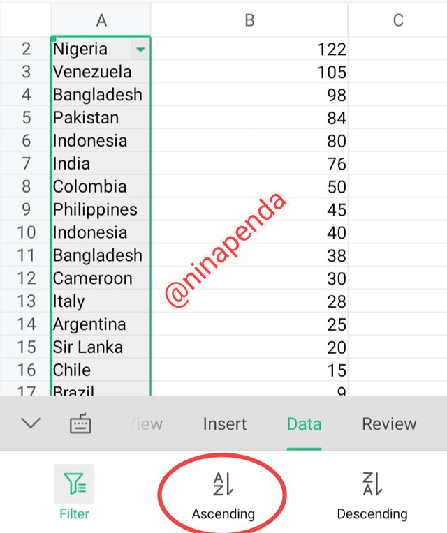 | Select ascending or descending |
|---|
| Select your working area or expand to other areas | 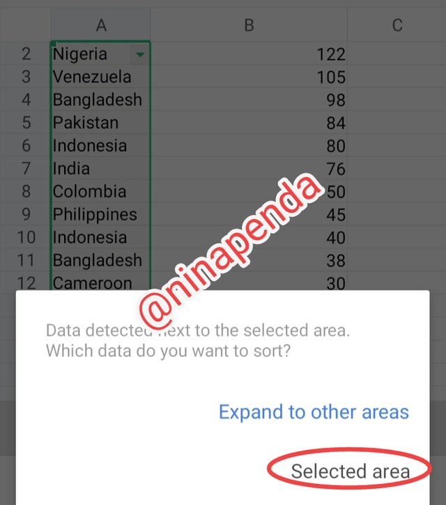 |
|---|
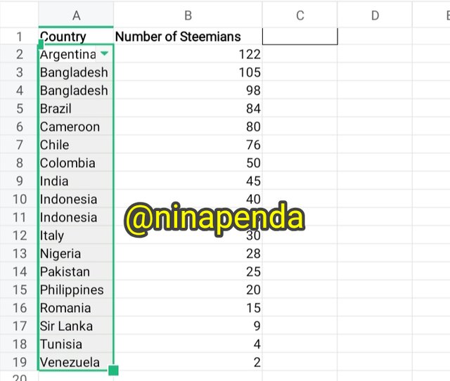 | From ascending order, here's the final result |
|---|
I invite @eliany @nancy0 @mariami

Upvoted. Thank You for sending some of your rewards to @null. It will make Steem stronger.
@tipu curate
Upvoted 👌 (Mana: 0/8) Get profit votes with @tipU :)
Thank you so much