SEC | S20W3 | Data Analysis with Excel: (Charts, and data analysis techniques.)
 |
|---|
It feels good to be here again this week guys! Am super excited about my participation. I must say, I've been getting a whole lot of value from the lectures dished out here weekly. That of this week is no exception. I will like to attempt the homework task for this week having gone through the lecture.
I hope y'all find my entry interesting. Without taking much of our time, Lets get into the business of the day guys
Sometimes I imagine how uninteresting and void of visual detail most data will look like if not for chart, there are so many things chart helps us to achieve when used, most important of it all is it ability to give a summary look yet filled with every information needed to be given just at a glance.
What are we really talking about? What are talking about chart in Excel. Chart are viable tool used in analysing data and trend such that it gives a very comprehensive and graphical view. Our teacher made reference to the consolidated booming report made by adeljose periodically while he neglected a very good example of his as well captured in each of his weekly summary Report.
This is just to let my teacher know I follow up not only this lecture but everything pertaining to this course. I think with what I've learnt in this lesson, I can improve in report that has to do with statistics. That said, Excel chart are in different forms and these forms are what makes it unique and distinct.
We have quite a number of them and am going to be mentioning them although my emphasis will be on just three which I have chosen to attempt this task. We have column chart, bar chart, line chart, pie chart, area chart, scatter chart and area chart. Of all these chart, I would be discussing just 3.
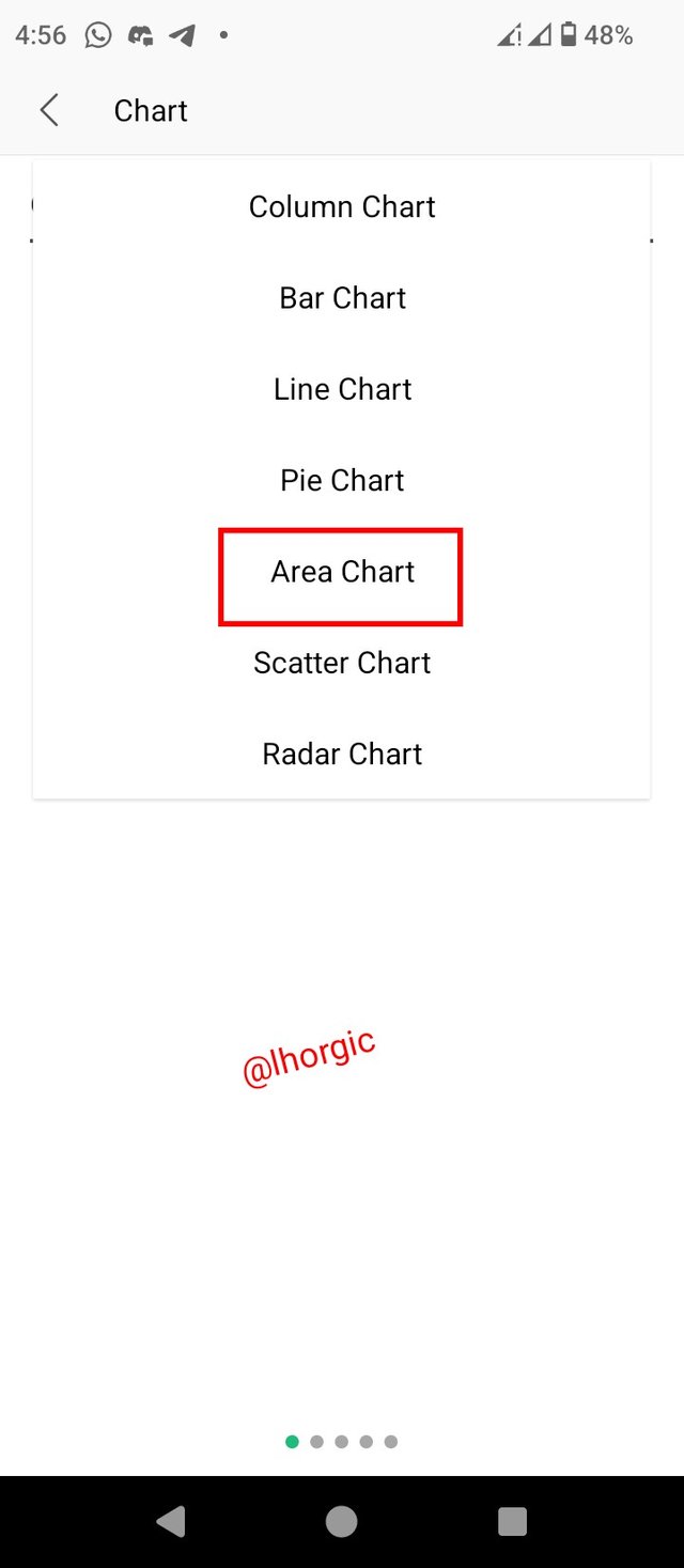
• Area Chart : This is a chart that is used to visually represent trend over a period of time capturing every form of change or event that has taken place withing a definite period of time. It's characterized with it mountain-like look depending on the flow of the data.
• Pie Chart: This is a chart that aims to convey proportion. It shows how much portion
a particular data has from the sum total of a whole portion. It's characterized with it circle-like shape showing different portion for the data analysed.
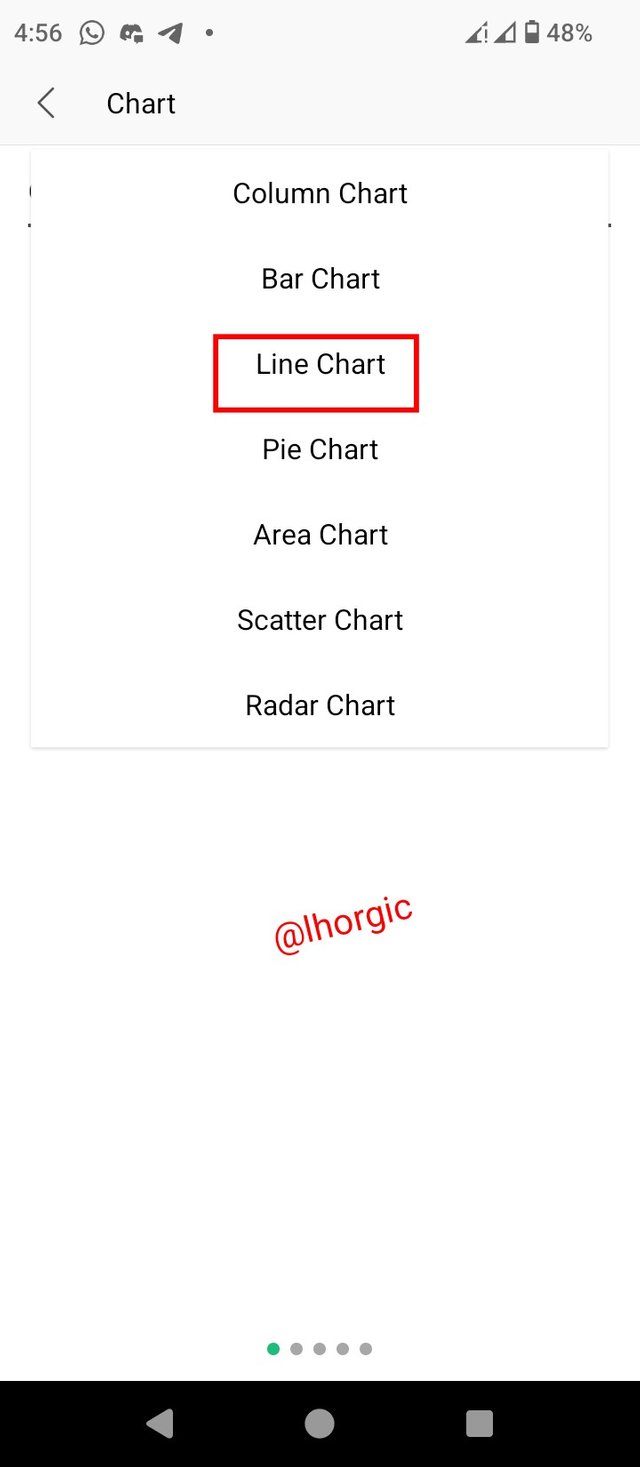
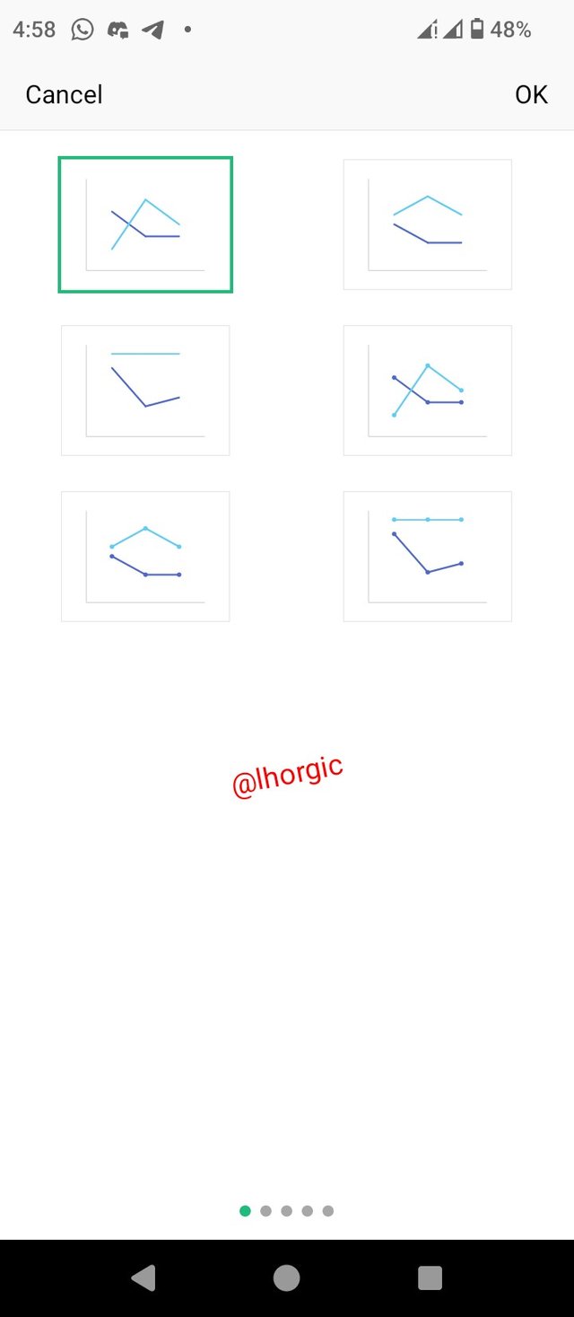
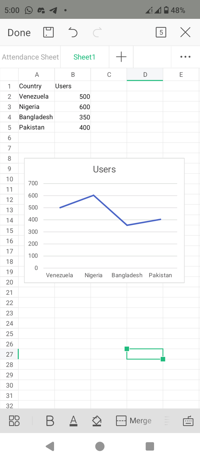
• Line Chart: line chart just as the name implies is used to analyze trends over a period of time. It's characterized with line running across the charts interface
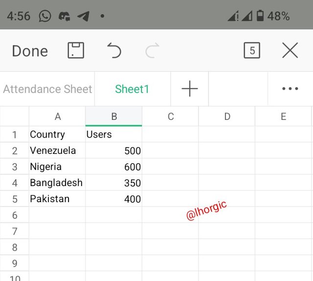
The first thing I did was to make a mini data entry which I would be needing for the charts just as seen below.
 |
|---|
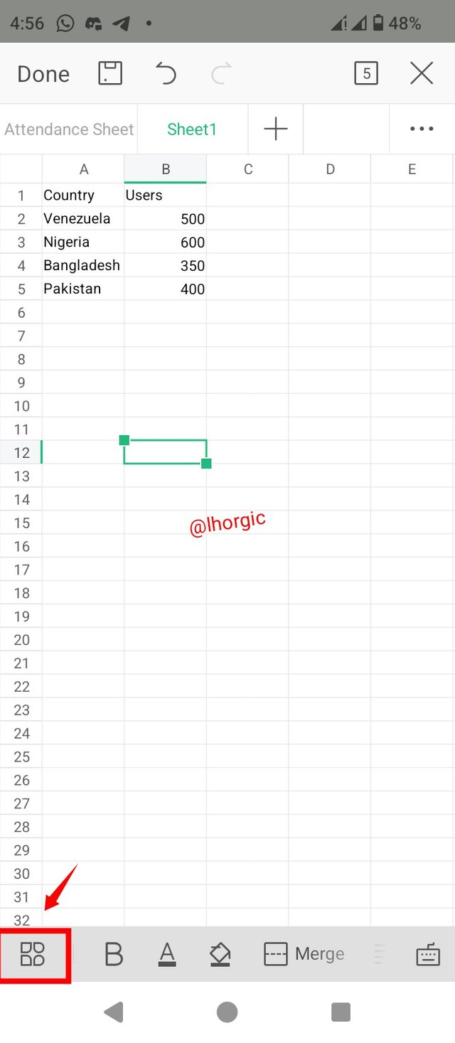
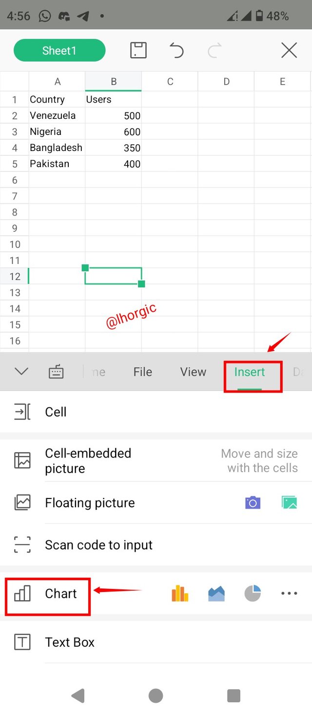
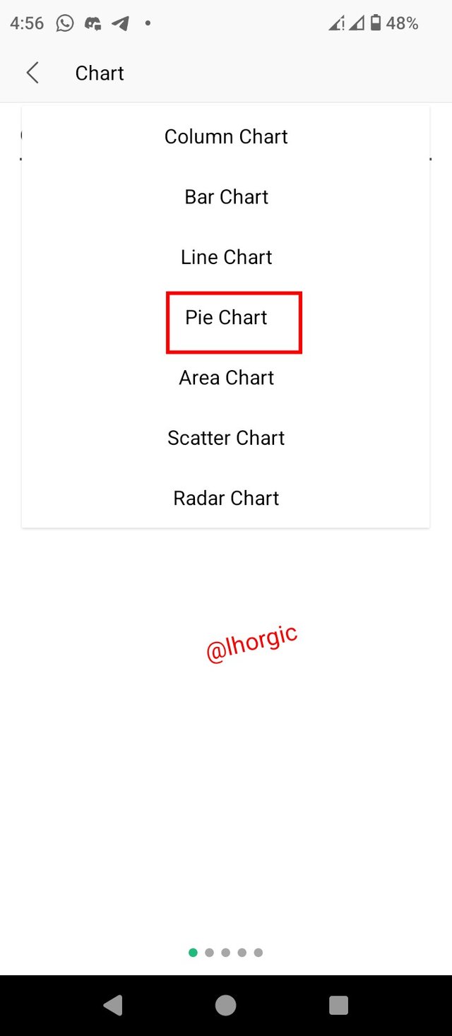
• Step 1: I located the menu button from which I got the insert button and then Chart.
I then selected the kind of chart I wanted to work on.
 |  |  |
|---|
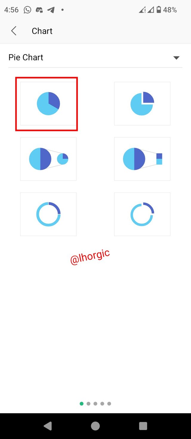
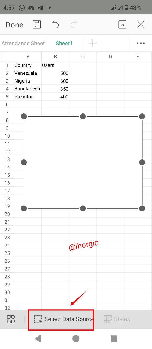
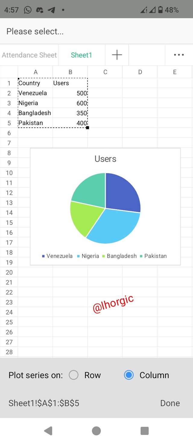
• Step 2: After selecting Pie Chart, I had to choose from the different types and then proceeded with ok. Afterwards, an interface appeared where I click on "select data source" and then highlighted my data. I clicked done and all was set for pie chart.
 |  |  |
|---|
• Step 3: I repeated the same process above to get the line chart just as seen in the images below.
 |  |  |
|---|
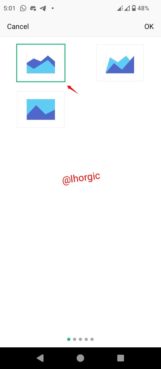
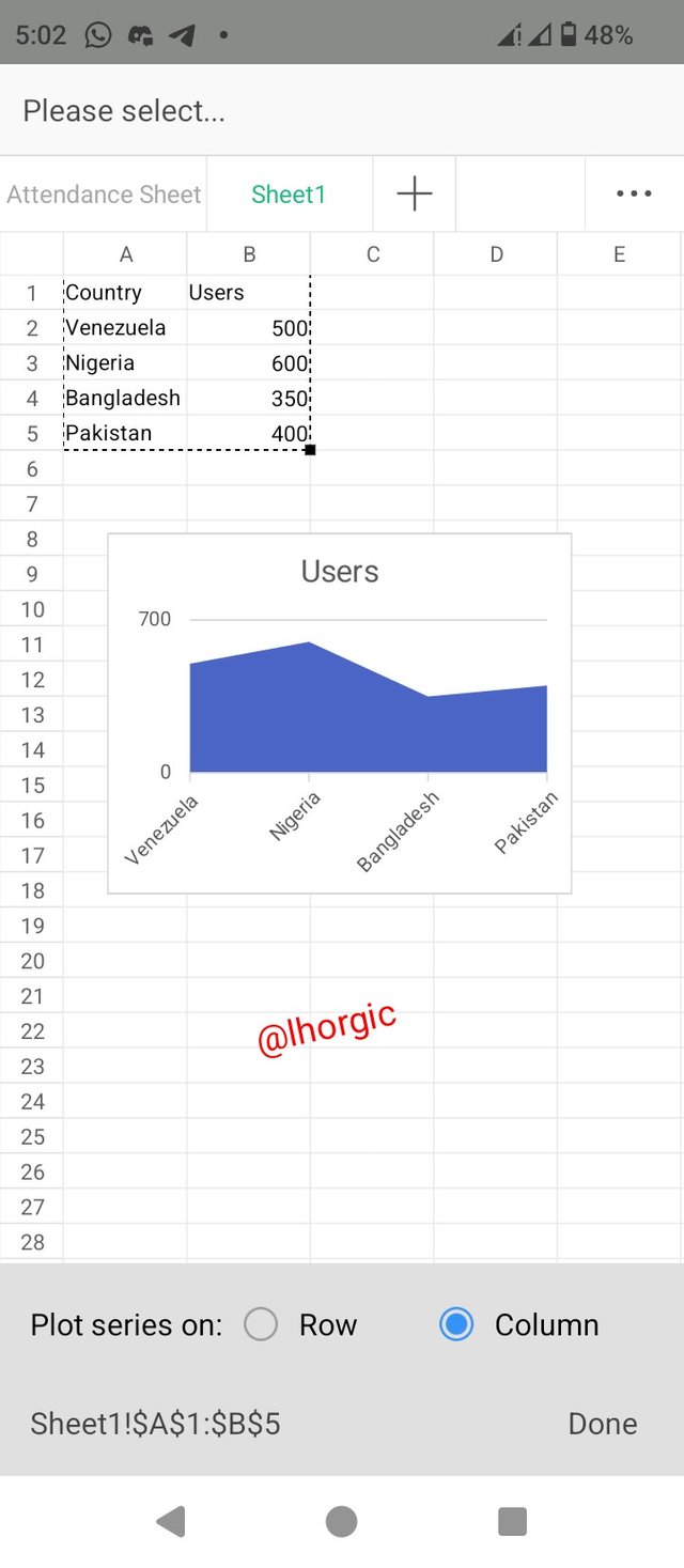
• Step 4: I repeated the same process about to get my Area Chart just as seen the images below.
 |  |  |
|---|
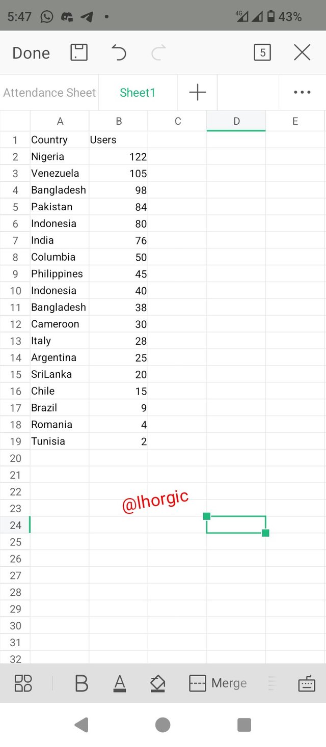
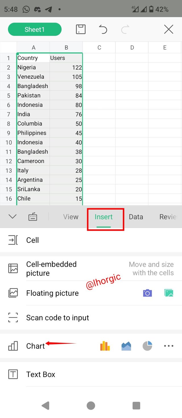
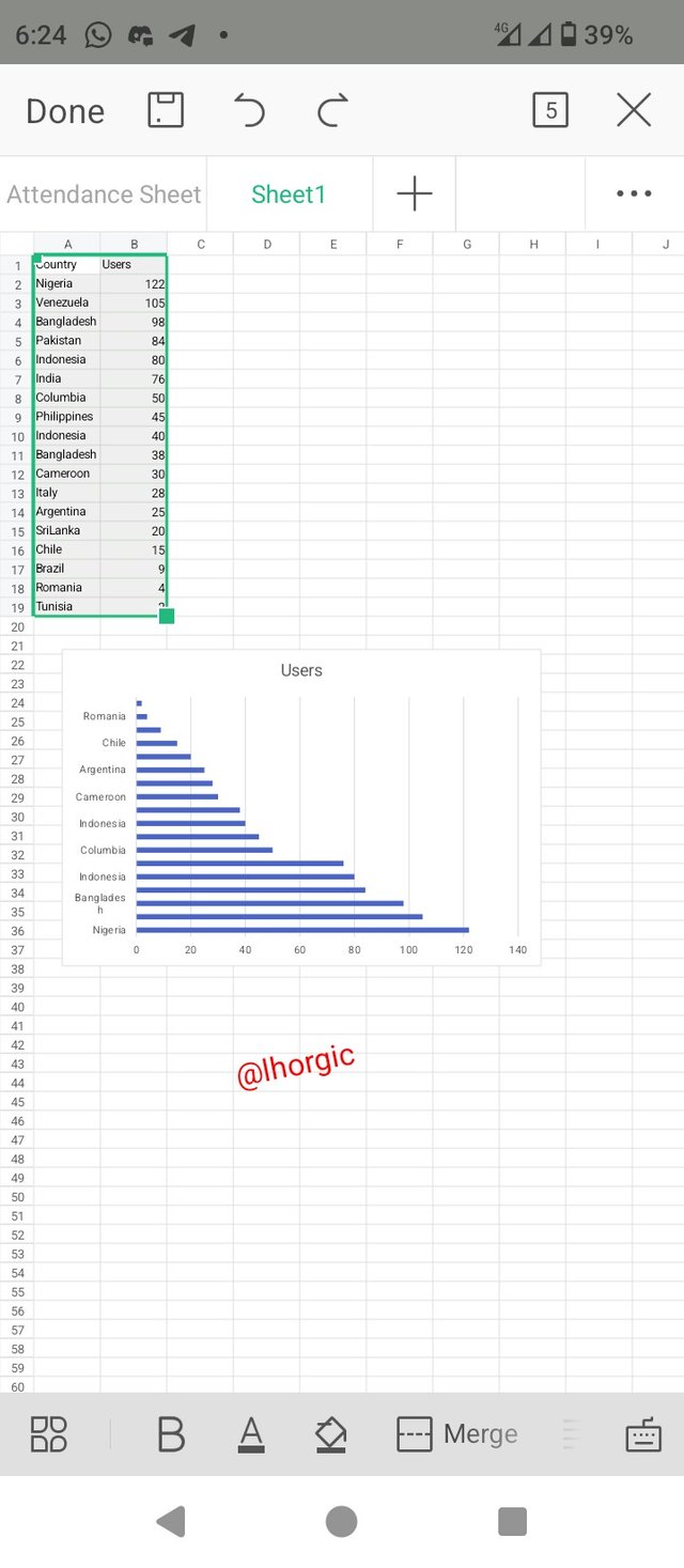
In this section, I want to prove that I can read information concerning chart and not only that, I can locate whatever chart I want to use for my data. For this task we have been asked to use Bar Chart for this task. I started by entering our data in the spreadsheet using the value given by our teacher. The screenshot is as seen below.
 |
|---|
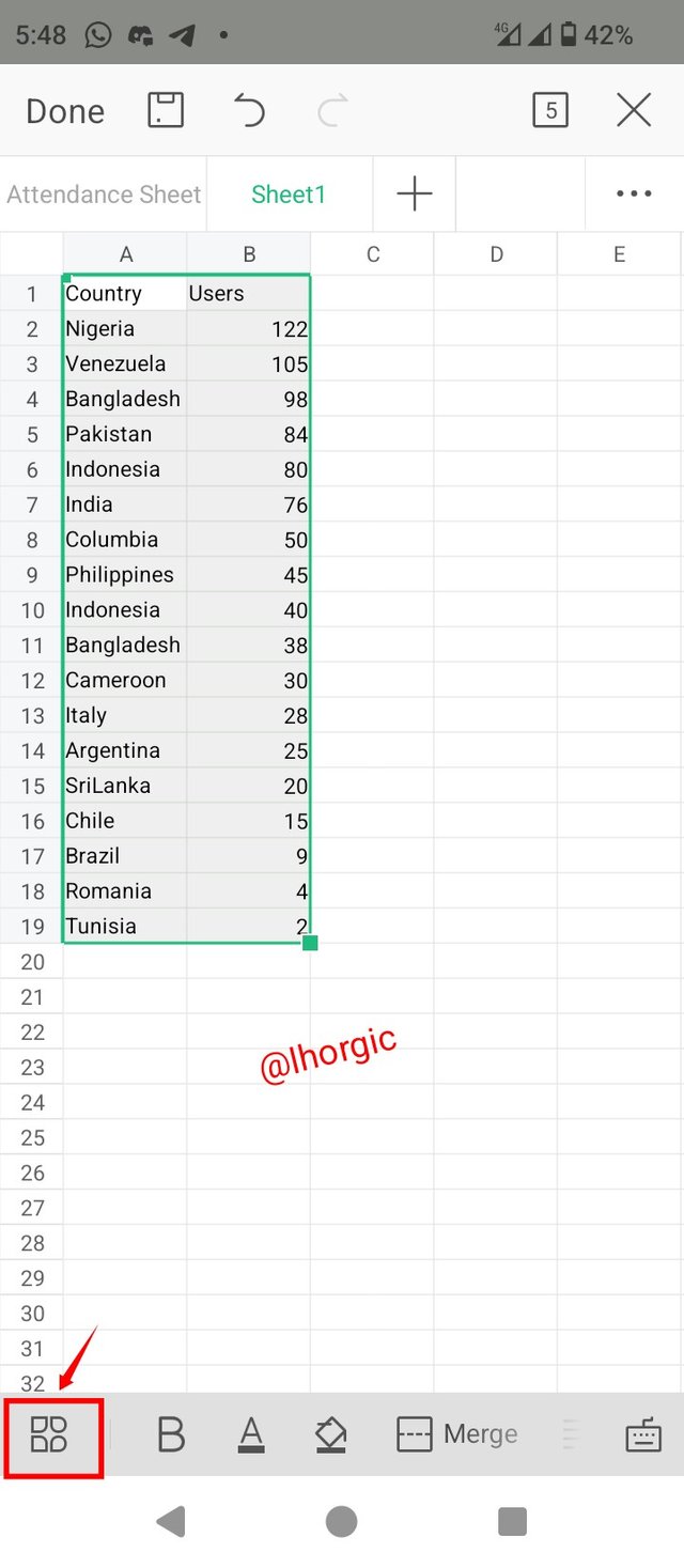
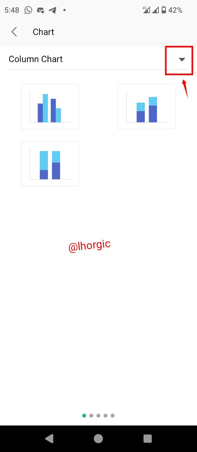
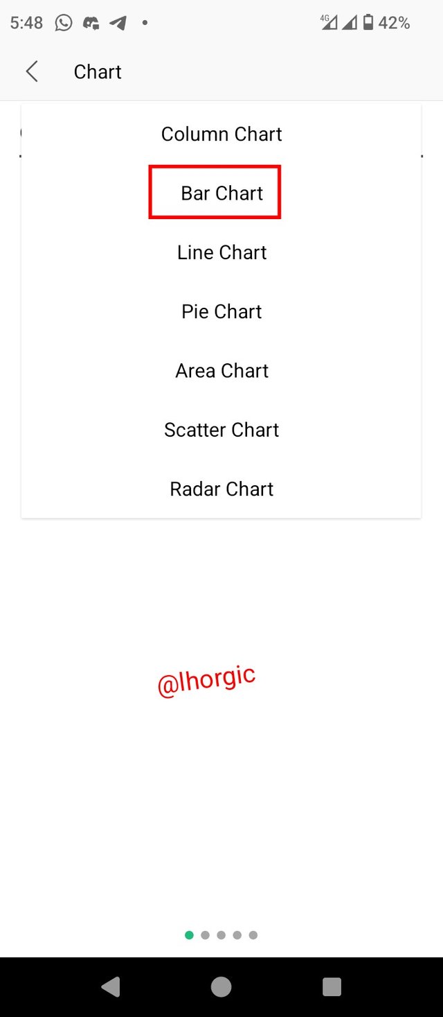
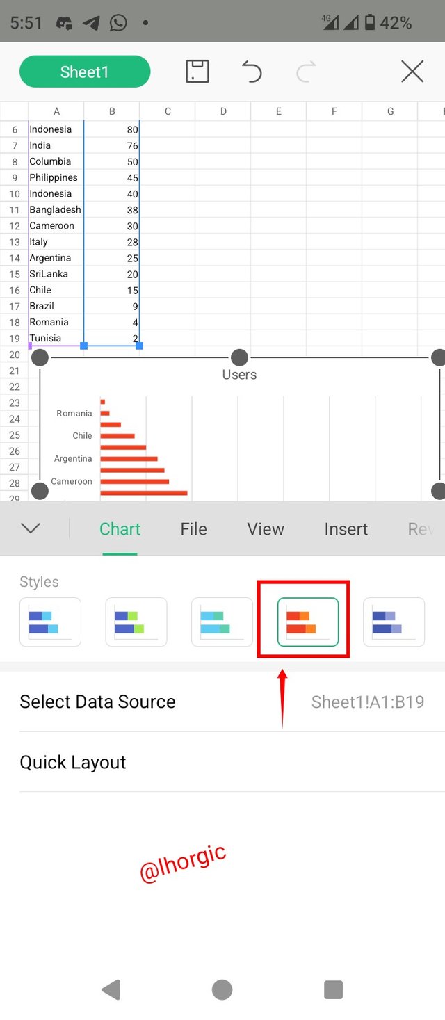
• Step 1: I first highlighted my data and then proceeded to the menu button, I clicked on it and then located the Insert button where I got my chart. The third image shows where I would select the particular chart (Bar Chart) am in need of.
 |  |  |
|---|
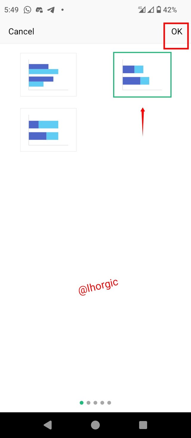
• Step 2: I selected Bar chart and then chose from the option the type I want and then clicked "ok." The result is as seen from the images below.
 |  |  |
|---|
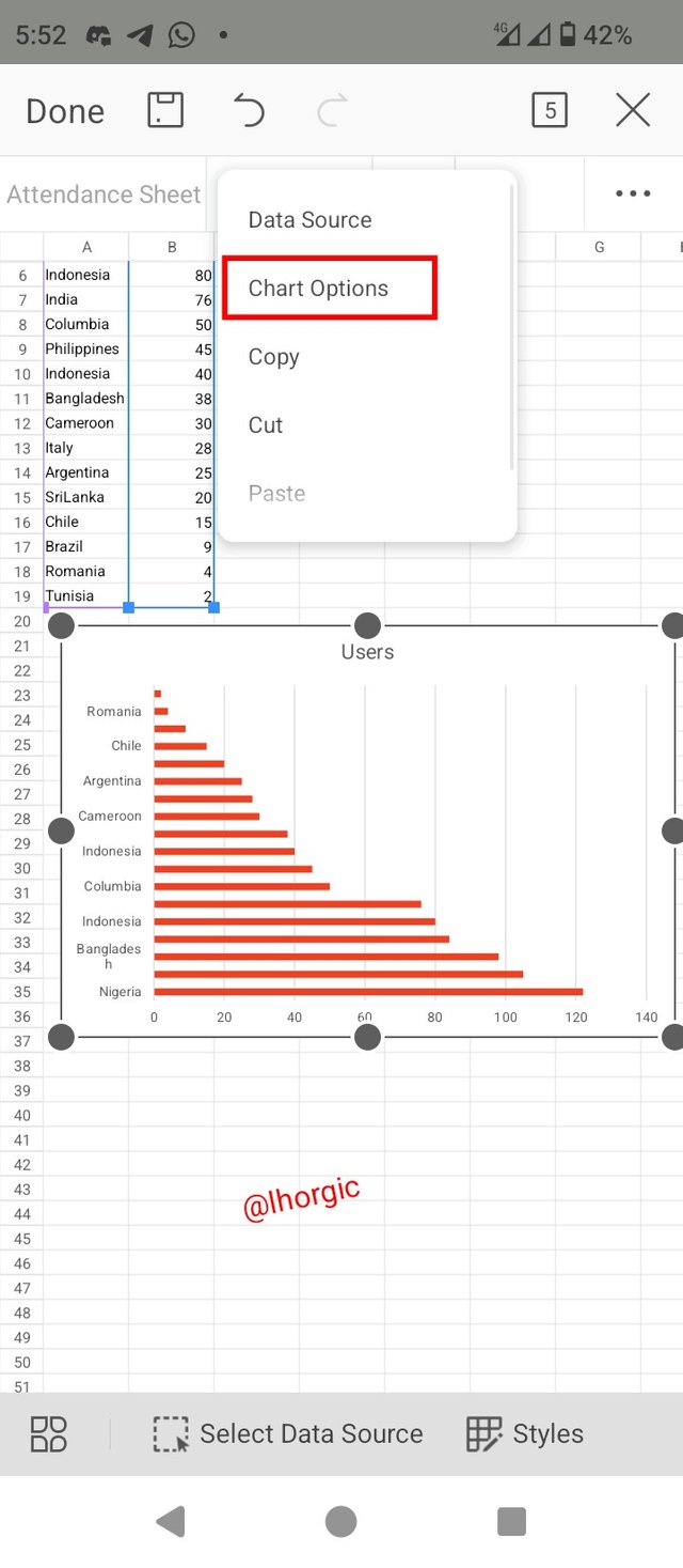
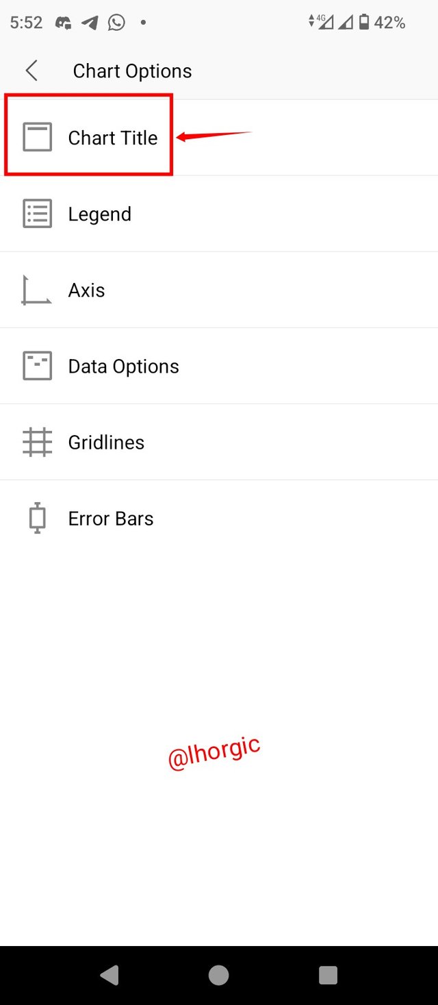
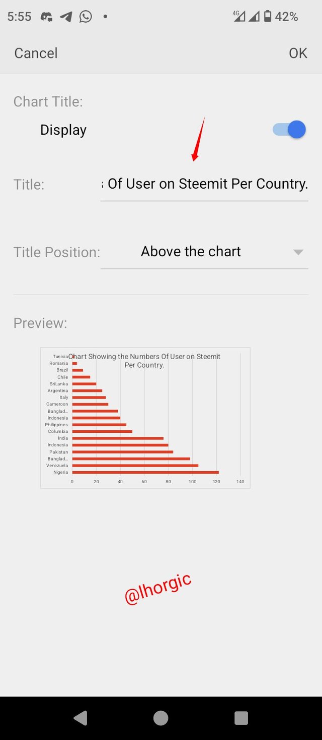
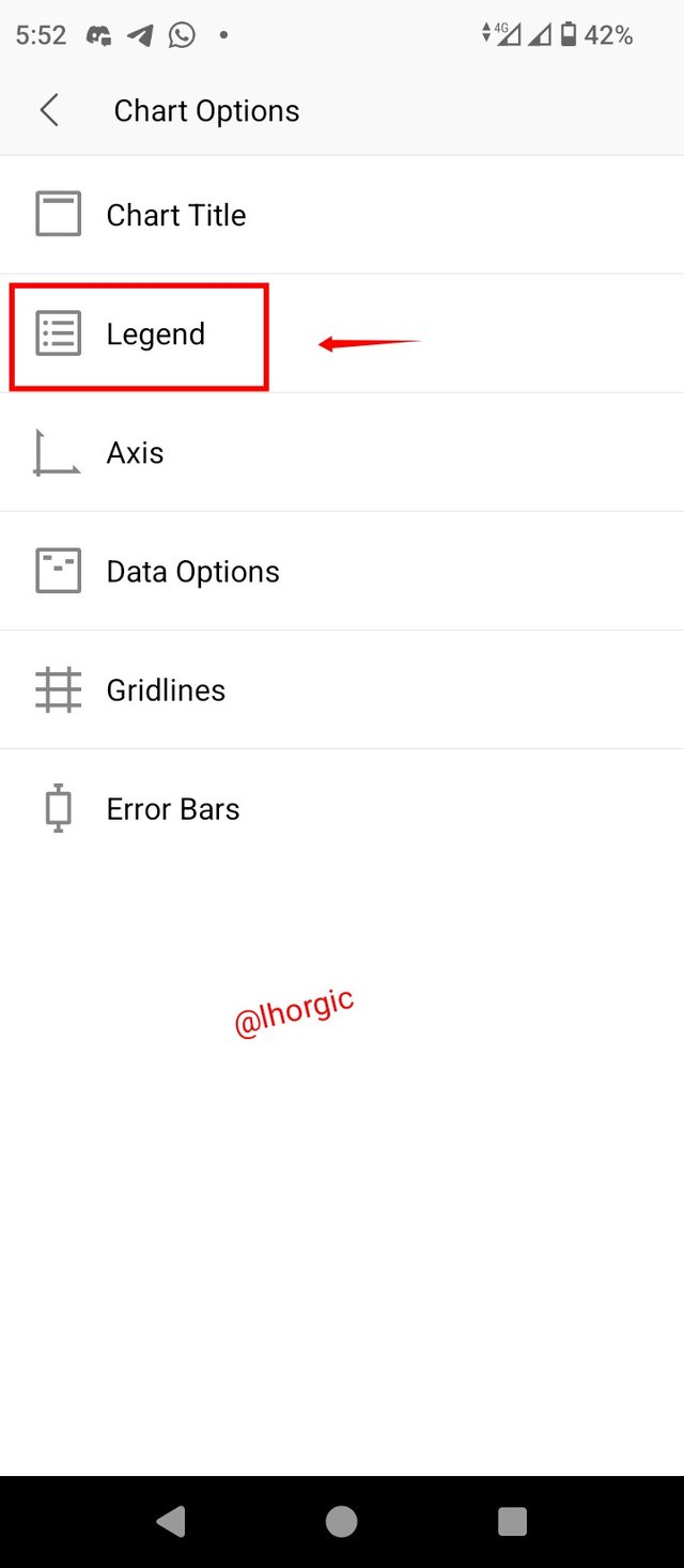
• Step 4: I highlighted the chart and then click on style to change it colour. Upon highlighting the chart again I chose the "chart Option"from the options given and this led me to the title and legend option among others. So I started with title.
 |  |  |
|---|
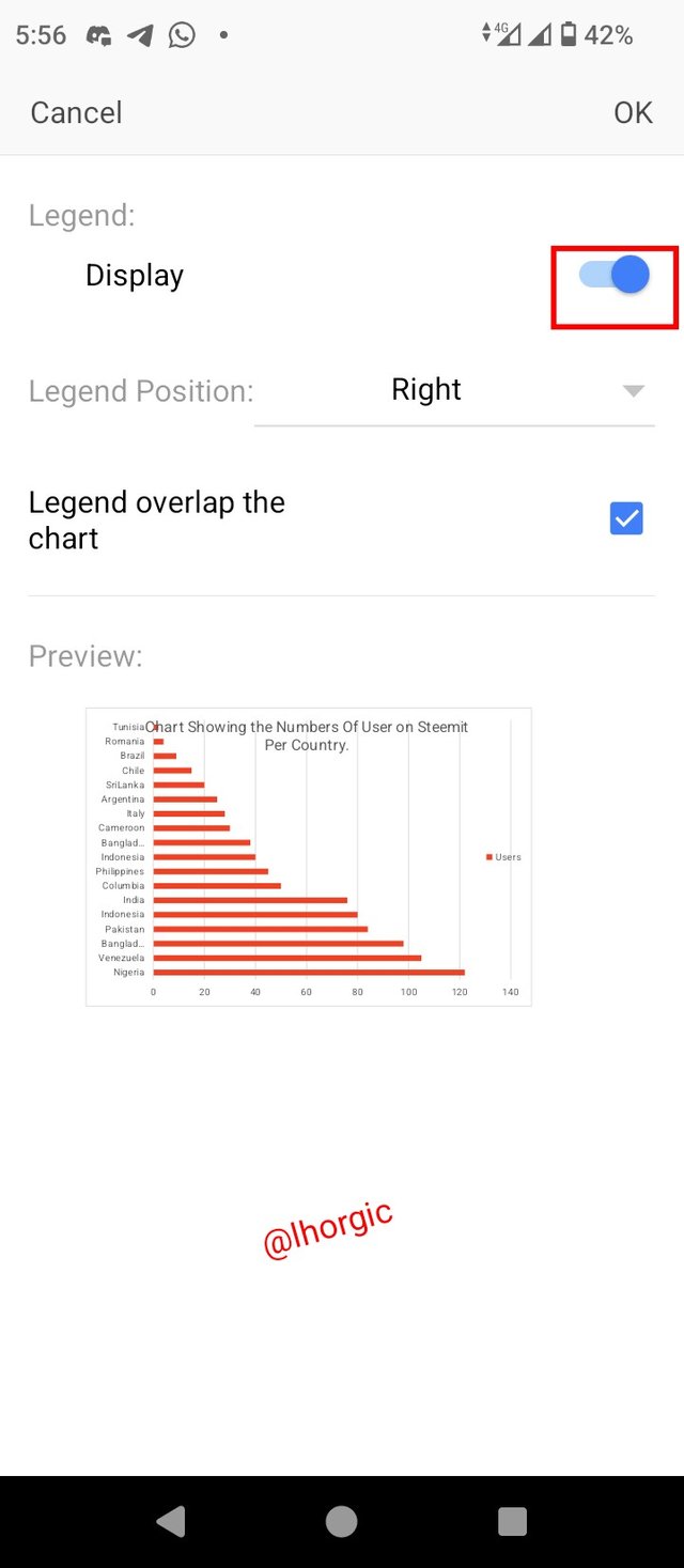
• Step 5: I then put in the title of the chart am preparing just as seen, and then went back to select the legend and then set my parameter, by toggling on the "blue"" bottom and positioning the legend to the right side. The result can be spotted in the images below.
 |  |  |
|---|
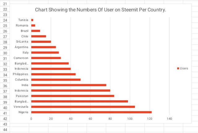
• Step 6: The overall outcome of the whole process is what we can see in the screenshot below. I would also be Interpreting what we have in the chart shortly.
 |
|---|
In this section, I want to explain what the bars on the chart represent based on the number of users from different countries represented on steemit.
• From the chart we can tell that the Nigeria has the highest number of users on the platform. So we can use the first position to describe them
• The second on the chart is Venezuela which follows closely after Nigeria
• Bangladesh also followed up, taking the third position according to the information on the chart
• Pakistan took the fourth position according to our chart, followed my indonesia and then india
• One can easily deduce the position of the other countries by observing the chart.
• The least on the chart is Tunisia with the just two users on the platform.
Data analysis in Excel can be defined as a systematic process of inspecting data, cleaning data, transforming data and ultimately modeling data to the end that useful information and conclusion can be drawn from such data which should aid decision making both for individuals and organization.
This is done using different technique, that is to tell us that there no single approach to it, it all depends on what you intend achieving with your data. Whatever technique you decide to use would surely end up revealing more information to you concerning your data.
The reason why many subscribe to the data analysis techniques include the following reasons..
• Accuracy : With the use of data analysis techniques, you can be sure that your data would be very accurate because most of these tool have been automated to carry out this flawless function. There will be nothing like missing values.
• Efficiency: Efficiency is another advantage one can derive from using these techniques. It makes work less tedious and seamless.
• Time saving: You can be sure you would save time when you embrace these systematic approach to your analytical activities. Monotonous tasks that involves duplications and repetition can be handled seamlessly.
• Productivity: This is like the Hallmark of the whole exercise, data analysis techniques in excel increases productivity. It takes it to a brand new level when you know your onion as it allows you summarize large and overwhelming amount of data accurately and also come up with information that are solid enough for decision making.
I think it's expedient to also talk about the various tools one can use in data analysis. They are as seen below. It includes the subject we are presently discussing, I mean chart.
• Charts : Chart help present data graphically and help us have a quick glance of vital information drawn from a set of data no matter how large.
• Conditional Formatting : This tool help highlight pattern and trends you might need to aid your analytical activities and also help you in decision making.
• Sorting : Sorting helps in the organization and arrangement of data in such a way that item (data) can be spotted or located easily. Most importantly is can help arrange in order such as lowest to highest or arrange data in alphabetical order.
• Filter : Filter is used to seive out the particular data you want from a given set of data. This tool does it systematical, so much that you can extract a particular type of data or information you need from an array of data.
• Excel Functions: We have talked about Funtion in our previous lesson and these function include = AVERAGE'= SUM` VLOOKUP and a host of others.
I want to wrap up this section by talking about how to organize Data based on what I've gather so far from the lecture. I just hope I do justice to this part of the task. Alright let's get as I highlight the process.
• Format the cells and highlight them
• Achieve data cleanup by Sorting and filtering data
• Add name to the cells
• Apply your formulas/Function
• Group data into rows and columns
• Use pivot table for better presentation and output .
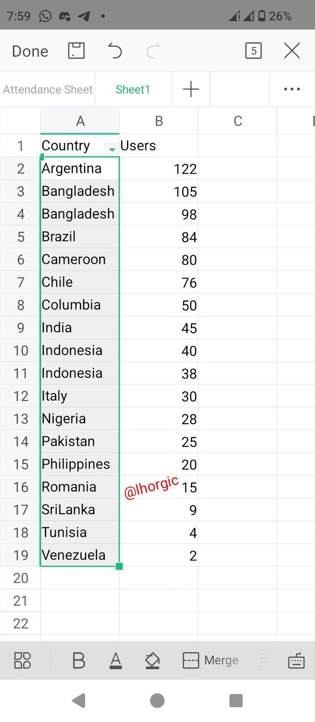
Just like our teacher taught us in today's class, I want to demonstrate how to alphabetically arrange the names of countries in the data on our spreadsheet.
• Step 1: I brought back our data, the one we used for the previous task and then highlighted the country section before proceeding to the menu button once again.
• Step 2: On clicking it, I went straight to my the *Data button, i clicked it and there i found the "ascending" option which is needed for the alphabetical arrangement of the countries we have in the data we are working on
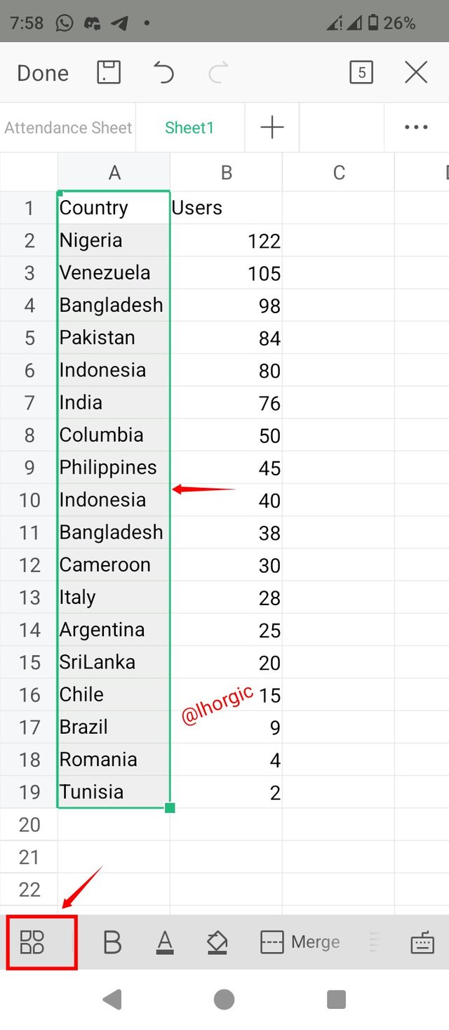 | 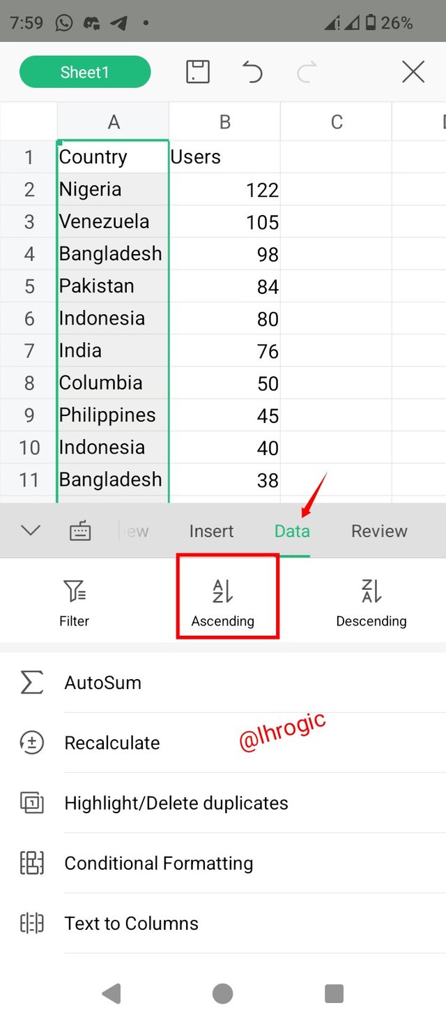 |
|---|
• Step 3: There was a pop up after clicking the ascending option and the pop up asked if I wanted to extend the action to the rest of the data or just on the selected area, I chose the selected area just as seen and then, I got my final result.
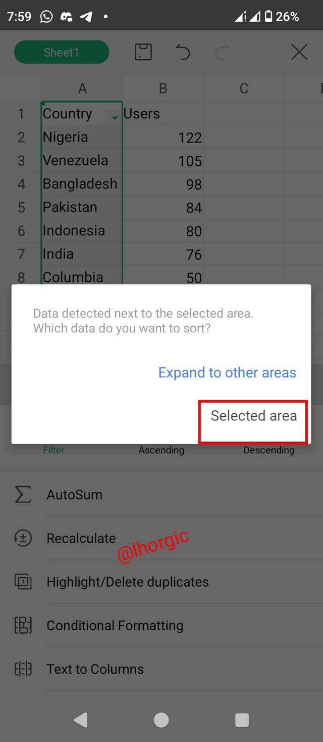 |  |
|---|
As we can see from the images, I have successfully attempted the task and am equally happy with the outcome. It's not looking different from what my teacher did in his example. I think I can now take a deep sigh before finally giving my fingers rest from typing and putting this assignment together all day. By my calculation, I think I've spent close to 5 hours putting this entry up and I believe its worth it, there is no price too big to pay for knowledge...smiles.
Just before I go I would love to invite my friends @rakiya @m-fdo @radleking to attempt this beautiful lesson. I hope they find it interesting too. Gracias
Regards
@lhorgic❤️
Has realizado un buen trabajo, cada día es bueno instruirse para ampliar aún más nuestros conocimientos, has explicado muy bien las formas gráficas en excel para el análisis de datos, que nos ayuda a optimizar nuestro trabajo para proyecciones futuras o a corto plazo.
Te deseo mucho éxito en tu entrada, saludos.
Bravo !
I love the way you show mastery of the WPS office app. A testement to the fact that you are not held down by limitations. This is true resourcefulness in exploiting mobil productivity on the go.
Thanks for appreciating my effort, you're right, I really do not want to allow any form of limitation. Truly my system was not functional and I had to do something, the result is what you see. Thanks once again boss.
Upvoted. Thank You for sending some of your rewards to @null. It will make Steem stronger.