Data Analysis with Excel: (Charts, and data analysis techniques.)
Topics Covered: Charts, and data analysis techniques.

This comes to the third week of our lessons and we humbly welcome you here once again friend. Feel free to point out anything you don't understand. In our first lesson, we introduced you to the basics, whereas in our second lesson, it was advanced Excel formulas, this time around we will be looking at charts and data analysis techniques.
Let's begin with charts
Charts
The chart is very important as it is the easiest way by which we can identify the highest or lowest information given in data visually. One good thing about Excel is that it offers us a wide range of charts and data analysis techniques that we can use to illustrate our data.
Charts are often used to analyse trends and patterns in data sets which allows the audience, external users, etc to see the meaning behind the data. For example, here on the Steemit platform, if you read through the consolidated booming report of this user @adeljose, you will see how he constantly being using the chart to analyze and illustrate data which even without you reading through the entire post, but by main looking at the chart you will get to know the community or user with the highest booming supports.

Now having said that above, it is to let you know that charts, help visualize data trends and patterns. As we have said earlier there are wide ranges of charts and data techniques in Excel which you can see from the above image.
Excel Charts Types:
Here are some of the most common types of chart options in Excel;
Comparison Charts:
This is the type of chart that draws a comparison between two (2) or more items on different parameters the image you are seeing is an example of a comparison Chart in Excel.
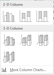
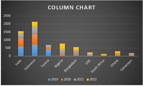
Column chart:
This is like an opposite to give first chart we have talked about. To put it short, this is the chart that is used to compare data values or related categories. It is the best chart that is used for comparing data categories and the image you're seeing is an example of a column chart.
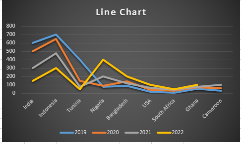
Line chart:
These are the chart types that are best used in identifying trends in data over time or continuous data. The image is an example of a line chart.
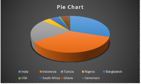
Pie Chart
This is the type of chart that is best used to illustrate the proportions of a whole, best for categorical data with limited categories in the data.
Histogram Chart:
This chart is all about showing you the graphical representation of a grouped frequency distribution with continuous classes. It is a chart type that groups the categories of data into groups or "bins" that help more meaning and sense of the data.
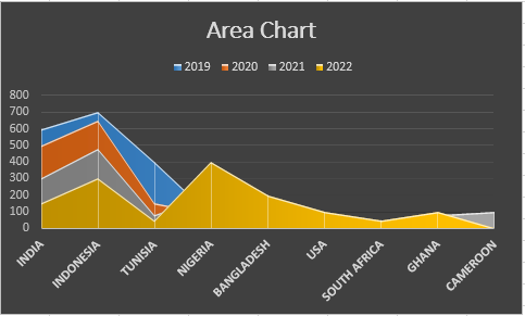
Area Chart:
This chart is used to show trends over time, days, months, and years or categories. Simply put it inside to highlight the magnitude of change over time.
There are other charts in Excel that we cannot talk about in this post because we want you to understand this lesson much better. Having said so let's take a look at how to insert a chart in Excel.
How to add/create a Chart
All the charts we have talked about including the ones we are unable to talk about here are easy to find and add to your data all you need to do is follow the given steps below 👇.
- Select the data that you want to visualize. (Here I made use of our previous data which was given as part of the contest tips in question 2).
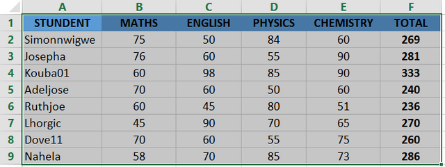
- After you have selected your data, go to "Insert" tab and click
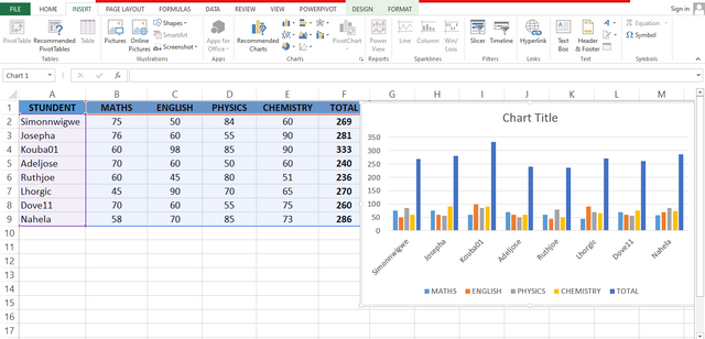
- Choose your desired data type. (Here I choose a Column chart)
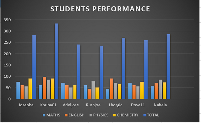
- Customize with chart tools (titles, legends, axes). This is the point you give your chart name, color and resize the chart according to how it is appealing to you.
Insight
From what is shown in the chart;
Kouba01, was the best-performing student in English, Physics, Chemistry, and in total general.
Nahela was the second-best-performing student
Josepha outperformed the rest students.
Data Analysis Techniques In Excel
In Excel data analysis is a very common and accessible way for businesses and individuals to analyze and visualize data. Excel offers us several tools for data analysis which you can use to seamlessly import and organize data from different sources. In Excel data cleaning becomes something everyone needs to understand as it helps to identify and rectify issues like duplicate figures and missing values.
To round up with our word, about data analysis in Excel, I want to let you know that Excel provides us with a range of techniques that help us to summarise, visualize, and understand complex datasets. Below are some of the key data analysis techniques you should know.
Tools for Data Analysis
Descriptive Statistics
This technique is us to summarise data and provide you with simple quantitative insights into the data. It includes the following; Mean, median, and mode: which are used for measuring central tendencies using
=Average()=Median()=Mode()
Standard Deviation and Variance: This is a technique that is used to measure the variability of data using the formula given below.=STDEV.S()=VAR.S()
For you to access descriptive statistics follow the given steps shared below.
- On your excess go to data > data analysis
- Select descriptive statistics and input your data range.
Conditional Formatting
Conditional formatting is a technique that is used to highlight patterns, trends, or anomalies in a dataset. It helps us to format cells automatically based on the rules that apply to the cell.
For you to access conditional formatting follow the given steps shared below.
- Select a column from your table. Here we are going to select a Total column. After that, we go to the home tab at the top of the ribbon locate the style group select conditional formatting, and then in the highlights cells rule select greater than an option.

Once you have done that above, you will see a greater-than-dialogue box appear.
At this point, write the quarter value and then select the color you want.
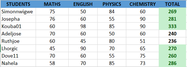
- As you can see in the Excel table total column changes of the values that are greater than 250.
Data sorting and filtering
This allows you to display or organize data efficiently so that only the relevant data that you want will be at the top. Also, it helps to sort a list of names that may not be arranged alphabetically to be in alphabetical order.
For you to access data sorting follow the given steps below.
- Go to data > sort and filter
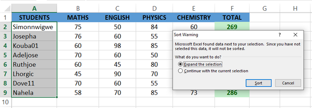
- To sort data whether ascending/descending or alphabetically or filter data based on specific conditions select how you want it to be sorted in the column.
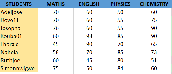
In Excel data analysis techniques range from descriptive statistics, and visualization to advanced tools like solver, power pivot, and regression. If you can be able to leverage these techniques you will be able to analyze and interpret data more accurately to make informed decisions on whatever data is presented to you.
Explain what you understand by Excel charts and discuss three (3) types of Excel charts that you know with clear screenshots.
Verify that you can read the information regarding chart location and creation in Excel and interpret it correctly using Bar Charts based on the data given below.
Number of Steemians per country.
| Country | Number of Steemians |
|---|---|
| Nigeria | 122 |
| Venezuela | 105 |
| Bangladesh | 98 |
| Pakistan | 84 |
| Indonesia | 80 |
| India | 76 |
| Colombia | 50 |
| Philippines | 45 |
| Indonesia | 40 |
| Bangladesh | 38 |
| Cameroon | 30 |
| Italy | 28 |
| Argentina | 25 |
| SriLanka | 20 |
| Chile | 15 |
| Brazil | 9 |
| Romania | 4 |
| Tunisia | 2 |
Briefly discuss Data Analysis Techniques In Excel and tell us how we can organize data in Excel for analysis.
Using the data given in question 2, arrange the names of countries alphabetically using data sorting techniques. Screenshots are needed.
Posts must be published in your blog and not in any community.
The title must be: "SEC | S20W3 | Data Analysis with Excel: (Charts, and data analysis techniques.)
The post must contain a minimum of 350 words, be free from plagiarism, and not use Artificial Intelligence (AI) or other forms of cheating.
Use the main hashtag #spreadsheet-s20w3 (required) among the first 4 tags
Add your country name hashtag (e.g. #nigeria)
If using the hashtag #burnsteem25 make sure you give 25% of the reward to @null
Invite 3 friends to participate.
Paste your participation link in the comment section, and don't forget to Vote and Resteem this post.
This contest starts Monday, September 23, 2024, at 00:00 UTC and ends on Sunday, September 29, 2024, at 23:59 UTC."
Note: We will choose the winners based on the quality of the post, a quality post in our opinion is a post that can provide interesting ideas and new insights for its readers. Proper use of markdown is also part of the quality of a post.
Cc:-
@simonnwigwe
In the title you refer to Google Sheets, yet throughout the post you refer to Excel.
This might cause some confusion.
Thank you so much for the correction. I have made the necessary changes with immediate effect.
very good
My entry ..
https://steemit.com/spreadsheet-s20w3/@aneukpineung78/sec-or-s20w3-or-data-analysis-with-excel-charts-and-data-analysis-techniques
https://steemit.com/spreadsheet-s20w3/@ninapenda/sec-or-s20w3-or-data-analysis-with-excel-charts-and-data-analysis-techniques
Here is my entry: https://steemit.com/spreadsheet-s20w3/@mohammadfaisal/sec-or-s20w3-or-data-analysis-with-excel-charts-and-data-analysis-techniques
My entry
https://steemit.com/spreadsheet-s20w3/@ruthjoe/sec-or-s20w3-or-data-analysis-with-excel-charts-and-data-analysis-techniques
How is it to rate a post?
Thanks it's Resteem
My entry
https://steemit.com/spreadsheet-s20w3/@rafk/sec-or-s20w3-or-data-analysis-with-excel-charts-and-data-analysis-techniques
HERE IS MY PARTICIPATION
https://steemit.com/spreadsheet-s20w3/@arinaz08/sec-or-s20w3-or-data-analysis-with-excel-charts-and-data-analysis-techniques
https://steemit.com/spreadsheet-s20w3/@xkool24/sec-or-s20w3-or-data-analysis-with-excel-charts-and-data-analysis-techniques