SEC | S20W3 | Data Analysis with Excel: (Charts, and Data Analysis Techniques
This is my homework post for Steemit Engagement Challenge Season 20 Week 3 assignment of Professor @josepha’s class, Data Analysis with Excel: (Charts, and Data Analysis Techniques.

Note :
- I used Microsoft Excel Excel 2021 in doing this assignment.
- I performed this task on Windows 10 PC, Google Chrome.
Task 1 - Explain what you understand by Excel charts and discuss three (3) types of Excel charts that you know with clear screenshots.
What I Understand About MS Excel Chart
Charts in Spreadsheet applications such as Microsoft Excel (MS Excel) are a very useful feature because they allow users to visualize alphanumeric data into images (graphics). Data in the form of images tends to be more interesting and easier to understand than a set of alphanumeric data. With it, the presentation of work results or proposals, for example, becomes more interesting and understandable. In other words, charts are visual representations of alphanumeric data sets.
Here is an example of a simple bar chart for two-column data.
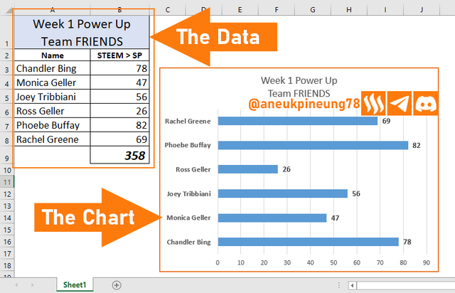
The image above shows how chart convert alphanumeric data into visual that are more interesting visually and easier to understand rather than the table. Viewers of the data will certainly find it easier to draw conclusions by looking at the chart than observing the data in the table, for example, it is faster for viewers to know who of the six members of team FRIENDS has done the highest Power Up and who has the lowest.
3 Types of MS Excel Chart
There are many types of charts in MS Excel that other spreadsheet applications may also have. Previously, I gave an example of a Bar Chart. Now I will give 3 other chart examples, namely 1) Pie; 2) Scatter; and 3) Histogram.
- Pie Chart
Pie Chart is probably one of the most popular chart types along with Column and Bar types. Pie Chart is commonly used on the Steem Blockchain. We have been seeing this type of chart used in activity reports on Steem. @crypto-academy uses 3-d Pie Chart (a variation of Pie type) along with another chart type in its weekly report of the implementation of the Steemit Crypto Academy. Another example of using Pie Chart in Steem Blockchain is the Doughnut type used by @steemchiller to visualize several types of data in SteemWorld, see the example below.
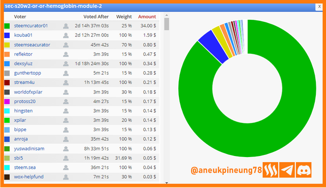
The chart featured in SteemWorld which analyze my article titled Hemoglobin - Module 2. The analysis is based on the number of rewards generated by each voter. Thanks to SteemWorld, always an adventure!
Pie charts are round or elliptical in shape (hence the name) and have “slices” that represent the proportions of certain data categories. This type of chart has become one of the most popular because it simply shows the proportion of each category of data to the total.
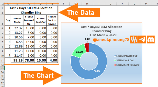
I have fabricated data on STEEM usage obtained by a fictitious Steemian named Chandler Bing over the past 7 days, the data includes STEEM Made, STEEM Powered Up, STEEM Transferred Out, and STEEM Sent to Saving. The data used is the total data of all these data segments. I used Dougnut Style of Pie chart type for this data, as seen in the following image.
- Scatter Chart
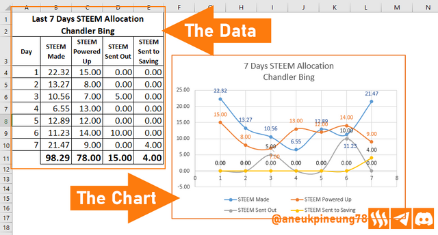
Next up is the Scatter Chart. Like Pie type of chart, this type of chart is useful for comparing several categories of data. Unlike the Pie Chart which processes total data and shows the total proportion per data category of the data selected for visualization, the Scatter Chart will show the value of each data point from each data category selected for visualization. Example of using Scatter Chart: based on the data we have used in the Pie Chart example above, we will make a comparison of the daily income and use of STEEM (Powered Up, Transferred Out, Sent to Savings) made by a Steemian named Chandler Bing. Then the Scatter Chart with the data as above is as follows:
- Histogram Chart
Histogram is a type of chart that is useful for getting an overview of the frequency distribution of a set of data. For example, there is data containing information on the number of articles written by 6 Steemians from the (fictitious) FRIENDS community group during Month X, and we want to get information about the number of authors who wrote articles in a certain range of articles. (This might sounds a bit complicated in terms, but in the world of statistics, it's one of the interesting things.) To do this, I have the data as shown below, with the lowest data being 63 and the frequency range being 40, so the first bin will contain data for the article count range 63+40 = 103, and so on following that range. Here is the resulting Histogram Chart:
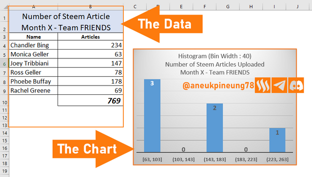
Through the Chart above we can see that there are 3 authors sending articles in the range of 63 to 103 articles, 2 people sending articles in the range of 143 - 183 number of articles, and 1 other person sending articles in the range of 223 to 263 articles.

Task 2 - Verify that you can read the information regarding chart location and creation in Excel and interpret it correctly using Bar Charts based on the data given below.
Number of Steemians per country.
| Country | Number of Steemians |
|---|---|
| Nigeria | 122 |
| Venezuela | 105 |
| Bangladesh | 98 |
| Pakistan | 84 |
| Indonesia | 80 |
| India | 76 |
| Colombia | 50 |
| Philippines | 45 |
| Indonesia | 40 |
| Bangladesh | 38 |
| Cameroon | 30 |
| Italy | 28 |
| Argentina | 25 |
| SriLanka | 20 |
| Chile | 15 |
| Brazil | 9 |
| Romania | 4 |
| Tunisia | 2 |
In MS Excel, Charts can be accessed through the [Insert] Menu. Under the [Insert] Menu, there are some ribbons including Charts Ribbon.
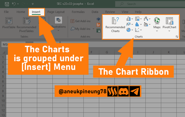
The following is how to create a Bar Chart based on the data given in the lectur.
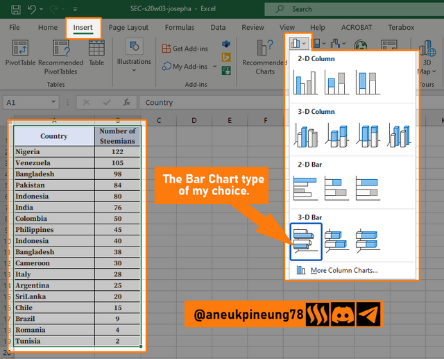
First, I make sure the data is selected and I am in the [Insert] menu. I press the [Insert Column or Bar Chart] button to display a floating dialog box where I can select some of the suggested chart types or I can select [More Column Chart] if I don't find one I like from the list of suggestions. Here I selected one of the suggested 3-D Bar types, as shown in the following image.
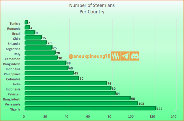
The result is as shown in the following image.
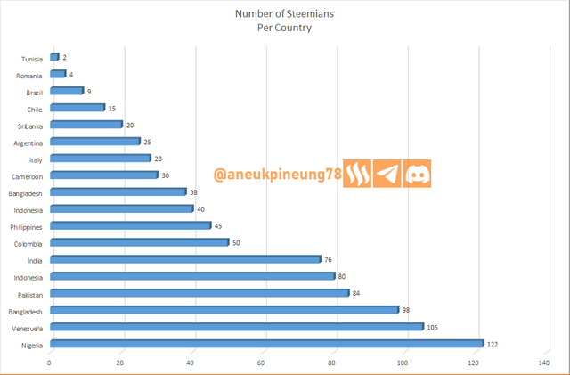
With a little adjusment, this is my final result:

Task 3 - Briefly discuss Data Analysis Techniques In Excel and tell us how we can organize data in Excel for analysis.
Purpose and Benefits of Data Analysis
Data can be likened to the beginning of a foothold that determines the journey ahead. In order for the journey ahead to be more directed and targets to be set more reasonably and results to be expected more optimally, the data needs to be analyzed further. Likewise, in MS Excel, data analysis can be useful for:
- Visualization of Data. With visualization, data that was originally alphanumeric in nature that tends to be confusing and uninteresting will be easier to digest and more pleasant to look at.
- Complex Data Management. MS Excel's ability to analyze a set of data will allow users to manage large and complex data easily.
- Automation of Mathematical Operations. With various mathematical functions integrated into it, MS Excel can help users automate operations such as multiplication, addition, subtraction, and division.
- Data Cleaning. Tools such as Remove Duplicates and Flash Fill make it easy to clean data so that it is more structured and ready for analysis.
- Better Decisions Making. By analyzing data, it is possible to identify - among other things - trend patterns, relationships between variables in the data, popular and least popular data, so that users can draw conclusions and make better and more targeted decisions.
- Others.
Example of Data Analysis Techniques In MS Excel
There are many data analysis techniques provided by MS Excel, from the simplest such as the mathematical function AVERAGE to the complex ones such as Power Pivot. Here are some examples.
- Mathematical and Statistical Functions.
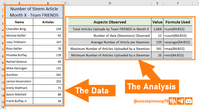
Included in this analysis technique are basic arithmetic and statistical operations made possible by functions: SUM, AVERAGE, COUNT, etc.- SUM: useful for summing data in a given range.
- AVERAGE: calculates the average sum of a set of numeric data.
- COUNT: counts the number of data (how many data in a certain range, not the total of data values), works on numeric cells.
- MAX: finds the maximum value in a set of data.
- MIN: finds the minimum value in a set of data.
- Others.
An example is as shown in the following image.
- Filter
Filter is useful for presenting certain data in a complex table, and hiding other data. For example, take a look at the following table.
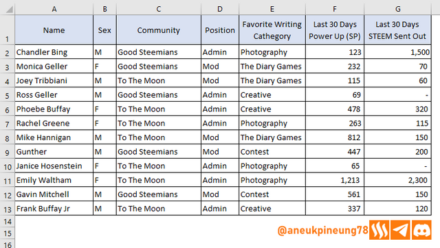
Now, let's say, I want to display only data from male Steemians, I use the Filter facility, and get the following results.
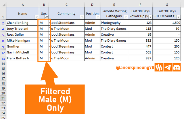
What if I go further and add another filter to show only data from male Steemians from To The Moon community? Let’s see:
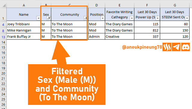
How We Can Organize Data In Excel For Analysis
Managing data well in Microsoft Excel is very important to facilitate the data analysis process. This is done by organizing the data into tables in a neat and well-structured manner. Make sure each row and column contains the appropriate group of data. Giving header names for each column and/or row is highly recommended and effectively helps when data analysis is done. In addition, although not important, also pay attention to the aesthetic value of the table e.g. certain columns are right aligned on all rows, and not random alignment which makes it unsightly.
It was also found that it is sometimes necessary to perform data cleaning (e.g. removing duplicate data and correcting Missing Values data) prior to analysis.

Task 4 - Using the data given in question 2, arrange the names of countries alphabetically using data sorting techniques. Screenshots are needed.
The Data Sorting function can be accessed through the [Home] and [Data] menus. In the [Home] menu, the Sorting function is located in the [Editing] ribbon, while in the [Data] menu it is in the [Sort & Filter] ribbon.

There are two Sorting methods, namely
lowest to highest ( a to z) and lowest to highest (z to a). In this example I will select the sorting method “A to Z” and I will access the sorting function through the [Data] menu. All I need to do is select the data I want to sort, enter the [Data] menu, and press the [Sort A to Z] button.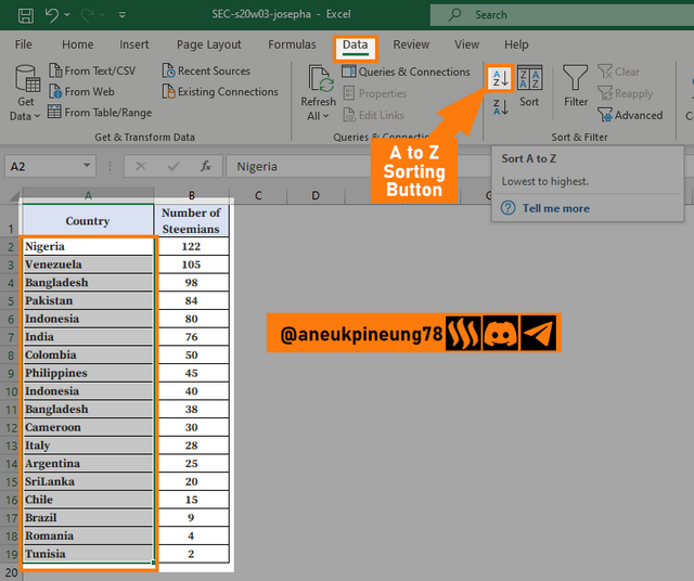
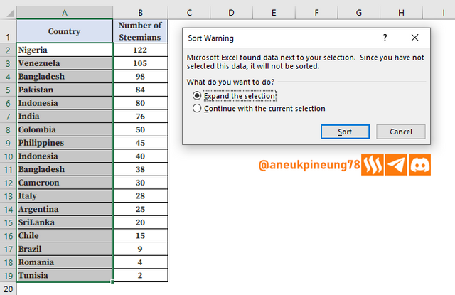
A dialogue box shows up, I have to choose [Expand the selection] since the data between columns are related for each line.
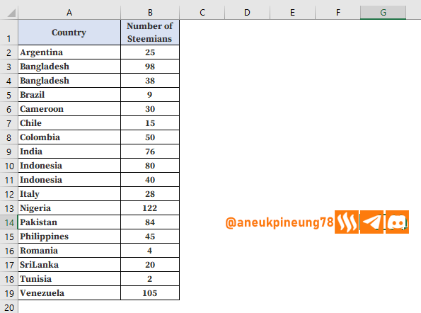
That’s all the steps needed. Here is the result:

Thanks
Thanks Professor Josepha for the lesson. I hereby invite @rayfa, @anroja and @lord-geraldi.
Pictures Sources
- The editorial picture was created by me.
- Unless otherwise stated, all another pictures were screenshoots and were edited with Adobe Photoshop 2021.


https://x.com/aneukpineung78/status/1839271980111114248
TEAM 4
Congratulations! Your post has been upvoted through steemcurator06. Good post here should be..Hola amigo, has hecho un buen trabajo explicando los tipos de gráficos en excel, sus pasos y para que sirve.
La técnica de análisis de datos la has desarrollado bien, te deseo mucho éxito en tu entrada y en todo en cuanto emprendas.
Hey thannks friend,, how are you doing? Is all good ??