SEC | S20W3 | Data Analysis with Excel: (Charts, and data analysis techniques
Asslam-u-Alaikum
Thank you professor @josepha for this wonderful lecture.
| Explain what you understand by Excel charts, and discuss three (3) types of Excel charts that you know with clear screenshots. |
|---|
Excel charts are graphical methods used to understand and present data easily. They help to see comparisons and trends by segmenting the data.
Here are three common types of Excel charts:
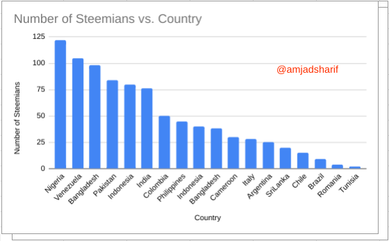
1. Column Chart
A column chart displays data in the form of vertical bars. This is great for comparing different categories, Such as showing sales for different months.
Here is an example of a Column Chart Screenshot.
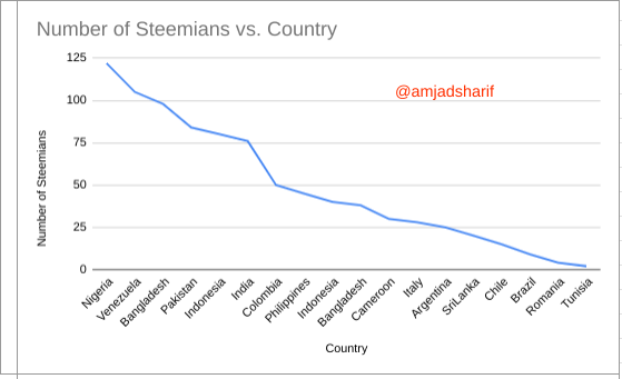
2. Line Chart (Line Chart)
A line chart connects data points with a line and shows changes over time, Such as price fluctuations throughout the year.
Here is an example of a Line Chart Screenshot.
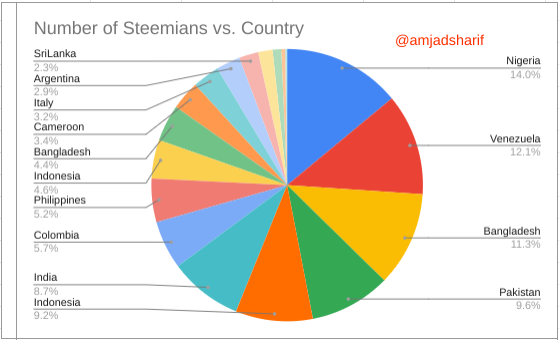
3. Pie Chart
A pie chart is a circular chart that shows the ratio of different pieces of data, Such as the percentage of each piece of total revenue.
Here is an example of a Pie Chart Screenshot.
We can create these charts in Excel by selecting the Insert tab. These charts make the information more clear and simple.
| Verify that you can read the information regarding chart location, and creation in Excel and interpret it correctly using Bar Charts based on the data given below. |
|---|
I have explained above about some charts now we will discuss how to complete step by step on given data.
Now I will input all the given data after opening my Google Sheet.
.png)
Now I will highlight my data that I input in the sheet. After that, I will go to the insert bar and click there then a slide bar will appear and if I click there, the column will appear.
.png)
Now I will change the shape that will attract the the viewers.
.png)
| Briefly discuss Data Analysis Techniques In Excel, and tell us how we can organize data in Excel for analysis. |
|---|
In Excel, data analysis techniques help us make sense of large sets of data by organizing, calculating, and interpreting it efficiently. Some common techniques include:
- Sorting and Filtering: We can organize data by Sorting it (e.g., from largest to smallest) or filtering out specific information to focus only on relevant data.
- Pivot Tables: Pivot tables summarize large amounts of data, allowing us to group and analyze data points, Such as sales by region or product performance.
- Conditional Formatting: This feature highlights data that meets certain criteria, making trends or outliers easier to spot.
- Charts and Graphs: Visual representations likeBar Charts or line graphs help you better understand and present your data.
To organize data for analysis, first structure it in a clean, tabular format with clear headers. Avoid merging cells and use consistent formatting. Ensure there are no blank rows or columns, as this can affect analysis tools like PivotTables. Finally, always label your data, so each column and row is easy to identify during analysis.
| Using the data given in question 2, arrange the names of countries alphabetically using data sorting techniques. Screenshots are needed. |
|---|
Here I will arrange the data with the help of the sort function, the data given in Question 2. The data will be easily categorized and it will be easy to understand.
I highlighted the data, then I will go to the data and click there and select sort range A-Z and click on it.
.png)
Now it will automatically arrange the data, the result is below.
.png)
Conclusion
Excel offers various data analysis techniques Such as sorting, filtering, PivotTables, and charts that make it easier to interpret large sets of data. Properly organizing your data by using clear headers, consistent formatting, and avoiding blank rows or columns is key to efficient analysis. This ensures that you can easily manipulate and gain insights from your data.
I invite @kyrie , @shabbir86, and @steemflower to participate.
Thank You
Regards: @amjadsharif
Very good article! You have explained Excel charts and data analysis methods in a very simple and effective manner.
Excel charts are used to present data graphically to show comparisons of different segments or changes over time.
As far as data analysis is concerned, you've made an excellent mention of tools like sorting, filtering, and pivot tables that help make complex data easier to understand.
This post of yours has presented the basic information about data analysis very well.Good Luck for contest
Thank you for your valuable feedback!
The way your line chart presents the slope makes it more outstanding even when the Column Chart is presenting the same information, confirming that some chart are more suted for presenting specific information.
I wish you the best in this contest.
Thank you for your valuable feedback 🙂!
Thank you @josepha