The story of logos Real Madrid and Barcelona Barcelona
The Spanish football league is one of the most important competitions in the world. It is followed by fans from all over the world with different nationalities, language or age. All the matches are followed with passion and enthusiasm, and they are keen to wear the uniform of the team they favor. , And raise his logo at each game but did not notify any of them, find out what is the secret behind this logo, and why designed in this form and colors in this article, we will shorten the most important teams and months in the Spanish league, to clarify the history of each logo, Of them, until the picture arrived The guardian now.
First: the Barcelona logo
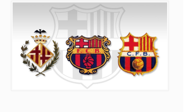
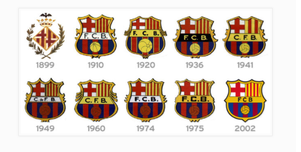
Barcelona was founded in 1899, and from then on the club's logo was changed more than once until it settled in its present form in 2002. Here is an explanation of the form of slogans.
Logo format :
1 - The first form of the logo is a crown topped by a bat surrounded by a branch of trees, and used this logo from the inception of the club in 1899 until 1910.
A competition was launched between the members of FC Barcelona in 1910, which was designed to design a new logo and was won by the player "Carles as Mala", where he was also a wonderful artist also has been stabilized in the form of the logo.
There have been minor changes that may have been negligible in the form of the logo, but have for years been the emblem of the Catalan team.
4 - designed a new logo for Barcelona Spanish, and was a completely different shape, designed in the form of a container containing inside the forty upper "St George's Cross", along with long yellow and red lines taken from the official logo of the city of Catalonia, appear the initials of the name of the club "FCB" In the middle of the logo, at the bottom of which is a drawing of football and the colors of Barcelona. There are some political pressures on the team, which tells the administration to change the logo, so that the club code is changed from "FCB" to "CFB". Two lines of the four lines in the logo were removed and y K in 1941.
5 - The logo returned to its former status and its first in 2002, becoming the official logo of the club until this time.
6 - The Barcelona logo combines the close association with the city of Catalunya, the country that has seen its beginnings and the sporting dimension of the club.
Second: Real Madrid logo
There are six slogans used by the Spanish team Real Madrid, from the beginning of its inception until now.
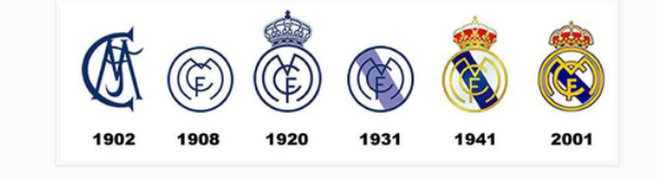
Founded in 1902, with over 116 years of history, the club's logo has undergone many changes and modifications.
The most prominent slogan among them was the royal crown.
The first logo of the club consists of an abbreviation for the name of the club, and was dark blue and the abbreviation is "Mcb" and that was in 1902. .- The previous logo was changed in 1908 changes the shape of the shortcut and becomes surrounded by a circle to become the club title since its time.
The most prominent slogan in 1920 when the Spanish King "Alfonso XIII", granting the club the title of "Real" in the sense of "Royal", and added honor when he put the crown on his shirt.
Real Madrid has been named since then.
A decision was taken in 1931 to ban all Spanish royal symbols. The crown is still removed from the club's logo and is also called to return to its previous position.
The decision was canceled ten years later to return the crown of the king, and painted golden in some areas as the team regained its full name.
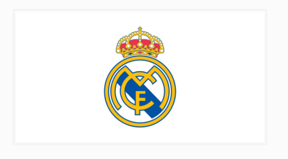
The last change was made to the logo in 2001, where shades of dark blue were added to all the borders of the logo.
thanks