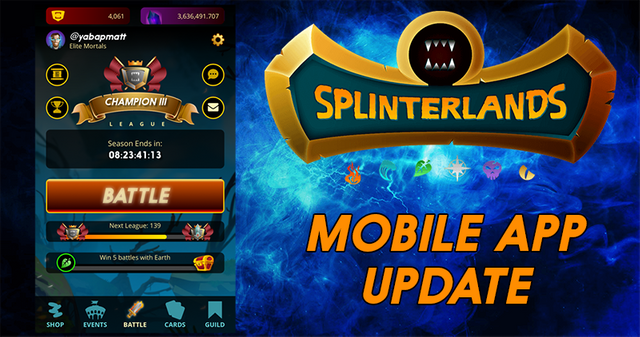
Splinterlands Mobile App Battle Preview!

We know that everyone is eagerly awaiting the release of the Splinterlands mobile app, and although we still have a good bit more work left to do before it's release-ready, we're extremely excited to share the progress we're making with this video which shows the end-to-end mobile battle experience:
We have spent a lot of time in particular on the design of the team creation page, since that is where the majority of the game play happens. We reworked this screen a number of times in order to make it as easy as possible for players to find and position the cards in the short amount of time that's available.
We are still pushing hard to get a first version out before the end of the year, however it's likely that certain features may not be available until later such as tournaments and the market. Initially the app will be released as a mobile web app that can be played via any mobile web browser, and in the future we will also submit versions to the Apple and Google app stores, although the crypto features will likely have to be disabled in those.
If you're like us then you're salivating at the potential of the game as it goes from primarily desktop browser to mobile application. Many of the potential markets we're looking to expand into are up to 70% mobile. With this tool in hand we'll be able to spread our game into those highly attractive markets in ways that have been previously out of reach. It also allows partnerships with other mobile apps that weren't available before like other mobile games, mobile wallets, and mobile browsers.
This is but a brief taste of what's to come. And we're hoping you're as excited about the potential as we are!

Stay tuned for more updates from the Splinterlands!
Website | Blog | Discord | Telegram | Shop

Looks good. One thing I noticed that is also currently an issue with the desktop interface: There's no easy way to select Fried Chicken (mana cost of 0) using the mana filter. Would it be possible to either include a 0-mana selector or to group the 0 and 1 mana categories so Fried Chicken would be included when 1 was selected?
Yes...gotta support the chicken!
You're right, only the chicken can save us. ;-)
Agree! The cluckening has begun. All chicken-kind asks that a manna selection of 0 be added so that we can be recognized as equals with other creatures of the Splinterlands.
I can’t wait to play a battle or three while I wait for the bus or in a queue.
Posted using Partiko iOS
I already do but web browsing can be less than perfect. :) long live SteemMonsters!
Posted using Partiko Android
First let me say this is amazing and we need that mana filter on desktop.
Great Job Guys and or Gals!
But for the purposes of feedback i feel the main game screen design needs a little work. It's clear in my mind the 1st card should be bigger as this is the main focus of the game. Simply dropping it down by a few pixels doesn't give me the sense of importance this card has.
And yes I know you are trying to fit everything on the screen, but maybe take a leaf out of Apple's design. Sometimes less is more.
To be honest once the game is in play, I don't really need to see all the stats of the remaining cards. Maybe if their stats change it just zooms in slightly so you can see them. Otherwise, save a little space and make that battle screen more pleasing on the eye rather than functional.
Anyway, it's a small thing and I appreciate the work that has already gone into making this real.
Great Job and keep going!
Great work, guys! Don't you want to make a horizontal application instead?
You will have much less space constraints, for the fights and the choice of cards for the deck
Nice, a little disappointing to here that no market function, but definitely can't wait for mobile battles as that's how I play most of the time anyways.
It says no crypto for apps submitted to the game store (possibly). Will you still be able to earn DEC if that's the case with mobile app battles?
Well that looks awesome.
The only thing I am missing is the level of the cards during the battle!
Keep it going, can’t wait until it is released!
Actually that's what the little colored bars above each card represent. The number of the bars that are filled in represent the card's level. In the video it is all max level cards so that's why all of the bars are filled. It's a clever way to show both the current card level (number of bars filled in), the max possible level (number of bars total), and the rarity (color of bars) all at once! Credit goes to @nateaguila for that design of course.
Thanks for clearing that up. @nateaguila and the complete design team did a great job!
You guys are ready to conquer the world!
Good luck!
Looks fantastic. Top effort all round.
Did we miss the animation for Giant Roc's trample in Round 1?
Not all of the abilities have been implemented yet.
Looks good, its amazing that yous have so much in the pipeline. The WAX announcement / UNTAMED release /Kickstarter&Fundition / Mobile and who knows what else yous are cooking up.
Keep up the great work, I'm very happy to have invested in your product.
That is a lot of news hahaha
what is the WAX announcement @rentmoney?
A partnership they announced a couple days back.
https://steemit.com/splinterlands/@steemmonsters/splinterlands-announces-partnership-with-the-wax-opskins-digital-asset-platform
I'm slacking... thanks for bringing it up in your comment! :P
No problem, its been very busy in the Splinterlands universe as of late so its no surprise that some may have missed an announcement or two (I know I have).
Excelent!!!!