SplinterFilter - Card Page Design Preview

Preview Design Of Our Card Pages!
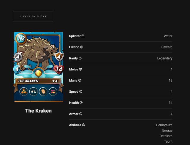
We are getting closer to completing the Filter and we have a preview of our card pages which you can see in the above image. We want to keep things clean and simple to view, all stats including "mana cost", "damage type / amount", "health amount", and "armour amount". We have also listed the edition the card belongs to ie. Beta, Untamed, Reward, Promo etc. as well as the rarity common, legendary etc. This will give you a better overview of the monster and of course we can use the data to include a rarity, or edition filter later on if we find it to be a requested feature.
We are also including some additional information for each card that will be little tips and hints on how best to use the card and what rulesets favour the card. A lot of newer players will likely find this helpful for when viewing monsters for the first time as it will give them a general idea of how best to play the monster.
Please do let us know in the comments if you have any ideas or would like to see any information that we haven't already included going into the monsters page. We'd really love to have a complete guide / tactic / ability / stat viewer all in the one place to help new and old players alike!
ETA
We're hoping for early March to be finished adding in the monsters then it's just a matter of finalizing the layout which we are 99% complete with, so there shouldn't be any further delays however my day job is very busy at the moment (hence the delays so far).