State of the Sndbox Competition Entry // Abduction [4th Attempt]
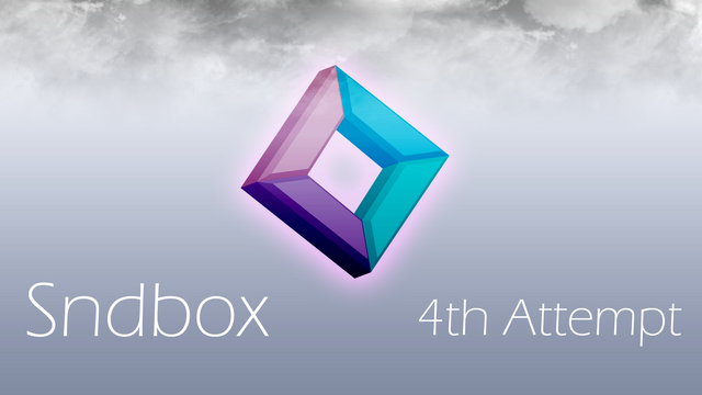
Hey guys, its been quite some time since I've posted anything. I'm not sure why I do this sometimes, but I'm glad to be back making a post. I just been busy with school and projects lately and since I only have two weeks left to go, its been crunch time. I have to make two commercial for a video editing class and the other one a presentation. Ugh, I don't really like getting up and talking in front of the class but its what I have to do to pass.
So I finally finished the 4th thumbnail for the sndbox competition, and I gotta say, I really like this one. I tried to be creative as much as possible. Well anyway, I guess I'll talk about the process. (*ゝω・)ノ
Ⓟⓡⓞⓒⓔⓢⓢ
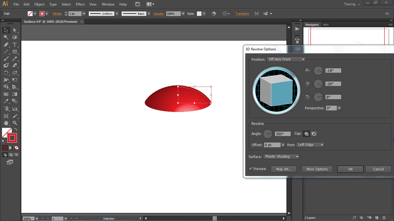
I started out making a curved path towards the right with the pen tool. I just found out that you can make spheres in Illustrator CS6 and I was pretty stoked about it. So I ended up choosing the revolve option in the 3D effects panel. I began to miss around with the rotation and the perspective of the 3D object. My main goal was to make an alien spaceship and in my head, I had it planned out on how it was going to look like.
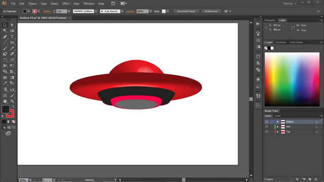
When I was done with the mid section of the spaceship, I started adding shapes and drawing with the pen tool for the bottom pieces. During the 3D process, I added in multiple light sources to the 3D objects. This is so that the spaceship can give off light while the logo is being abducted. (¯﹃¯*) So far I was pretty pleased to see how it was turning out. Learning new techniques and applying them to my work always feels good.
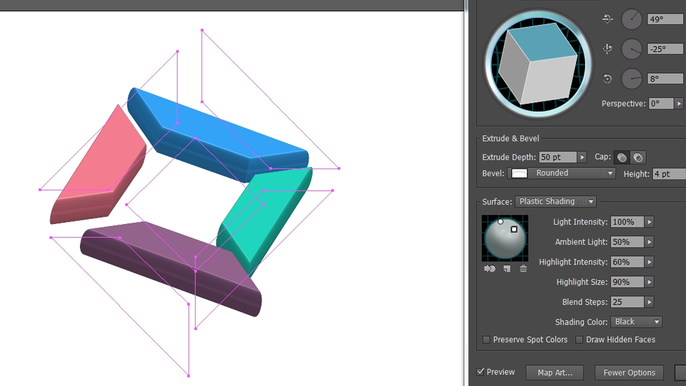
As for the logo, I also made it into a 3D object, but this time I wanted to spread out the individual pieces and make it look like a weightless object that's being taken by the UFO one by one. I then added in the light sources on top of the object. I tried experimenting with different textures for the logo, but I ended up going with a plain object for simple reasons.
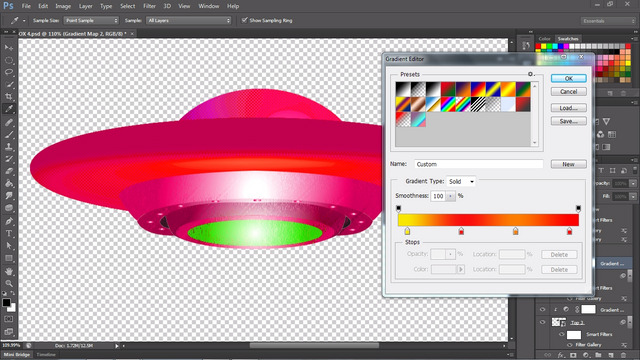
Lastly, I moved the spaceship parts one by one into Photoshop CS6 so I can edit and apply effects individually. I added in a texture for the bottom piece, several more textures to the mid and top piece, and a gradient effect to top it off.
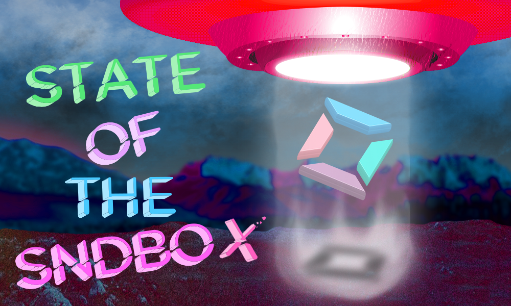
Of course there were more steps to making this thumbnail, but I would be talking about the process forever like Hue, saturation, and tilt shift (my favorite blur effect).
Illustrator CS6
Photoshop CS6

For a second there I thought it said ‘16 hours ago’ and that you are back (*´-`)
I thought I was back (lol) but, I don't know, I just been getting weird vibes from steemit lately. In my spare time I'll try to curate content as much as possible so that my voting thingy doesn't go to waste. I do have content that's just sitting here, but I haven't been feeling up to post anything.
I didn't think you would comment on a old post @fukako haha. Maybe I'll post something in the near future, and thank you for commenting.
well hope you ll come back :) steemit is weird, so i use busy instead :P
I really like your job......the shadow under the logo is a detail that is really interesting
Thank you @ran.koree I tried to be creative every month for the contest.
Congratulations @raizel! You have received a personal award!
Click on the badge to view your Board of Honor.
Do not miss the last post from @steemitboard!
Participate in the SteemitBoard World Cup Contest!
Collect World Cup badges and win free SBD
Support the Gold Sponsors of the contest: @good-karma and @lukestokes