State of the Sndbox Competition Entry | For the Next

The beginning of the month is fun for me and also a challenging month to follow a @sndbox contest , most of the participant logos I see are different and very good too. This is one of the challenges for the participants to make the logo as attractive as possible.
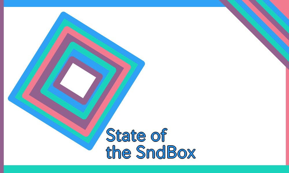
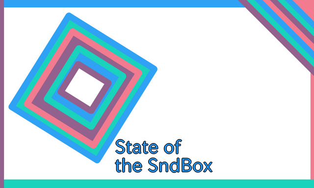
for me it's not something because those who want to try hard will get good results too , little explanation about my logo made this is a very simple logo just a few shapes and lines for this logo I conclude from the previous winning logo reviews that they create a logo that is interesting and unique therefore I try to make a little different and to be easy to know without adding a color other than the color pallete #sndbox.

From the first day of the contest announcement and today is the second day trying to share this content or logo for all participants and especially for the contest providers hopefully this logo can be put to good use in its place.
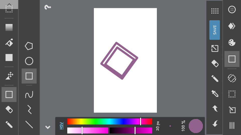
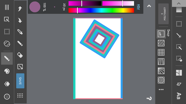
DESIGN PROCESSING
STEP 1

STEP 2

STEP 3

FINAL RESULT

[Download For All File.SVG](file:///C:/Users/Aufar/Downloads/1519962949686.svg)